
Transparent borders
Brad Frost Transparent bordersYou Want border-color: transparent, Not border: none by Dave is a great reminder to not remove borders from components for accessibility reasons, especially to better support high contrast mode.
border-color: transparent comes in handy for other use cases as well.
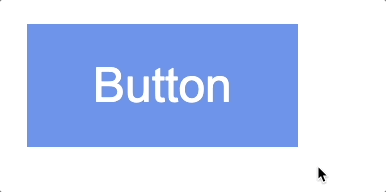
The first is for a such a 101-level thing, but holy smokes is it still something I commonly encounter across the internet. Defining a border on hover like so:
button:hover {
  border: 2px solid navy;
}
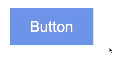
Changes the box model and is janky as all hell:
There are many ways to address this, including using border-color: transparent.
button {
  border: 2px solid transparent;
}

button:hover {
  border-color: navy;
}
This all feels pretty CSS 101, but apparently it still needs spelled out!
Another use case for border-color: transparent is for themeable design systems. We help organizations create themeable design systems for many different purposes, including supporting multiple brands, sub-brands, white labeling, product families, dark mode, and more.
When supporting multiple theme, it can be common for some themes to use borders while others don't. This flexibility is great! Each brand is able to express themselves how they see fit. But if implemented using different border widths, shifts in the box model happen.
Here's the difference between borders defined in a theme vs using border-color: transparent:
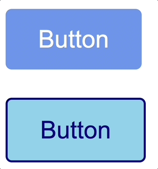
The lack of border results in a smaller, which can lead to misalignment and other unexpected behavior. border-color: transparent preserves the button size across themes.
Some shifts are inevitable (looking at you, typography!), but wherever possible you want to minimize shifts to the box model across themes and variants in order to reduce QA efforts across themes and variants. You can accomplish this by defining transparent for border colors in themes that don't have visible borders.
So yeah, hooray border-color: transparent!