
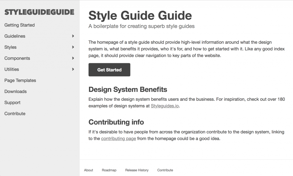
Style Guide Guide, Gatsby Edition
Brad Frost Style Guide Guide, Gatsby EditionWe're happy to announce Style Guide Guide, Gatsby Edition! You can check out the demo here.
The workshop and the storefront
There are lots of moving parts, tools, and environments involved in making a design systems take shape. We've found it helpful to break down two important environments of a design system into the "workshop" and the "storefront". The "workshop" is the environment designed for teams to be creative (playful, even) and productive. It is in the workshop where new components are established, explored, iterated upon, tested, and ultimately packaged up for production. The "storefront" environment is the style guide website that serves as the happy home for all the ingredients of a design system. In addition to displaying design principles, guidelines, processes, and other helpful info, the storefront showcases complete UI components alongside useful information for users to better understand what a component does, and how to properly implement it.
A storefront powered by React
We've built style guide websites using Jekyll, which led to the creation of the original Style Guide Guide project (demo here). Like a lot of people, we've been doing a lot more work in React lately. Tools like Storybook and React Styleguidist are fantastic workshop tools that help teams visualize and build the design system's components. However, those tools are designed for the working group's productivity, which serves a much different purpose than a style guide website, which needs to serve many, often less-technical audiences.
So! That's why built Style Guide Guide, Gatsby Edition. The project serves as a style guide website boilerplate for teams authoring their design systems with React. Building the style guide website in React provides several advantages for teams who have chosen to build their design systems in React:
- The design system's presentational components can be ingested and used directly by the Gatsby style guide website, meaning that the style guide site is powered by the very components it displays (the ultimate dogfooding!).
- This allows the team to trial the workflow for deploying the design system into a working application via npm packages.
- That means there's almost no friction to get updates to the components into the style guide site. Changes were made to the button or card component? Run
npm update design-system-componentsin the Gatsby style guide project to pull the latest and greatest into the style guide. - Consuming the components directly helps ensure the components can successfully power real software applications, rather than simply as abstract components floating around in the ether.
A design system workflow
As I mentioned earlier, there are a lot of moving parts to a design system. I know this because I've been building increasingly-complex visuals! But it all checks out, I swear. Let's take the following graphic and break it down:
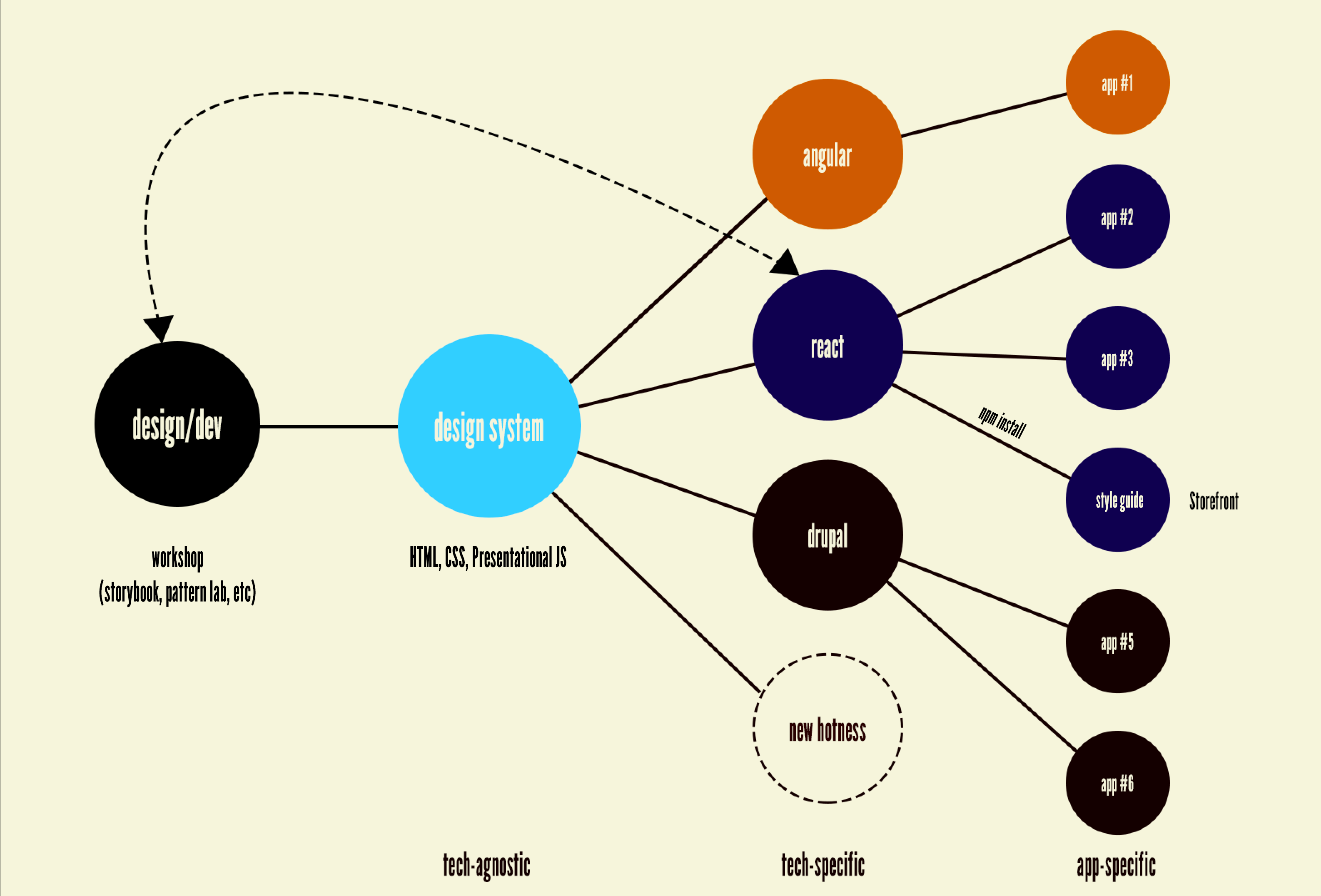
- Designers and developers design and build the design system's components in a workshop environment like Storybook, Pattern Lab, Fractal, or any number of other tools.
- The output of that work is HTML, CSS, and JavaScript rendered in the browser. I've talked about the importance of maintaining technology-agnostic design systems, which acknowledges that today's hotness may not be tomorrow's hotness. It's essential to choose tools that build software today, but a design system should be bigger than any one of those tools.
- A technology-agnostic design system is then translated into tech-specific flavors of the design system. For teams authoring the design system using React, the React flavor of the design system becomes the most complete and ultimately becomes a reference for other tech-specific versions of the system. Similarly, if the organization is building a lot of Drupal stuff, the team might choose Twig as the default tech-specific version, then port to Vue, Angular, or any other templating language.
- Individual applications consume a tech-specific version of the design system, often via a package manager like npm (although other methods exist as well). When updates are made to the tech-specific version of the design system, those applications will update to the latest and greatest.
In our work, we've found building the design system's components through the lens of pilot projects is incredibly important. By adopting a style-guide driven design system strategy, the team automatically has a relatively standalone design system pilot project with which to build the system's components from. Pretty cool! Not only does this help the team create components through the lens of a real project, it also allows the team to trial the workflow detailed above. How does a team deploy the design system's components to an application code base? Treating the style guide storefront as a pilot project helps teams figure out how to do that before trying to do this with a live application where the stakes are higher.
Lots to be done!
Ian has done a ton of hard work to get this thing up and running, which is fantastic. Both of us have been working on this, but we'll be the first to admit we're still getting our sea legs when it comes to React. We're still working out a lot of the kinks, and would love some input from the community. For instance, we weren't able to get the live component's React code and rendered HTML all wired up. If you want to help improve the project, pull requests and issues are welcome!