A Global Design System
TL;DR: This is a call to action to create a Global Design System that provides the world’s web designers & developers a library of common UI components. A Global Design System would improve the quality and accessibility of the world’s web experiences, save the world’s web designers and developers millions of hours, and make better use of our collective human potential.
Sounds pretty good, right? In this article, I’ll talk about our collective design system journey, the rationale for creating a Global Design System, some thoughts on how to make a Global Design System actually happen, and discuss how a Global Design System would impact the world’s web designers and developers. Let’s dig in!
Our design systems journey
Once upon a time, people had to design, construct, and maintain a bespoke user interface for each and every web digital product. This was manageable when an organization’s digital landscape looked something like this:

But as we all know, the digital landscape has exploded into a cacophony of websites, web apps, native mobile applications, and other software applications we can collectively call “digital products.” It’s not unusual for an organization’s digital product landscape to look something like this:
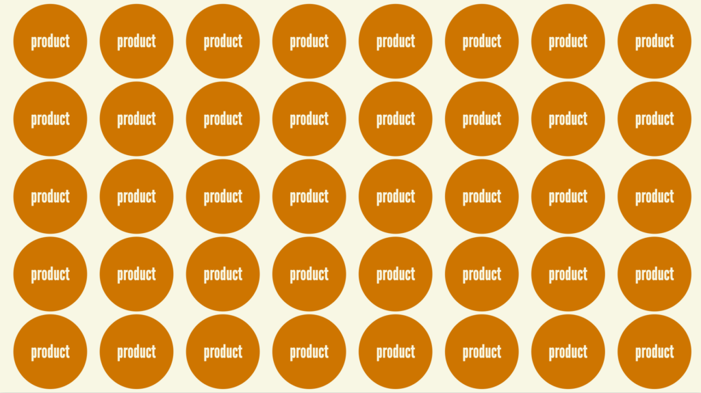
Designing, building, and maintaining a bespoke user interface for each individual digital product is expensive, inefficient, and fraught. And so a chorus of voices rings out across organizations the world over: “Let’s stop reinventing the wheel! Let’s save designers and developers time and agony! Let’s promote consistency and cohesion! Let’s ship higher-quality users interfaces!” This is the rallying cry for what we have come to know as design systems.
Over the past ~10-15 years, concepts around modular UIs have matured, technologies have been born, and tools have evolved to create a library of common user interface components that power an organization’s portfolio of digital products.
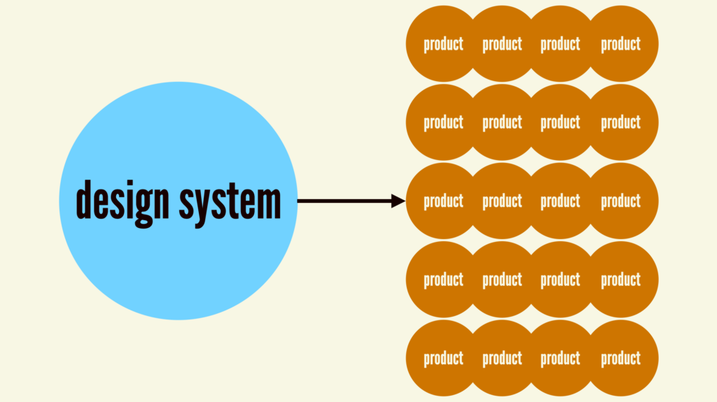
With a design system in place, product teams can wield the design system’s buttons, form controls, accordions, and other common UI components in order to increase speed, improve UI quality, and free teams up to work on more worthwhile tasks. This approach has proven to be very effective, and now design systems have become a best practice employed by digital organizations of all shapes and sizes around the world. Hooray design systems!
Our duplicative present
And we all live happily ever after, right? Well, not so fast. Organization-wide design systems have eased the individual burden of designing/building (and redesigning/rebuilding ad nauseam) common solutions over and over again. But an ironic pattern emerges: every organization ends up building solutions that overlap substantially with what every other organization is building. Our efforts to reduce duplicative work at the individual level are resulting in duplicative work at the inter-organization level.
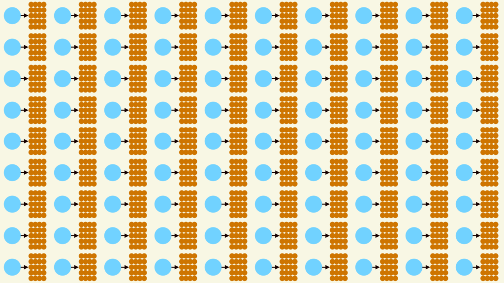
This phenomenon is understandable: organizations are trying to bring order where they have influence. (We see this within organizations as well, where several production teams under the same roof build their own systems because they don’t have influence beyond their group to build an org-wide system.) But the result is the same: now we have a meta design system problem.
Right now, vast numbers of human beings are devoting their time and energy to designing, building, documenting, and maintaining the exact same set of common components. Accordions that open when a user clicks them. Accordions that — you guessed it — close when a user clicks them again. Datepickers that…pick dates. Tabs that switch panels when selected. Form fields that associate labels with their respective inputs. Alerts that communicate success, error, warning, and information status. Dialogs and tooltips and drawers oh my! By and large, these components are unexceptional commodities that assume the same general shape and behavior regardless of whether the design system serves a non-profit, a federal agency, a bank, a publication, an e-commerce site, a Fortune 500 enterprise, a dog salon, a startup, SaaS company, you get the picture.
These basic UI components are tricky to get right. Looking across the World Wide Web, 0 of the top 100 websites use valid HTML, and our collective accessibility game is abysmal. The WebAIM Million project crawls the top million websites and reliably delivers a depressing annual report about the state of website accessibility:
Across the top one million home pages, 49,991,225 distinct accessibility errors were detected—an average of 50.0 errors per page.
WebAIM Million
While these issues can’t solely be attributed to the constant reinvention of common UI components, they certainly contribute to the problem! Historically our approach to this important issue has been to shout louder at developers to construct things with accessibility as a primary consideration, but that strategy doesn’t appear to be working.
All of this duplicative work yields experiences that still suffer serious quality deficiencies, and there are even more wrinkles to consider. Each design system is isolated and disconnected, which means each organization is left to its own devices to ensure the library keeps up with the web’s ever-evolving best practices. Updating components to adopt new HTML elements, attributes, and techniques has so far been a manual process that is delicate and error-prone. And it’s a two-way street: there’s not a clear path for the broader web to benefit from excellent solutions and ideas that were born in org-specific systems.
So what are we to do? Let’s return to our wise design systems rallying cry: “Let’s stop reinventing the wheel! Let’s save designers and developers time and agony! Let’s promote consistency and cohesion! Let’s ship higher-quality users interfaces!”
Only now let’s redirect that rallying cry outside of any individual organizations’ walls and apply it to the world at large.
A proposal for a Global Design System
When the design system is boring, it frees designers and developers to do the new stuff, to solve new problems. The design system carries the burden of the boring, so that designers and developers don’t have to.
Josh Clark
There is a massive opportunity to save the world’s designers and developers millions upon millions of hours, freeing up time and human potential to work on far more pressing problems than making an accordion open and close.
There’s a massive opportunity to dramatically improve the accessibility, semantics, and overall quality of the world’s web experiences.
There’s a massive opportunity to harness the collective brain power of the world’s best and brightest.
There’s a massive opportunity for the web community to demonstrate to a volatile world what true worldwide collaboration and cooperation looks like.
I think there’s a massive opportunity to create a Global Design System.
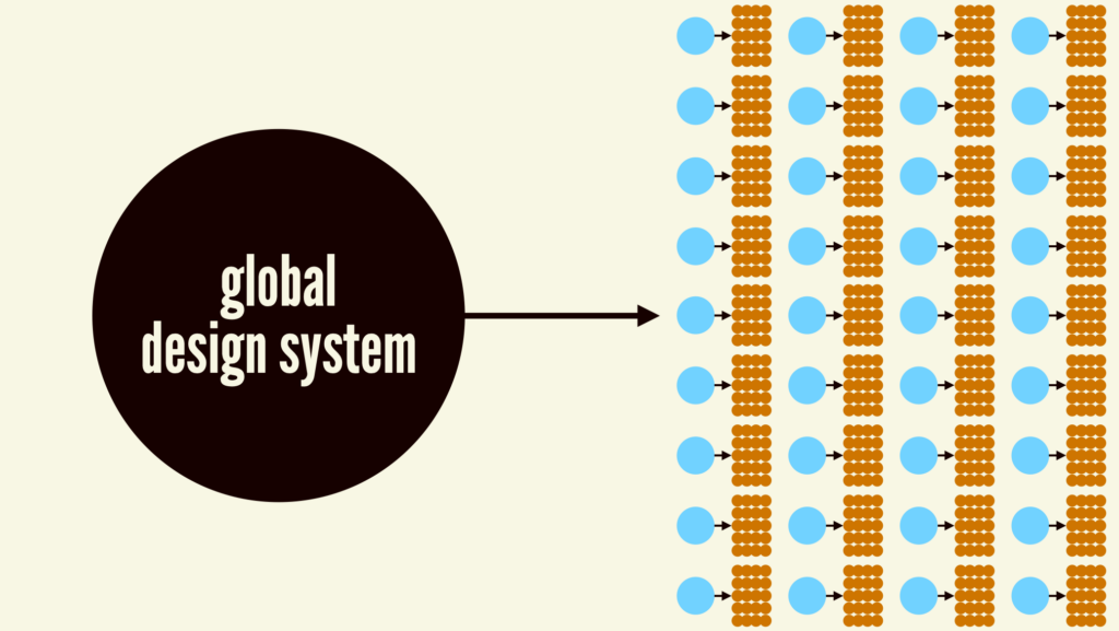
A Global Design System would centralize common UI components, reduce so much of this unnecessary duplication, integrate with any web-based tech stack, and create a connected vehicle for delivering front-end best practices to the world’s web experiences.
What exactly would a Global Design System look like? We’ll get to that, but first let’s talk about how it differs from a few things that already exist.
A layer on top of HTML
You might be asking, “So you’re saying we just need to add a bunch of new elements to the HTML spec?” To which my answer is “Maybe!” But also “Maybe not!”
HTML is amazing, and provides the elemental pieces we need to make websites and apps work. I think about HTML elements and attributes as the most elemental, low-level IKEA furniture parts:
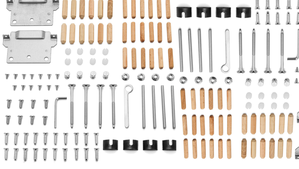
Historically, that’s all developers have had to work with. We’d rummage around the pile and pick out the things we need to create our products. As we’ve already discussed, there’s a lot of room for error in this process; it’s a bit like drawing the rest of the owl.
Thanks to the tireless work of browser folks and standards bodies, I think that by and large we have most HTML elements and primitives in place to make most common web user interfaces. What we need now are more prefabricated UI components that abstract away much of the close-to-the-metal HTML and give developers composed, ready-to-use modules to drop into their projects.

Many — or even most! — web developers shouldn’t need to understand many close-to-the-metal HTML concepts in order to make web applications function. What would it mean to centralize the markup of dozens of common components and provide those as plug-and-play solutions to back-of-the-front-end developers?
A Global Design System can also serve as an incubator or test kitchen for new HTML elements or properties. We see this with recipes in the layered design system ecosystems we encounter; great ideas born in product-specific layers can eventually be absorbed by the lower-level system. The HTML standards process is necessarily slow, deliberate, and comprehensive, so a Global Design System layer on top of HTML can pragmatically help developers get things done now while also creating a path to future inclusion in the HTML spec if applicable.
Why don’t we just use [third-party library]?
For many years, we’ve heard “Why doesn’t everyone just use [Material Design | Bootstrap | Tailwind UI | Foundation by Zurb | etc]?” After all, these tools are already constructed, tested, documented, open sourced, and put through their paces by some of the world’s largest organizations.
This instinct makes a ton of sense! Great artists steal, and there’s a real pragmatism in reaching for existing, sturdy work. However, adopting someone else’s design system surfaces two important issues:
- These solutions were (understandably!) created with a specific organization’s specific goals & considerations in mind. The architecture, conventions, and priorities of these libraries are tuned to the organization it serves; they don’t take into account the sheer breadth of the world’s UI use cases.
- They nearly always come with a specific default aesthetic. If you adopt Material Design, for example, your products will look like Google’s products. These libraries can be configurable, which is great, but themeabilitiy has limits and often results in many teams fighting the default look-and-feel to achieve custom results. In our experience, this is where folks end up creating a big mess.
Projects like Headless UI and react-aria provide primitive UI components and functionality without a default look and feel. This is what we’re shooting for! We want the common structure and functionality that third-party components provide, but we often want to bring our own styles to the party. However, many of these libraries are tied to a specific technology, namely React, which limits their reach.
So while existing libraries are great, they come with a default look and feel that have limits to their customizability. And while headless UI libraries capture the right spirit, they’re tethered to specific libraries or frameworks. What we need is a library of aesthetic-and-technology-agnostic UI components that provides sturdy semantics and functionality while also providing a ton of aesthetic flexibility.
Making a Global Design System happen
Here’s where the rubber meets the road. What does this look like? How would all of this go down? Who would be involved? Where would this live? When should this happen?
The answers to these questions require a lot of conversation, collaboration, and coordination amongst a diverse, yet-to-be-determined set of stakeholders. I don’t pretend to know exactly how to turn this idea into a reality, and I’d very much welcome ideas and conversation about how to make it happen! With that caveat, I’d like to share a few ideas that could be helpful.
What would a Global Design system be?
A Global Design System would be a common library containing common UI components currently found in most design systems (Shout out to the brilliant Open UI project for this epic matrix!). In order to be successful, these components would need to be:
- Vehicles for accessibility and other front-end best practices, creating a single source of truth for common UI components.
- Easily themeable in order to match any brand or design language.
- Intuitive to use, providing users with a cohesive & consistent API language, sensible structure, and grokkable syntax.
- Interoperable to be able to power any website or app.
- Be internationalized in order to account for the sheer diversity of languages, writing modes, et al. found throughout the world.
- Be composable and extensible so users can modify or extend the system without having to hack things to pieces.
Given the above principles, I think it would make sense for the Global Design System to be a library of Web Components. Web Components are part of the web platform and are interoperable (in theory at least) with any web-based tech stack. Setting aside current weirdness with Web Components (that’s a post for another day), they seem like a sensible technology choice for an initiative like this.
Web Components for a Global Design System could look something along the lines of these examples:
<w3c-text-field
  label="Email Address"
  type="email"
  required>
</w3c-text-field>
<w3c-alert variant="error">
<w3c-icon name="stop" slot="icon"></w3c-icon>
Your credit card is expired. Please update your information.
</w3c-alert><w3c-button-group>
<w3c-button variant="primary">Log In</w3c-button>
<w3c-button>Cancel</w3c-button>
</w3c-button-group>For all you literal people out there, take all of this with a grain of salt. I’m not proposing this exact syntax or structure; take this as a “for instance” gesture sketch.
A Global Design System would exist as a standalone library of components that consumers would pull into their projects, style to match their brand/visual language, and integrate into their application’s business logic. Not only would this be far more efficient than having to design, build, test, deploy, and integrate bespoke components from scratch, a Global Design System would give teams added confidence that the components are sturdy and reliable.
Of course it would also make sense to create a corollary UI library in Figma and other design tools that share the same API, structure, conventions, and default appearance as the Global Design System code library. And of course there would need to be solid reference documentation for this library, which would take the burden away from each and every design system team on the planet to define and describe what a freaking button is. And while we’re at it, it likely makes sense to consider native mobile and desktop operating systems as well; while these environments differ in important ways, there are also many shared conventions that a Global Design System can help define or inform.
What wouldn’t a Global Design System be?
I think there are a few special callouts for what a global design system wouldn’t be. A Global Design System wouldn’t:
- Provide a particular aesthetic – Think of this as a vanilla base containing only browser-default styles. People can create their own custom themes or use styles contained in Tailwind, Open Props, Bootstrap, Material, et al. In our experience working with scores of different design systems, common components have a shared general semantics and behavior, but are styled dramatically different. Think Global Design System + CSS Zen Garden.
- Be a comprehensive solution for all UI needs – It’s impossible to account for every use case on the planet. Think pragmatism and the 80/20 rule here. If the Global Design System could provide solutions for the majority of use cases for a given component, that would be a huge win! But what if you have a need to make a custom SVG starburst button that does a backflip when you click on it? That’s fine! We still have the ability to make our own special pieces of UI the old-fashioned way. This is also why a layer on top of HTML might be a better approach than extending HTML itself; HTML has to account for all use cases, where a Web Component library can limit itself to the most common use cases. It would be critical for the library itself to be quite conservative and focus on extremely common use cases or else it would buckle under its own weight and endless requests from the peanut gallery. Governance would be key!
Who
I tend to define a design system as the official story of how an organization builds user interfaces. A design system needs to be tuned for the specific digital product landscape that exists at an organization in order for it to be successful. But the organization we’re talking about here is this:

Because of the global nature of this effort, it couldn’t be owned by a specific corporation. With that said, it seems like it would make sense for huge tech companies to sponsor and fund an effort like this!
From my perspective, an organization like the W3C would be the best home for something like this. Their mission is pretty hand-in-glove with this whole idea:
The World Wide Web Consortium (W3C) develops standards and guidelines to help everyone build a web based on the principles of accessibility, internationalization, privacy and security.
It’s also worth mentioning the amazing Open UI project, which has been doing a lot of the hard legwork on rounding up common UI components across many popular design systems. And I have no doubt there are many other organizations, projects, and people from the design system community who would love to participate in an effort like this.
Where
A Global Design System would need to consist of a set of assets that include:
- A code repository containing the source code for the Web Components
- Any necessary code packages (npm, yarn, composer) to deliver the Web Components to any environment. (Note: reliance on JS, packages, etc is something to address in order to create components that can be easily used by any web environment. This post by Lea Verou captures how the modern landscape creates barriers for people to create/use Web Components)
- A design library in popular design tools like Figma and Sketch.
- A reference website to provide documentation and information about the project.
Where exactly those things would live is determinant on a whole slew of factors, so we can leave it here for now.
How
As mentioned before, I have no idea how exactly this would all go down. I’d figure it would require a lot of conversation, alignment, and coordination before anything tangible could happen. Here’s my hand-wavy stab at a process from my naive outsider perspective:
- Have conversations with any interested party, including: standards bodies, relevant existing groups, design system teams, individual designers & developers, etc to get some momentum going.
- Probably create a working group or similar to start moving forward in a more formal way.
- Do research to better understand what common UI components and variants should exist in a Global Design System. Have conversations with and learn from popular design system teams and popular UI library maintainers. Talk to product designers and web developers to better learn what their pain points are and learn what they’d like to see in a Global Design System. Involve experts in accessibility, semantics, internationalization, and other relevant specialists to ensure a Global Design System embodies best practices. Sync with Open UI to see how this overlaps with their existing work. Study existing design systems. Conduct an interface inventory across the web to capture a cross-section of in-the-wild use cases.
- Lay out a plan of attack to build a Global Design System library. Define what exactly it is, align on technology choices, establish architecture, align on naming conventions, etc. Establish a roadmap for creating and delivering the Global Design System components. Figure out who’s doing what, and so on.
- Design and build – This is the easy part 😂. Design, build, document common UI components according to the architectural conventions. Test alpha/beta releases with guinea pigs.
- Release – Make the Global Design System components available to use; get everyone in the web community to evangelize, and get prominent design systems and projects to adopt the new library.
- Iterate – Add new components and variants to the library according to the roadmap. Get feedback, etc.
- Govern – A core group would of course need to govern the design system on an ongoing basis to address issues, field requests, protect the system’s integrity, and so on. This would obviously be a tough gig considering the global nature of the project, but I’d imagine it would be fulfilling in the same ways that working on big globe-spanning projects are.
Something like that. Again, my perspective is naive so take all of this with a grain of salt. For now, let’s at least get the conversation part started!
When
I’ve had the opportunity to speak about this topic at several conferences, and I’ve thoroughly enjoyed the subsequent discussion about the prospects of a Global Design System. The number of “I’ve been saying this for years!” and “you have my sword!” responses leads me to believe there’s a strong appetite for a Global Design System. People are hungry for this to happen, the technologies are now largely in place, and the whole industry has a far better understanding of component-driven design and development. I think the time for a Global Design System is now.
What would this mean for the world’s web designers and developers?
I think that a Global Design System has the potential to transform how web designers and developers do their jobs.
When I talk about design systems, I often talk about respect and human potential. Every design system team having to build their own common components isn’t a respectful use of their time and potential. Lord knows there are some wicked problems to solve, so let’s free our hands and brains up to work on those problems instead!
If a Global Design System existed, what would design system teams do? While I understand anxiety around being replaced (hey, we hear this about design systems from product designers & developers all the time), there’s still plenty of work to do. I find this tremendously exciting: design system teams would be freed up to focus on more interesting aspects of creating great digital products than simply component construction.
Plenty of the current work would remain:
- Crafting a design language – The design system team would continue to be responsible for the applying the brand’s application to digital product as a thoughtful design language.
- Documenting guidelines for specific use and context of components within the organization would still need to
But there would also be a huge opportunity to free teams up to focus on bigger-picture issues. In our work at Big Medium, we help our clients with the human, process, product-level, and organization-level aspects of design systems. This is the stuff that truly makes or breaks a design system effort, but too often gets lost in the ground-level work of component production. With a Global Design System in place, teams could:
- Architect and orchestrate a thoughtful design system ecosystem that helps the organization ship better products faster, realizing the value of a design system.
- Collaborate with production teams to create and curate high-value product-specific design patterns, on top of the common UI.
- Create smart components that are wired up and ready to integrate into product codebases.
- Build new automation tools (hello, AI!) to scaffold designs, code, and tests quickly.
- Use the design system to bust barriers between disciplines, especially between design and development. A Global Design System can help these world’s get closer together, but
- Help consuming teams make great UX and development decisions with common and org-specific components.
- Capture, curate, and celebrate the organization’s standards, best practices, and innovations.
Freed from much of the mechanical production work, design system teams can spend more time on the stuff that is truly unique to the organization. There’s still a ton of work to do, and that remaining work makes better use of our human intellect.
What’s next?
That’s a damn good question! How to transition from “A Global Design System seems like a good idea” into “let’s do this!” is a big question mark. So I’ll pose the question to you: what’s next? What do you think about the idea of having a Global Design System? Good idea? Bad idea? What would you like to see in a Global Design System? How do you envision it all going down?
I believe in the web. There have been many weird twists and turns over the years, but the idealistic embers of the World Wide Web are still burning. I want the web to thrive, and I want people working to build the web to thrive and realize their potential as human beings. I bet you feel the same way. So let’s make a Global Design System happen together!