Pattern Variations
At the heart of a good design system is a set of solid, flexible components that can be arranged to create cohesive, delightful user interfaces. There’s an oft-repeated misconception that pattern-driven design and development forces teams to use a finite, rigid set of components that stifles creativity and doesn’t serve the real needs of applications. That’s only true if you design the system that way. An effective design system provides components that are robust, resilient, flexible, and adaptable. Let’s talk about some of the ways in which patterns can be designed for flexibility.
Content
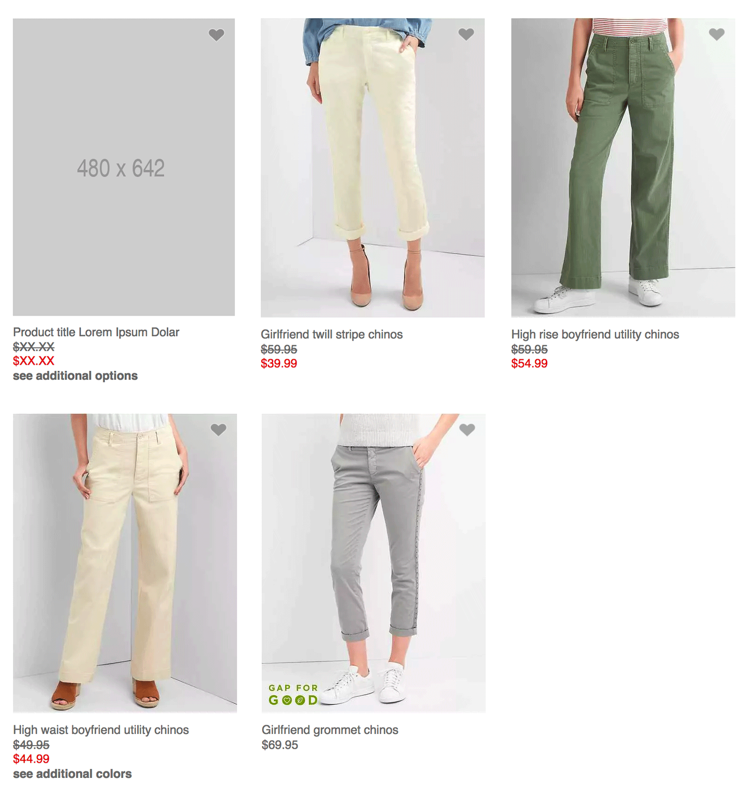
This is the whole idea of pattern-based design and development. You create a component, and then use that component by putting different content inside of it.

Components must be able to handle a variety of content that could be poured inside them, so it’s crucial to make a clean separation between a component’s structure and the actual content. If a publication has headlines that could be 24 characters long as well as 240 characters long, the components used to display those headlines need to be flexible enough to handle those different kinds of content. How do you do that? It’s important to bake that into your process so content edge cases don’t surprise you and your team at the 11th hour. Design with dynamic data so you can rest assured your components can handle empty states, short content, extremely long content, and everything in between.
Structure
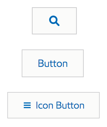
This type of pattern variation that involves adding or omitting an optional element of a component. You may have buttons that contain just text, an icon and some text, or just an icon.

For most of these components, the style and behavior remain the same and only the HTML is affected. However, for some components the style must be adjusted if an HTML element is present or is absent. So let’s talk about style variations.
Style
If you establish a CSS architecture that uses a BEM-like syntax, you might create component blocks that look something like .c-table. The block defines the default styling rules for the component. But those styles may not work for every scenario. So the team needs to define one or several style variations of the component to serve the needs of their applications. For our table example, we might make a .c-table--condensed and/or .c-table--striped variation.

The powerful thing about style variations is that these modifiers can often be combined, which provides teams with a lot of design flexibility but is still built on the same structural and stylistic foundation. For instance, authoring <button class"c-btn c-btn--secondary c-btn--large" /> results in a button that has secondary styling (which may involve a different background color) but is also larger than the default button styles. This type of controlled flexibility is what makes for powerful design systems.
Behavior
This type involves creating variations of a component that provides certain interactive behavior.

Think of buttons that can be toggled off and on, cards or alerts that can be dismissed, and data tables with selectable or draggable rows. These behavioral are often coupled with structural and stylistic variants (for instance, adding the X button to the alert component in order to achieve the desired behavior).
Documentation is oh-so-critical
Creating documentation is just as important as creating the components themselves. Providing a slew of components with variations is all well and good, but if teams don’t know how to utilize them properly, you’ll end up just giving them more ingredients to create bad user experiences.
The style guide is the storefront where your components and their variations are displayed alongside usage guidelines, examples, links to live apps, etc. That added context helps steer design system users in the right direction so they implement the components in the way the makers designed the system.
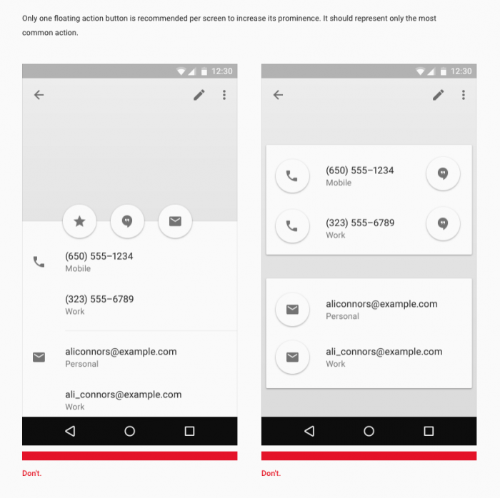
Material Design’s floating action button is a great example of usage documentation in action. Without proper documentation, it’s easy to see how this very unique circular button pattern could be abused by implementers who simply like circles and would want to stuff them everywhere. So the system designers lay out very clear documentation on how these components should (and shouldn’t) be used:

At the end of the day, take the time to craft a set of robust, flexible, and extensible components for your design system. Properly document these variations in the style guide and provide usage guidelines to help people reach for the right pattern in the right context.