Style Guide Best Practices
Style guides and pattern libraries are essential tools to help Web teams maintain sanity while creating experiences for our multi-device Web.
The benefits of style guides are many: they establish a common language, make testing easier, save time and effort, and create a useful reference to keep coming back to. And most importantly, it lays a future-friendly foundation for your organization to modify, extend, and evolve over time.
Make it happen
Obviously, in order to incorporate style guide best practices, you first need a style guide. Where to start? I’d recommend checking out all the great resources, tools, and examples on Styleguides.io to get buy-in from your organization.
A good first step towards establishing a style guide is to conduct an interface inventory to document your entire existing interface. It’s also essential to choose the right tools to help create your style guide.
Make it cross-disciplinary

One of the biggest pitfalls I see with style guides is that they are often created with only one discipline in mind. Developers create code standards and libraries to make their lives easier, while designers create interface pattern libraries to establish consistent design patterns.
Of course these are nobel endeavors, but a larger, more worthwhile goal is to create a tool that’s useful for designers, developers, project managers, business owners, and even third parties. A style guide can serve as a watering hole that helps everyone at an organization speak the same language and builds awareness/appreciation of the system.
Make it approachable
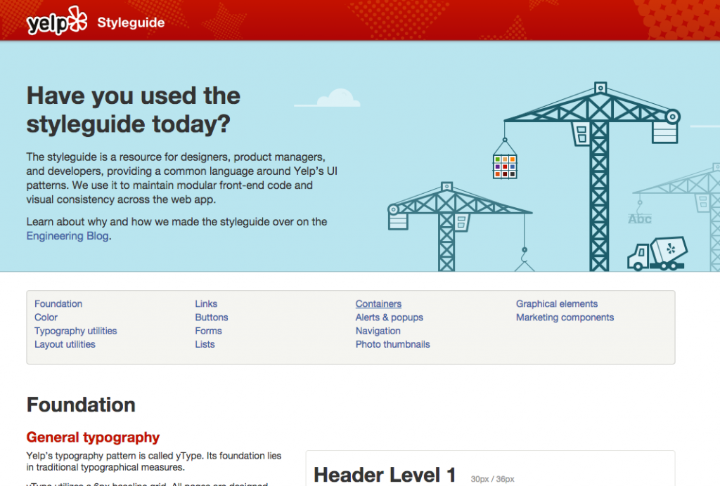
In order to be useful to everyone, the style guide should clearly convey what it is and why it matters. Some style guides (typically developer-specific ones) tend to be a bit muddy or jump straight into code samples. This can intimidate other disciplines and lead them to believe the resource isn’t for them.
Presentation matters, so take the time to design an approachable style guide.
Make it agnostic
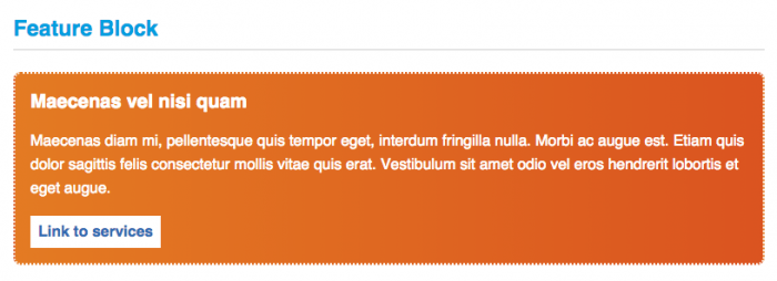
Pattern-based design and development requires you to blur your eyes a little bit. When creating a design system built for reuse, it’s essential to take a step back from the current context and name things in an agnostic way. “Carousel”, not “Homepage Carousel”. “Filters” not “Product Grid Filters”. “Radio Button Group” not “Gender Select”. And so on.
Naming patterns in an agnostic way reduces duplication and leads to smaller, more efficient, more portable systems.
Make it contextual
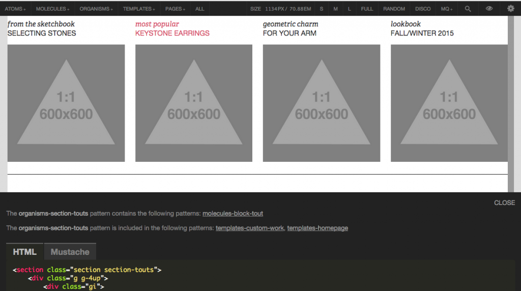
Pattern libraries can be great, but they can often be an abstract concept. Too many pattern libraries in the wild don’t provide context to how and where patterns get used. Where are “Horizontal Tabs” used? What patterns make up the checkout template? If I make changes to the “Accordion” pattern, what’s going to break?
One of my favorite features of Pattern Lab is its ability to show what patterns make up any given pattern, and also show where the patterns are employed. This helps teams understand how global a pattern is and where they need to test/QA if changes are made to a particular pattern. The ability to traverse between in-context and out-of-context is massively helpful for designers and developers.
Make it maintainable

Creating a style guide that is perfectly in sync with the production environment is the Holy Grail.
CSS and JS can be easily migrated from one place to another, but pattern markup is where things can get challenging.
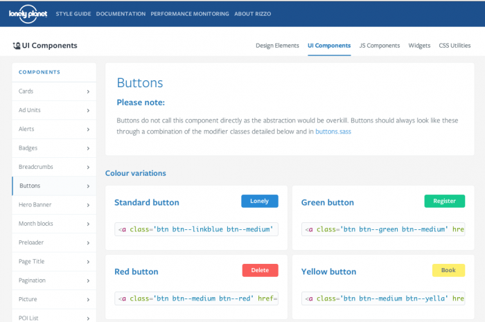
I highly recommend Ian Feather’s article on how Lonely Planet created a style guide that is integrated with their production environment. Make a change to a pattern in the style guide, and boom, it’s updated in the production environment. Super clever stuff.
Unfortunately it’s difficult to scale this kind of solution (the myriad of available backend environments makes things difficult), but I’m encouraged by the tools, techniques, and thinking around this issue. The next version of Pattern Lab will allow people to use the templating engine of your choice, which can help get markup much closer to your backend production code. Also, things like the Pattern Lab Component Builder by Evan Lovely automagically updates the style guide whenever Sass gets changed.
It’s important to strive toward an automatically in-sync style guide to prevent the resource from becoming out-of-date and obsolete. Note: if you have experience/ideas of using Pattern Lab to keep the style guide and production environment in sync, please let me know.
Make it part of your workflow
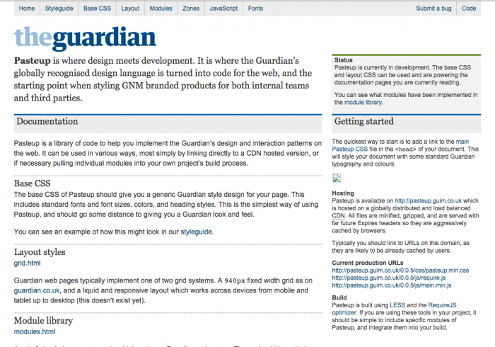
A style guide needs to become an integral part of your organization’s process and workflow if it’s to continue to be a useful resource.
As sad as I am to admit it, the majority of style guides I’ve delivered to clients have been abandoned. It’s challenging to bake style guides into an organization’s workflow when you’re on the outside. True changes to process needs to come from within. Like most things, the real challenges here are people and organizational issues rather than technical ones. Thankfully I’m seeing more teams step up to the plate and champion style guides as the cornerstone of their workflows.
Make it visible
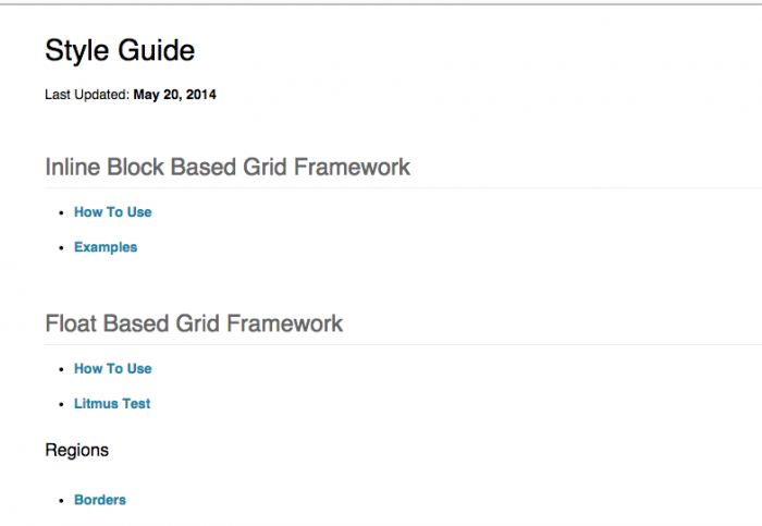
A style guide can only be useful if the organization knows it’s there. That’s why I strongly recommend making your style guide public.
Gasp! Horror! Wouldn’t that cause us to lose our competitive edge?
There’s much to be gained by being open and sharing more, and making your style guide public is no exception.
Large organizations almost always have issues with the right hand not knowing what the left is doing. Documentation and resources are often buried in internal wikis or behind logins or some other unnecessary/archaic crap. By making your style guide public you’re not just making it visible to the outside world, you’re making it a lot more visible to the people within organization itself. And after all, those are the folks that will be making use of it.
Also, sharing your style guide serves as recruitment tool that shows you’re up to speed on modern Web best practices, and gives a glimpse into your tech stack, style, and workflow.
Make it bigger
Pattern libraries for Web teams are proving their worth over and over again. So why not widen the scope a bit, and create a hub for the many other areas that could benefit from a style guide? Brand assets, design language, voice and tone, and writing can and should be consistent and available. Use the Web style guide to start a broader conversation.
Make it last
No organization wants to perpetuate the “burn the whole thing down every 3-5 years” style of redesign. A good system is built to stand the test of time, and establishing a solid style guide can help make that happen.
That’s not to say things can’t change. But establishing a design system now makes those changes easier down the line. After all, even with an entirely new design, you’ll still need buttons, inputs, image types, and so on. Style guides are beneficial from Day 1, but become much more valuable as time goes on.
As someone who helps organizations do better work, I’m absolutely thrilled to see more people embrace style guides as an effective way to create and maintain resilient design systems. If you have questions or are interested in a workshop about style guides and more, please do get in touch.
