Responsive Strategy
Right now around 11 or 12% of the top 100,000 sites are responsive, and no doubt that number is slated to rise over the next few years.
As the people in the depraved cat-skinning business say, “there’s more than one way to skin a cat.” The sick bastards. As more organizations roll up their sleeves to tackle the realities of our multi-device Web, it’s worth taking a look at the various strategies employed to reach that squishy nirvana:
Responsive Retrofitting

Responsive retrofitting is the process of taking an existing desktop-only website, and “making it responsive” after the fact.
For existing sites (particularly ones that are also businesses) teams don’t always have the luxury of tossing everything aside and building anew.
Dan Cederholm
For many organizations, large-scale, from-the-ground-up redesigns are simply out of the question. That’s why responsive retrofitting is a popular approach to create a better user experience for non-desktop devices.
Pros
- Relatively quick – There’s really a whole spectrum of responsive retrofitting, but taken at its most basic definition, this strategy can literally consist of injecting a
small-screens.cssfile into your website. While that’s a crude example, responsive retrofitting is attractive for many organizations because it doesn’t require rebuilding everything from the ground up. - Familiar – Users don’t get knocked down the escalator of acquired knowledge. People get used to an interface over the years. By retrofitting an existing interface, organizations retain that level of familiarity while still providing a better user experience for smaller screens.
- Organizationally quicker – Politically speaking, retrofitting a lot safer than starting from scratch. There’s less bickering about what color green to use, what banal stock photos to use, and management doesn’t really need their arms twisted as hard. This allows teams to launch responsive sites sooner.
Cons
- Only scratches the surface – Again, there’s a whole spectrum of responsive retrofitting out there, but the goal for a great many of these projects is “make it squishy”. By focusing primarily or solely on reflowing layout, retrofitted responsive experiences often miss out on the whole world of other considerations that go into making a successful multi-device Web experience.
- 10 gallons of water in a 3 gallon bucket – Because desktop-only sites were made for desktops (and have often existed for a long while), they have a tendency to contain a lot of crap. And because most retrofitting exercises focus on reflowing layout, a lot of these content-related issues aren’t fully addressed.
- Performance – There’s something weird about writing more code to better support smaller devices. Subtraction can go a long way, but retrofitting doesn’t inherently encourage performance as design.
- Worse support – mobile-first media queries provide better support for the many Web-enabled mobile devices that don’t support media queries.
- Band-Aid fix – I die a little whenever I hear people say “make it responsive” like it’s some checkbox on a project plan (which sometimes is actually the case). This type of myopic thinking misses the true opportunity responsive design provides.
Responsive Mobile Sites
Responsive mobile sites, or what I call planting the seed to a responsive future, is the practice of making a separate m-dot site that employs responsive design techniques. Organizations like The BBC, The Guardian, and (a site I worked on) Entertainment Weekly are all utilizing this strategy.
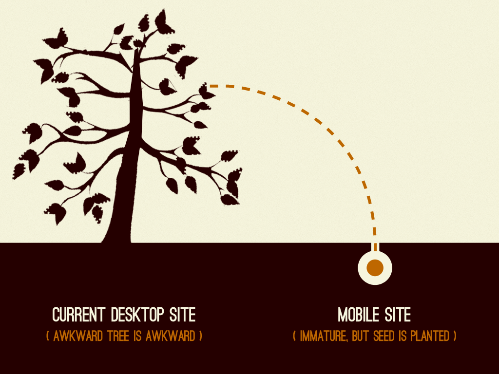
Mobile provides an opportunity to plant the seed to grow out of your legacy desktop site.
With time and effort, the legacy site can be removed and a mobile-first, adaptive, future friendly experience
Pros
- Lower risk – Most organizations still see a minority of Web traffic coming from mobile devices. So launching a responsive mobile site allows organizations to test the responsive waters without betting the farm on responsive design.
- Learning to be flexible – Designers can learn how to think more fluidly. Developers learn about the myriad quirks of old Android devices. Management can learn to let go of pixel-perfection. A responsive m-dot can serve as an important sandbox for learning.
- Infrastructure – Teams can learn to tackle tough content management issues, like art directing images and more.
- Trim the fat – This approach offers a better chance for teams to ask “do we really need that”, as well as focus on performance. Why? Because they’re focused on making a mobile experience first and foremost.
- A mobile-first future – While initially deficient in content or features, given enough time and effort these mobile sites can ultimately replace their former desktop counterparts.
Cons
- It’s still an m-dot site. – Responsive or not, this approach still inherits the many woes of m-dot sites: URL redirect issues, content management/governance issues, content parity issues, continuity, SEO, and more.
- Band-Aid fix – A lot of mobile sites are created to stop the bleeding. Many m-dot sites are created to address the growing amount of traffic coming from mobile devices. While these solutions can certainly solve present needs, this doesn’t necessarily translate into a long-term, future-friendly strategy.
- Die on the vine – Some organizations will start these projects, get halfway through the transformation, then throw it all away once next year’s budget gets approved.
- Small screens design – Because of the initial focus on small screens, it can be challenging to scale up an interface to look great on larger screens after the fact.
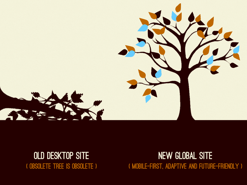
Mobile-first Responsive Design

Mobile-first responsive design creating an interface that addresses the constraints of mobile (small screen, low bandwidth, etc), then progressively enhances the experience to take advantage of available screen space, features, and more.
Pros
- A fresh start – A mobile-first responsive project is a clean start. Designers are excited to focus on core user and business goals. Developers are focused on lean, mean markup. By casting aside (or totally reworking) an existing codebase, teams can address our multi-device reality without having to worry about legacy overhead.
- Better support – By developing mobile-first, developers are able to support more mobile devices, especially older devices that don’t support media queries.
- Performance – While the performance of any site really depends on the implementation, a mobile-first responsive project gives teams the opportunity to address performance out of the gate.
- Concurrent Consideration – More broadly speaking, a mobile-first redesign (despite its name) tends to factor in the entire resolution spectrum rather than placing emphasis on any one device class.
- Future friendly – A mobile-first experience addresses creates more an opportunity to create a sound foundation that’s build to stand the test of time, and to serve as a platform for future growth and iteration.
Cons
- Time consuming – let’s face it, a mobile-first redesign isn’t a shortcut. It takes a lot of time and effort to build things from the ground up. The trick is to make the effort worth it.
- A mental shift – It’s challenging to get teams and organizations to think about things differently. The mobile-first mentality flips everything on its head, which challenges the conventions people have gotten used to over the years. This requires selling things through (thankfully there’s a book for that), and ongoing reminders to keep people from falling back into their old ways.
- Organizationally difficult – A big redesign is usually encumbered with all sorts of organizational red tape. The CEO wants to weigh in on the designs, despite not being in all the preliminary meetings on what all this responsive design hoobityboop is all about. Ambition and politics can get in the way of creating a user experience that looks and functions great on any device.
- Unfamiliar – Any redesign is going to be unfamiliar to users at first. But great care needs to be taken to maintain users’ level of familiarity with the interface, especially after going through a major overhaul.
Piecemeal
A piecemeal responsive strategy breaks a large-scale redesign down into bite sized chunks. Like retrofitting (although in this case these strategies aren’t mutually exclusive), it might not be possible to undergo a massive redesign. That’s why some organizations take it a step at a time. There are few different flavors of piecemeal responsive redesigns:
Page by Page
Page-by-page responsive redesigns take a subset of pages . Companies like Microsoft have rolled out responsive homepages, while leaving the majority of interior pages desktop-only.
Pros
- Highly visible – rolling out a responsive version of most viewed pages (like a homepage) puts the effort where most users are likely to see the refreshed redesign.
- Learning to be flexible – Organizations often use these projects as pilots for broader initiatives. By focusing on a few core pages, they’re able to learn all that goes into making a responsive interface and then use that knowledge to apply to the rest of the site.
- Better chance of launching – Focusing on one page or one feature is a great way to make sure things actually get done. Redesigning the whole kit and caboodle at once could be a monstrous undertaking, which means it might never see the light of day.
Cons
- Continuity – User goes from shiny, new responsive experience to crappy legacy content a few quick clicks. This is bad from a consistency standpoint, as users view a company as a single brand, not as a hodgepodge of different departments and priorities.
- Short-sighted – a lot of page-based redesigns are so focused on “launching by Q3”, there often isn’t a game plan for rolling out the project to the larger site.
- Die on the vine – You have to plant a flag in the sand first and foremost with a strategy like this, or else risk permanently living in Frankenstein land.
Component by Component
I’ve worked with several organizations that are undertaking a rather interesting approach to responsive design. Instead of tackling the homepage first then moving onto interior pages, some organizations are making key components (like the header and footer) responsive, then slowly moving onto other components. When the whole interface is made responsive, they switch on the viewport meta tag and be left with a responsive experience.
Pros
- Gradually introduce users to a new interface– Instead of knocking users over their heads with an All-New, 100% Amazing Responsive Experience(!), this piecemeal approach introduces the new interface over a period of time. The changes aren’t so extreme that users will be angry, but move the design in the right direction.
- Break things down – Teams learn to solve problems at the modular, atomic level rather than focusing on the page.
- Gauge level of effort – Breaking things down into modules gives a better idea of the scope of the project.
Cons
- 50 Shades of Incomplete – This approach can be awkward as users are exposed to a Frankensteined interface that is both old and new, fresh and stale.
- Die on the vine – these types of projects need to have clear end goals or they could end up in purgatory forever.
- Technical co-existence – What happens when one module using the latest technology and techniques butts heads with an old crusty legacy module? There are lots of technical architecture challenges with this approach.
“I’m Chevy Chase…and you’re not.”
Of course, every organization is different, so which path to choose depends on a number of factors. Time, budget, scope, organizational structure, skillset, and more all influence which responsive strategy to employ. But as time goes on, it’s becoming increasingly apparent that organizations need to address the ever-growing multitude of devices that access the Web.
46 Comments
Tim Severien
Personally, I prefer the mobile-first strategy. In reality we usually do opposite. Our customers are small to medium-sized with small budgets. We have to get a premium WordPress template to fit their needs in their budgets. These templates are often responsive but lacks originality and are too generic thus the design rarely strengthens the content and communication.
The customers who have larger budgets often see the value of a good site, so they empty their pockets to get a solid product, but in most cases it’s not enough for a full-blown responsive site.
I guess that’s part of being an agency though.
My side-projects are always responsive, but retrofitting is still in my system so I often simply forget to approach it the other way around.
Theo
You nailed it Mister! Great overview on responsive strategy, thank you very much.
Chris Gosling
I never even considered the piecemeal or component by component approaches. Early on responsive retrofitting seemed like a cheaper/quicker option to offer clients but I began to find that these projects ended up taking longer than starting fresh with a mobile first design. Most of the sites I have worked on haven’t been extremely content heavy though and I’m sure that could change the workflow quite a bit.
I recently started a project that is much more content heavy and long term than anything I’ve worked on before. I will be responsible for this project long term and not on a freelance / client basis. Here I would say that I may have been using the piecemeal method without realizing it as I spent my first bit of time updating components of the current site to better adapt to the mobile web and once I had made a few improvements here and there switched over to beginning a mobile first redesign.
Jon Williams
Thanks Brad! That’s a really helpful synopsis. Can I get that in a handy Keynote slide format for my next “let’s make it responsive” client meeting?
Iain Cameron
A very interesting article. However as a regular reader of The Guardian, I’ve stopped reading it on my phone. I want the whole newspaper, I want to decide what is important to me. Scrolling’s not that hard… It feels like a ‘light’ version of their site.
Greg Fischer
Great post. This pros/cons style is a nice neutral way to identify why different organizations might approach mobile with varying strategies.
We run a SaaS tool for homebuyers and real estate professionals and we have a pretty beefy marketing site too.
We prioritized the marketing site and retrofitted most of it, though used the project to make some new pages (and redesign old ones) with the intent that all future development would be mobile-first. This was possible because our front-end dev is super flexible and the entire project was done in-house with our team.
Next we tackled the homebuyer facing version of the software (since this is the bulk of our user base). Why not an app? Our experience is content and design heavy with most of the interactions happening upon the first login.
Finally, we are addressing the remaining instances left in the professionals version (dashboard, profiles, etc).
I think our project was successful because of the team’s motivation to learn new techniques and apply them, because of our design-centric approach (to everything) and mostly because we fundamentally believed this would deliver the best ux for our users.
Peter
@Tim your clients might not always symphatize with the value the solid product brings. Usually it’s way more expensive, not it might just not be completely necesarry. I can completely understand that. If I want to buy a car that ‘just drives’, but the car dealer is pushing me into buying fully loaded BMW and gets grumpy if I dont relate.. well, thats just negative energy 🙂
Michał Aleksander
mobile first… resolution of certain, brand new smartphones is higher than resolution of some tablets and old laptops
Jess Hutton
In my world, time and money are of the essence; user experience is valuable, but not a priority; and mobile-first is a confusing idea. I’ve had a lot of trouble helping people differentiate between mobile-first and responsive – it gets frustrating to hear, “But that’s what we’re doing” when I bring up mobile-first. We’re retrofitting. It will work ok, but with a site as old and bulky with code as ours is, it’s not a good fix.
Sam Roberts
Mobile first is the ideal, at least from a design standpoint, although sometimes commercial realities make things more complex. Building responsively has definitely changed the way I think about a design overall. I’m a lot more cautious now of adding things to the design unless they are really needed. If we don’t need a particular feature on mobiles, a lot of the time we can do without it at other resolutions either.
Mike Lynch
Nice summary of the current RWD landscape. I wouldn’t consider retrofitting to be quick though. In my experience, retrofitting an existing desktop site has been way more of a pain than just starting from scratch.
Brad Frost
Which is why I said there’s definitely a spectrum. Some teams only have a week to spare. Others sink a lot of time and effort to retrofit an existing interface.
Rick Sloboda
Sweet read, Brad! I just got off the phone with a business owner and I’m encouraging her to start from scratch as it’s an opportunity to clean up all of the site’s debris that have accumulated over the years.
Steven
Great article Brad, and great summary of responsive design strategies.
My favourite is definitely the Mobile-first Responsive Design.
Josh
Thanks for this excellent writeup! I will definitely be using this as a reference in future discussions around responsive design. 🙂
Max Chadwick
Interesting roundup including some strategies I’ve never considered.
I’ve had the luxury to always have “going responsive” be accompanied with a redesign / the ability to code “from scratch”. A lot of the code from the old build is reusable, and I couldn’t imagine all that much time would be saved retrofitting responsive vs starting from scratch. In cases budget issues I like the idea of doing it on a page by page basis so that the budget can be spread over a long period.
pinkbigmac
Good reading. When I’m starting from scratch usually I prefer a mobile first strategy using a simple responsive framework to reduce costs. After that all depends on the project if an additional mobile optimized version makes sense. My experience says that it often does.
Greetz,
Mathias
ArleyM
m.dot sites may also suffer the wrath of Google – they hate inaccurate, non 1:1 redirects. G recommends responsive for seo.
John Slegers
IMO the most optimal strategy for most websites is entirely ignored here : desktop-first responsive design.
Desktop-first responsive design is when you create an interface is built first and foremost to look best on a desktop, but based on a responsive architecture that allows your design to easily be adjusted to the constraints of mobile (small screen, low bandwidth, etc).
Desktop-first is a mixture of graceful degradation and progressive enhancement, as it degrades a sometimes expensive desktop layout to mobile restraints while also enhancing that same layout with mobile specific features.
Jordan Lewis
If people are interested, I wrote a comprehensive case-study on how Envato are progressively converting the Envato Marketplaces (i.e. http://www.themeforest.net) to be responsive by using a ‘Piecemeal component-by-component’ approach.
Leonardo Correa
“Most organizations still see a minority of Web traffic coming from mobile devices”
In Australia, 51% of smart phone owners access internet everyday. Shame some companies start a project from scratch and still don’t consider mobile devices at all.
http://blog.marginmedia.com.au/Our-Blog/bid/93665/Australian-Mobile-Marketing-Statistics
Frank
Personally I think there is place for mixings.
My own experiences is that today in design conception many clients favour a desktop mock-up first and then tablet / smartphone versions to keep “responsiveness” in mind.
But I will not define the conception as the way you describe “Responsive Retrofitting”.
Yes it is “desktop first” but integrating other terminals considerations from the outset in the way we take charge of navigation, consulting, interactions etc. (and of course anticipate on what “touching” could offer).
Sara
Thank you John Slegers. I was surprised no one pointed this out before. We use a desktop-first responsive approach and it works very well. Part of it has to do with knowing well the things that make a website look and work great on tablets and mobile, so from that knowledge we can build a great desktop design, and easily mold it in the development process to function great on mobile. I guess really I would prefer not to say it is a desktop-first responsive approach, because really I consider it a desktop & mobile first responsive approach. Both happen in harmony together.
Nate Wright
Your list of Cons for the mobile-first method only mentions organizational/social problems, suggesting that there is no technical drawback given the right time/energy. However, even if 30% of traffic on a site is mobile, that’s still 70% of traffic coming from desktops.
Optimizing for mobile and progressively enhancing for desktops typically involves reducing the desktop experience in some way — reducing the number of elements on the screen, simplifying navigation components, getting rid of CPU-intensive scripts, etc.
We could argue over whether or not this is actually a bad thing for the desktop experience in general (I’d be inclined to say no, on average). But nevertheless it still means that decision-making necessarily preferences the minority mobile experience over the majority desktop experience (for now at least).
I, too, opt for a mobile-first strategy whenever possible. But I think it’s worth considering/mentioning that there is at least some drawback to the approach aside from problems with reluctant bosses and lack of time.
uidesignguide
An excellent approach to this. Not all solutions fit the particular requirement. The best approach is to provide a variety of solutions and then pick which works best for each particular case!
manu morante
With mobile-first I had a hard time at first. But after I feel very comfortable.
Karl Keefer
Great summary. Thanks!
I found a mistake in your copy — “addresses creates”
Walter J
It took me almost 2 years to revamp our official State Tourism (www.sabahtourism.com) website into a fully responsive using Drupal .. One part is learning the responsive technique and the other part is the Drupal learning curve .. My approach was “Desktop first” and goes down to mobile ..
Giannis
Excellent article! Nicely put. Looks like everything goes the responsive way nowadays.
Mark
A comprehensive run own of the options. As designer I’ve followed the debates over responsive approaches and it seems a large consensus are now behind the mobile first approach. I can see the logic from a coding view but I’m still not convinced from a design point of view. Starting with the small narrow window in my view will constrain creativity to a degree, while some may argue that this focuses you on the most important aspects I’m not convinced. I think a good designer can design on a larger canvas, being creative, the skill is then keeping the essence of that design when reduced to smaller screens. If you start on the smaller canvas your going to be adding design aspects on, I think many sites can end up looking very bland on desktops because the design was optimized for mobile and then just scaled up.
Dawid
Great Article! I checked to see that it was responsive before I started reading it though, otherwise what would be the point… 😛
Mike
Great post. I’ve had the luxury of doing mostly re-designs from the ground up typically starting at the desktop then working down to smaller screen sizes. It’s helpful to put the various strategies in compartments for consideration the next time I need to make an existing website responsive.
adeeb
Making a site from scratch to be responsive, is usually not feasible(for most companies, as they have very little budgets allocated for web resources). Going step by step is usually the way to go, optimizing for the popular resolutions.
AlienSKP
Commenting on this page will make me a web dev superstar and an expert in responsive strategy.
Ryan Wu
I created a decision making process for these strategy according to personal experience.
http://tumblr.ryanwu.me/post/78345250748/responsive-strategy-decision-making-process
Barrett Lombardo
Well organized and digestible post!
The problem we have always had at Orbit is calculating the ROI for our clients relative to their investment, understanding of approaches, and internal capabilities to administer or technically maintain the website. And thus, it is even more complicated for our web strategists to educate in context of options.
So for a long while, we focused on immediate need – an optimized mobile site at a specific breakpoint.
Right now, we are working towards mobile-first, fully responsive as the default for all projects with a viable budget. Anything else is an exception.
We also do have options for more recently launched sites to be retrofitted to a mobile breakpoint. http://www.orbitmedia.com/blog/responsive-retrofit/
Vendhost
A fresh start, like spring cleaning, is time consuming but well worth it.
Doing a proper content inventory (although painful) will break it all down and give you better insight of the bigger picture. Then piecing the puzzle back together can often provide a fresh approach to new content too.
David
This is certainly a good list, that I’ll refer to during strategy meetings. That said, I’m still unconvinced on the ‘piecemeal’ approach of an m.dot approach. For instance, looking at what Guardian has done, you see the mobile/responsive parts and you think, “great, simple stuff”, then you go to old school fixed-parts and your UX flow is completely broken. And when it comes to new sites, or big overhauls, it’s really difficult to go past mobile-first.
Bret
Thanks for the writeup, Brad. If I may, I’d like to add an additional “pro” for the Mobile First strategy: Less real-estate forces designers to “unclude” things that they would traditionally add to designs with more available space (read desktop). This tends to result in sites with far less clutter and typically a cleaner design.
Jason Day
Coming off of the initial stages of a huge retrofit project, I cringed when I read “this strategy can literally consist of injecting a small-screens.css file into your website”, but I calmed down quickly enough. In our case (fortune 500, ecomm, 20 years online, legacy code) the logistics of a retrofit was incredibly complex.
However, for most medium to small sites, I believe responsive retrofitting is probably the best approach. This approach allows for further defining the experience over time, improving the methods & approaches (refining retrofit techniques into permanence) and further a/b testing. Additionally, this approach allows for the ability to progress into a mobile first approach. You can further refine your end state, while defining the best case mobile state. You can then build a bridge between these two states, using one to inform the other. In this way, you are continually refining and capturing business needs and determining the best holistic approach for your site across devices/uses.
Adam Dillon
I prefer Mobile-First for side jobs, but at my current main job, due to its size we are rolling out component by component. That is a very challenging method. It’s to the point where we are going to start over with a Mobile-First approach.
The cons for component by component mentioned above are very relevant. It almost seems like a never ending process. The mobile first approach should be very refreshing.
Tom
Excellent article! Love it. Thanks for sharing!
fwolf
Turns out, Responsive Grid System is one of the fastest and best options if you’re challenging the Retrofitting Monster. This and HeadJS. The latter one gives you: Happy HTML5 polyfills, Modernizr on speed, and nice async or on-demand loading of assets (ie. JS + CSS).
Of corpse, your site already has to use some kind of grid, else it’s gonna get ugly. And then, the regular “let’s redesign this shit all over again” approach is, in most cases, cheaper to achieve than the retrofitting one. Esp. if the underlying code you’ve got work with is a horrible potpourri of 4 people not knowing what to do. And yes, that’s a real life example I just recently had to work over.
cu, w0lf.
David Barnes
Brad,
Great article on RWD and I especially like your pros and cons for a mobile first approach to responsive design. Your right, mobile first is time consuming and it also takes a mental shift in how we think about the web or the future of a website. Most of the sites I work on are not mobile first but I want to start thinking differently and communicating to my clients differently. I like your idea about addressing performance right away. This reduces down time when designing and developing a website. I would like use your site as a go to resource for friends and clients. Thanks for all the work you do for the web design community.
Javier España
There’s one more approach that we are currently using on our new MTV websites. Since we do iterations of each website every year we have a lot of code that gets re-used. So what we do is a hybrid between Mobile First and Responsive Retrofitting.
Basically we start with Responsive Retrofitting and once things are in a good place we move our mobile media queries to the main CSS and the main CSS rules to the media queries for desktop.
That way we start with all the code we already have in place and don’t want to re-QA and end up with a Mobile First approach.
Thanks for the good read!
Javier
Nat @ Webdesignderby
Great article! Love the pros and cons list in particular, great for future reference, thanks!
Comments are closed for this post. If you've got something to add, feel free to reach out on Twitter.