
7 Habits of Highly Effective Media Queries
Brad Frost 7 Habits of Highly Effective Media QueriesAs we all know, media queries are responsive design's secret sauce. Here are some considerations for crafting high-quality media queries:
- Let content determine breakpoints
- Treat layout as an enhancement
- Use major and minor breakpoints
- Use relative units
- Go beyond width
- Use media queries for conditional loading
- Don’t go overboard
Let content determine breakpoints
Every time you see 320px, 480px, 768px, 1024px used as breakpoint values, a kitten gets its head bitten off by an angel...or something like that.
Don't use popular device dimensions (320px = iPhone portrait, 480px = iPhone landscape, 768px iPad portrait, etc) to determine breakpoints. The device landscape is always changing, so today's values might be moot even just a year down the road. The Web is inherently fluid, so it's our job to create interfaces that look and function beautifully on any screen instead of in just a few arbitrary buckets.
The reason I created ish. was to encourage designers to consider the entire resolution spectrum, not just today's popular device dimensions. Try out disco mode to stress test your designs.
So where should you insert breakpoints? Follow Stephen Hay's advice:
Start with the small screen first, then expand until it looks like shit. Time for a breakpoint! -Stephen Hay
It's as easy as that.
Worth Reading
- Determining Breakpoints in Responsive Design
- Fanfare for the common breakpoint
- There Is No Breakpoint
- Choosing device sizes to support for your responsive designs
- The In-Between
Treat layout as an enhancement
The absence of support for media queries is in fact the first media query. -Bryan Rieger
As part of a mobile-first responsive design strategy, it's important to author our styles in a mobile-first manner.
So instead of this:
/* Desktop-first styles: Avoid */
.column {
    float: left;
    width: 50%;
}

@media all and (max-width: 50em) {
    .column {
        float: none;
        width: auto;
    }
}
We want to only introduce layout-specific rules when we need them:
/* Mobile-first styles FTW */
@media all and (min-width: 50em) {
    .column {
        float: left;
        width: 50%;
    }
}
Authoring mobile-first styles results in smaller, simpler, more maintainable code. This approach also provides better support for the tons of older mobile browsers that don't support media queries.
Worth Reading
- Creating a Mobile-First Responsive Web Design
- Essential considerations for crafting quality media queries
Use major and minor breakpoints
It's important to understand that not every aspect of your design needs to neatly fit into small, medium or large breakpoints. Sure there are moments in a site's design where dramatic things happen, like when one column becomes two columns becomes three columns. The points at which those big changes happen are major breakpoints.
I use Sass to keep track of my breakpoints, so depending on the design my major breakpoint variables look a little something like this:
$bp-small : 24em;
$bp-med : 46.8em;
$bp-large : 50em;
$bp-xl : 73em;
But there are instances between those values where one specific element might need modified. This style adjustment to a specific element can be called a minor breakpoint (or tweakpoint as Jeremy Keith puts it).
Back to my Sass, I crudely insert my minor breakpoints between my major breakpoints like so:
$bp-small : 24em;
$bp-small-2 : 29.75em;
$bp-small-3 : 39.8em;
$bp-med : 46.8em;
$bp-med-2 : 48em;
$bp-large : 50em;
$bp-large-2 : 54.5em;
$bp-xl : 60em;
$bp-xl-2 : 67em;
Ugly? You bet. Does it work for me? You bet.
How you approach major and minor breakpoints is up to you, but it's important to utilize both kinds of breakpoints.
Worth Reading
Use relative units
I love to lean back in my chair when at my computer, so I find myself hitting Cmd + on a lot of websites to zoom in the text. When we use pixels to declare our breakpoints, page zooming enacts a horizontal scrollbar and things don't work so great.
/* Avoid pixel-based media queries */
@media all and (min-width: 800px) {...}
Instead of using pixels, we should be using relative units for our media queries.
/* use ems for media queries */
@media all and (min-width: 50em) {...}
Firstly, we're already ditching pixels in favor of ems, rems and percentages in every other aspect of our styles, so why not carry that through to our media query values? Secondly, authoring media queries in relative units allows browsers to adjust the design based on the user zoom level, resulting in a more pleasant, more accessible reading experience.
See, it's like Grandpa-vision!
Worth Reading
Go beyond width
Viewport width isn't the only thing media queries can detect. There are a ton of media features we can detect, including color, color index, aspect ratio, device aspect ratio, width, device width, height, device height, orientation, monochrome, resolution, scan, pixel-density and more.
While I don't even know what a bunch of those are, there are quite a few really helpful features that can helps us out:
- Using
pixel-densityto conditionally serve larger background images and icon sprites for Retina and other hi-res screens. - Using
heightto detect the available screen height, and adjust styles accordingly. For example, on this site I'm listening for height and scaling my gigantic title type accordingly. - Using
orientationto detect whether a screen is in portrait or landscape mode. Orientation might be used to conditionally disable fixed positioning to free up screen real estate.
I'm certain there are a ton of amazing use cases for all these media features, so take a look through them and consider how you might exploit them in your designs.
Worth Reading
- MDN: CSS media queries - Vertical Media Queries and Wide Sites
- Using CSS Sprites to optimize your website for Retina Displays
Use media queries for conditional loading
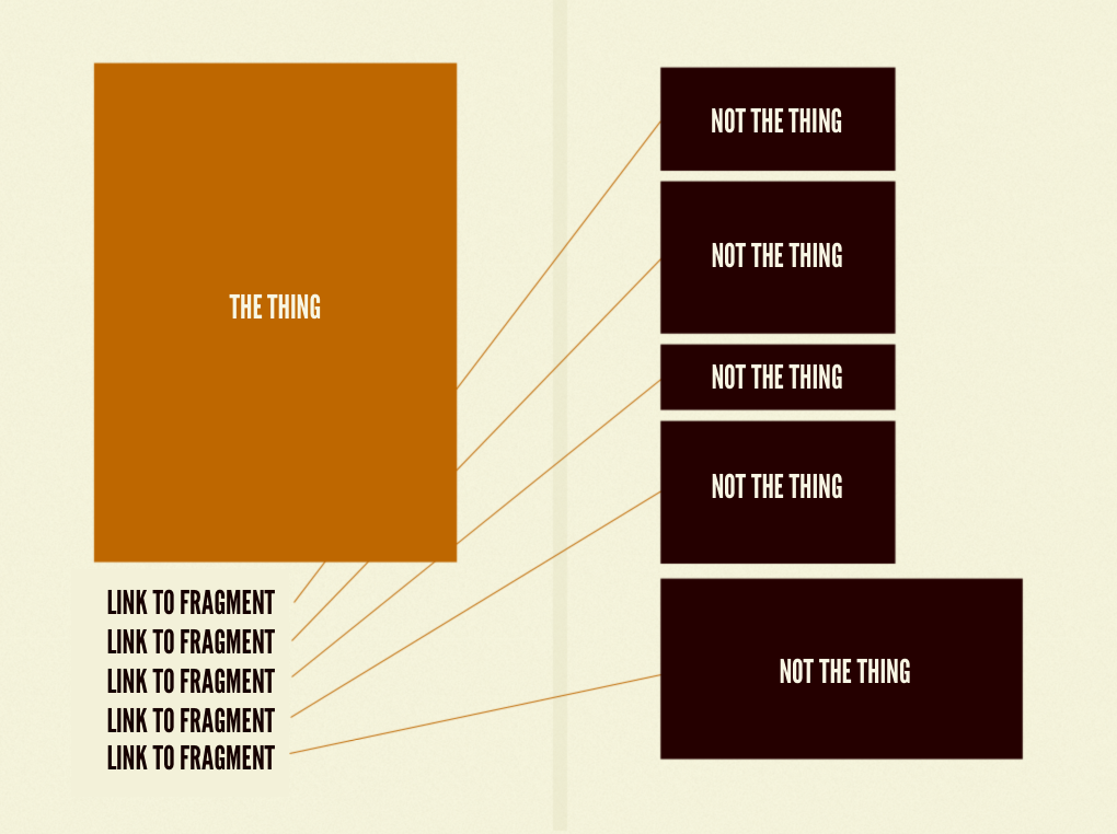
Web pages consist of The Thing and a bunch of other stuff that aren't The Thing. If your friend shares a link on your wall that said "check out these pictures of cute kittens!" and you eagerly click the link, what do you expect to find? In this case, the pictures of cute kittens is The Thing.
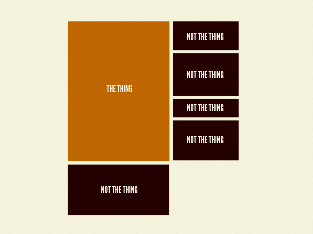
But there might be a bunch of other stuff on the page that aren't The Thing. Maybe there's a feature to comment on the pictures of cute kittens. Maybe some social widgets to share the pictures of cute kittens. How about related pictures of cute kittens. You get the idea. While these features add value to the page, they aren't The Thing. What we want to do is prioritize the primary conten while still providing access to this supplemental content and functionality.
What we can do is chunk out those things that aren't The Thing into their own HTML chunks (often times things like comment and share widgets are 3rd party chunks), then only pull in that secondary content when the conditions are right.
We can use matchMedia to make this happen. matchMedia allows Javascript to capitalize on all the media query goodness. It looks like this:
if (window.matchMedia("(min-width: 40em)").matches) {
  /* load secondary stuff */
}
We can then load the secondary content when the right conditions are present.
matchMedia is well supported and a polyfill is available as well.
Conditional Loading is one of the most powerful tools we have in our toolkits. It allows us to prioritize core content and performance while still providing a robust, fully-featured experience to environments that can handle it.
Worth Reading
- An Ajax-Include Pattern for Modular Content
- Conditional Loading for Responsive Designs
- Conditional loading of resources with mediaqueries
- Clean Conditional Loading
Don't Go Overboard
With responsive design, it's easy to get caught up in all the media query magic and go a little crazy. While media queries are certainly fun, introducing a lot of complexity into your designs is going to come back to bite you. We already have to deal with an insane amount of complexity: the device landscape, a dizzying amount of inputs, browser and device support, keeping clients and teammates happy, and so much more. I really like Lyza's advice to do as little as possible. The more complex we make our interfaces the more we have to think in order to properly maintain them. It's definitely in our best interest to strive for simplicity when faced with such a complex Web landscape.
Well, that's that. Now get out there and start querying your medias.
This post is a summary of a talk I gave at the online Mobile UX Summit last week.