
Enforcing Accessibility Best Practices with Component PropTypes
Brad Frost Enforcing Accessibility Best Practices with Component PropTypesI'm diving into React a lot more, and I'm specifically focused on making rock-solid, dumb presentational components that can be ingested by other applications. Part of making these components rock-solid is providing some definition and guardrails for the props associated with each component. Enter PropTypes:
PropTypesexports a range of validators that can be used to make sure the data you receive is valid...When an invalid value is provided for a prop, a warning will be shown in the JavaScript console.
In other words, provide the right data or you'll get yelled at by your computer.
I set out to add PropTypes to all the components in my Dumb React project (which, as the name implies, is a relatively dumb React application that merely constructs a static homepage and has no interactivity or functionality).
Let's take the hero component as an example. Here's what it looks like:

It's a reasonably basic component with a few dynamic properties: heroimgsrc, heroimgalt, title, and description. I now want to add some PropTypes to clarify what kind of data should be associated with each of these props:
Hero.propTypes = {
  heroimgsrc: PropTypes.string.isRequired,
  heroimgalt: PropTypes.string.isRequired,
  title: PropTypes.string.isRequired,
  description: PropTypes.string
}
For this component, all of the props happen to be the type string. But the big thing here is the isRequired bit. What that does is tells whoever is consuming this component certain props are required in order to function properly.
PropTypes and isRequired gives us an opportunity to enforce accessibility best practices. If I want to use my Hero component and don't define a heroimgalt prop, my terminal and the browser's console will yell at me like so:
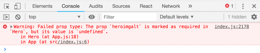
This is good. It's basically saying "Hey, in order to use this component properly you need to provide alt text for the hero image. Chop Chop." You can now repeat this process across other components to avoid many accessibility issues. In the embedded video above, I show how to require a label for an inline-form component (think search box or newsletter signup form) to use more semantic markup and better serve screen readers.
PropTypes provide a ton of utility in addition to enforcing accessibility best practices. But this was one of the first things that really jumped out at me. In the context of a design system, baking these guardrails in at the system level better ensures any application consuming these dumb UI components are following accessibility best practices.