HTML Wireframes
For the first few years of my career, I didn’t know that wireframes existed. It wasn’t until I started working at a larger agency that I first encountered a strange new black-and-white InDesign world, where multiple rounds of 100+ page PDFs were generated and presented to clients.
While a lot of great thinking goes into these highly-detailed wireframes, the actual artifact creates a lot of issues.
Problems with High-Fidelity Static Wireframes
“When someone hands you a flyer, it’s like they’re saying ‘here, you throw this away’.”
–Mitch Hedberg
- They’re abstractions – High-fidelity wireframes are huge unrealistic abstractions. They’re fixed width, they can’t demonstrate interactivity, and they kill trees. Generating mountains of full-blown PSD comps doesn’t make much sense anymore, and I’d say spending a lot of time generating a bunch of fixed-width, non-interactive wireframes doesn’t make much sense either.
- They’re full of assumptions – High-fidelity wireframes make all sorts of assumptions about layout, aesthetic design, source order, and more. In my experience, the people generating these wireframes don’t come from a front-end or visual design background, so these documents end up limiting the design and technical possibilities.
- They’re verbose – This doesn’t have to be the case, but I’ve worked on many projects where high-fidelity wireframes were unnecessarily detailed and explained things that should really be demonstrated. The annotations looked like book chapters. “Call me Ishmael. When the user hovers over the dropdown, it exposes…”
- They’re a crutch – Writing book chapter-length annotations is a incredibly poor substitute for actually communicating and collaborating with clients and colleagues. No one discipline has all the answers. It’s increasingly important to encourage real conversation and collaboration rather than having a verbose document do your talking for you.
Lo-fi All the Way
“Ideas want to be ugly.”
–Jason Santa Maria
While high-fidelity wireframes have all sorts of downsides, they’re ultimately trying answer the questions “What should go on this screen and in what general order?”
These are obviously important questions to ask, and thankfully we don’t need to get too high-fidelity in order to arrive at some answers. Sketching is an incredibly powerful way of getting ideas out quickly, and gives you, your clients, and colleagues an opportunity to have conversations around your content without wading too far into the weeds.
Jason Santa Maria has been talking about a gray box method of wireframing for a long while now, and the idea is to simply block out the content in gray boxes to define the content and its general hierarchy. For our open redesign of the Greater Pittsburgh Community Food Bank, we’ve been using the gray box method to great effect:
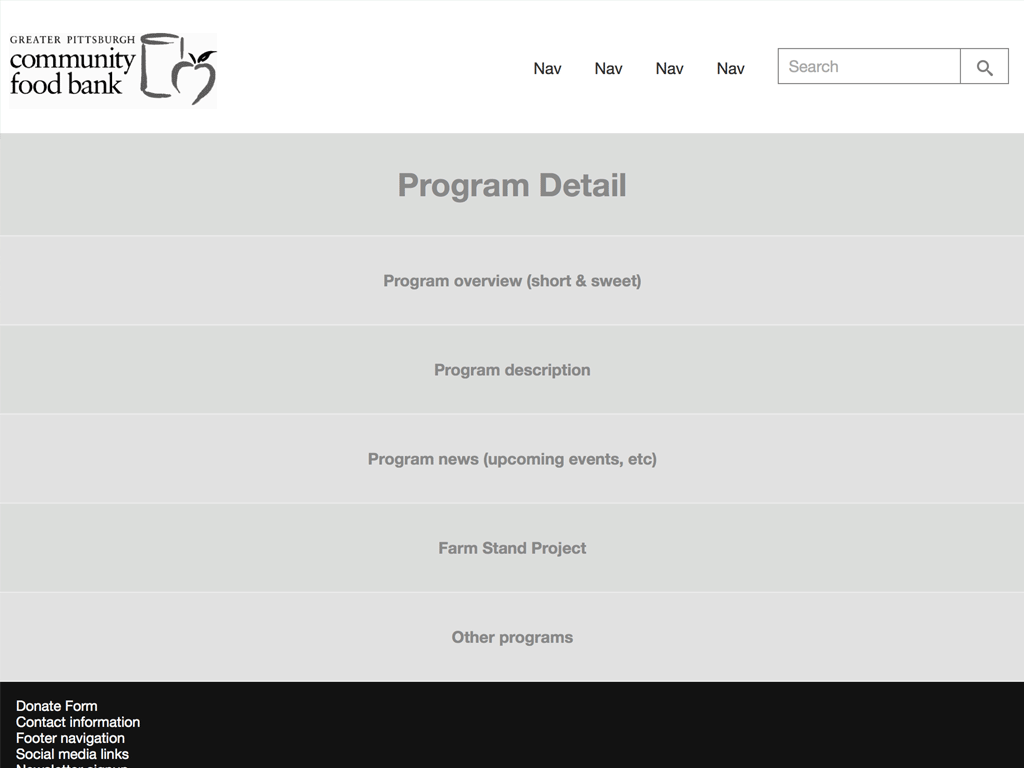
This gives us an opportunity to ask the client “Hey, is everything present and accounted for? Are things generally in the right order based on importance?” And while the content will naturally evolve over time, we didn’t need to sink a whole lot of time into these wireframes to establish a good direction.
HTML Wireframes
It’s a good idea to create wireframes in the browser, and I’m happy that smart folks like Matt Griffin agree. Here are some of the many benefits of wireframing in HTML:
- They get into the browser quicker – Right out of the gate, wireframing in HTML lets you, your teammates, and clients interact with your interface in its final environment. You can fire up HTML wireframes on devices, which gives you a more realistic sense of how the design feels.
- They reinforce the notion that you’re creating a website – When PDFs, JPEGs and other static artifacts get thrown around, there’s a tendency to forget the medium for which you’re designing. Clients end up printing out these artifacts and writing in the margins like it’s a brochure. HTML wireframes reinforce the fact that you’re creating something that will be live on the Web.
- They’re interactive – Clients and colleagues can step through a flow using hyperlinks, which is a hell of a lot more realistic than “please turn to page 65” in a PDF. And once you’re a bit further down the road, you can more easily demonstrate interactions like active states, dropdowns, motion, etc.
- They allow for living, breathing annotations–Annotations in static wireframes often get lost in the sands of time over the course of the project. That’s a shame because usually there’s some good thinking there. Using tools like Pattern Lab’s annotations feature or Elliance’s Metaframe allow annotations to make into the browser as well. Done right, these annotations can remain intact in a living style guide/pattern library.
- They lay the foundation for the final product – At the beginning of my projects I set up Pattern Lab so that I can start establishing my interface system and get a head start on my final code. While doing my wireframes, I have a bunch of stuff that looks like
<div class="fpo">Pagination</div>, but in wiring up these placeholders, I’m simultaneously laying the foundation for my design system which will ultimately become the final code. - They allow you to iterate – Swapping things around in code is often much more efficient than having to adjust a bunch of layouts in a static design tool. Wireframing in code gives you the chance to take your initial sketches and iterate on them until they become the final product.
From Wireframe to Final Product
In a traditional waterfall process there’s a clean line between the wireframing phase and the visual and code phases. Developing wireframes in the browser blurs that line, which is nothing but a good thing. Instead of shuffling around wireframes_02112014_v2_FINAL_forreview_final_FINAL_jonedits.pdf, you’re able to spend more time in the browser building up the fidelity of the final product.
For our food bank project, here’s what that looks like:
The initial wireframes utilized the gray box technique in a single column layout. As mentioned above, this helps us get at what content needs to be on the page and in what general order. I also typically get a head start on the header and footer so that the thing somewhat resembles a website.
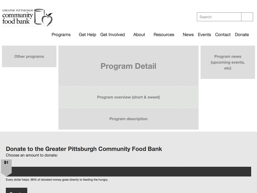
Next up is introducing a general layout into the gray block wireframes. This helps articulate what happens on larger screens when there’s enough room for sidebars, section navigation, etc.
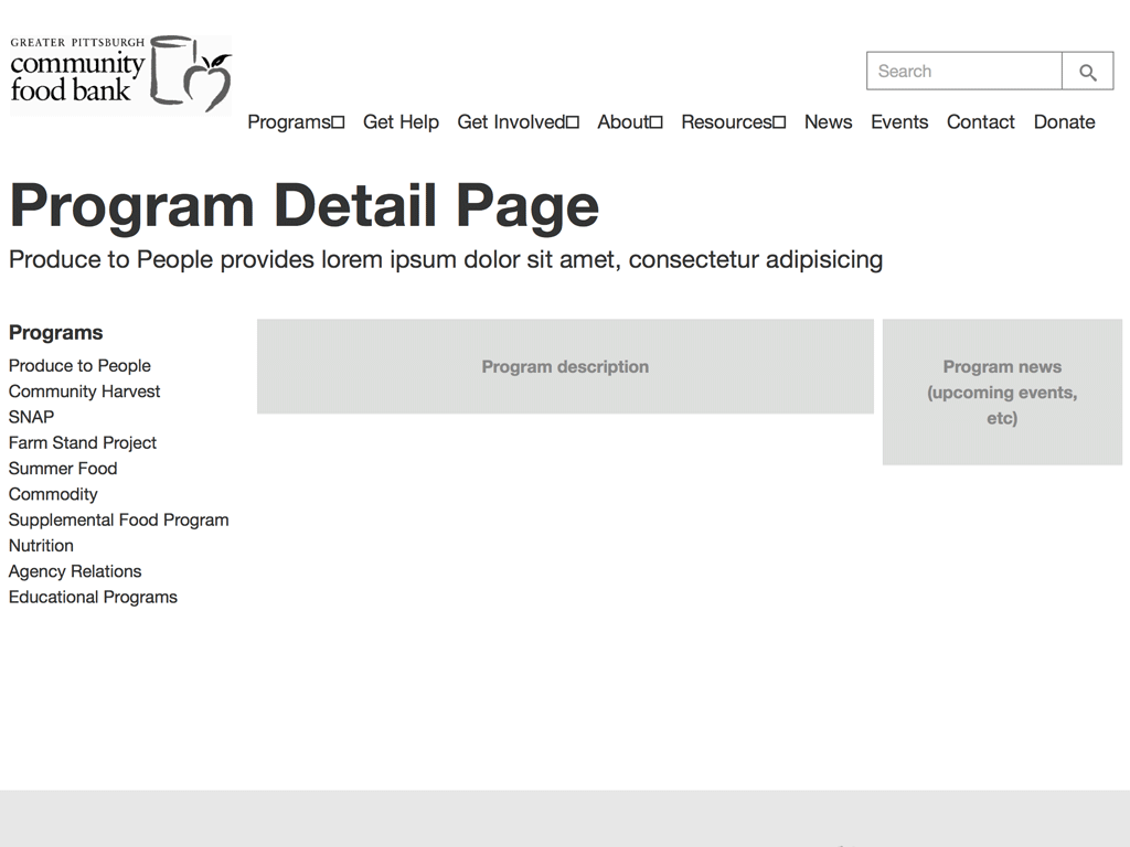
Once we feel good about the content on the page, I start replacing the gray boxes with molecules and organisms that will eventually become part the final interface. In the above example, I’m replacing the “Other programs” block with a pattern called “section navigation”. That include looks like this:
{{> molecules-section-nav }}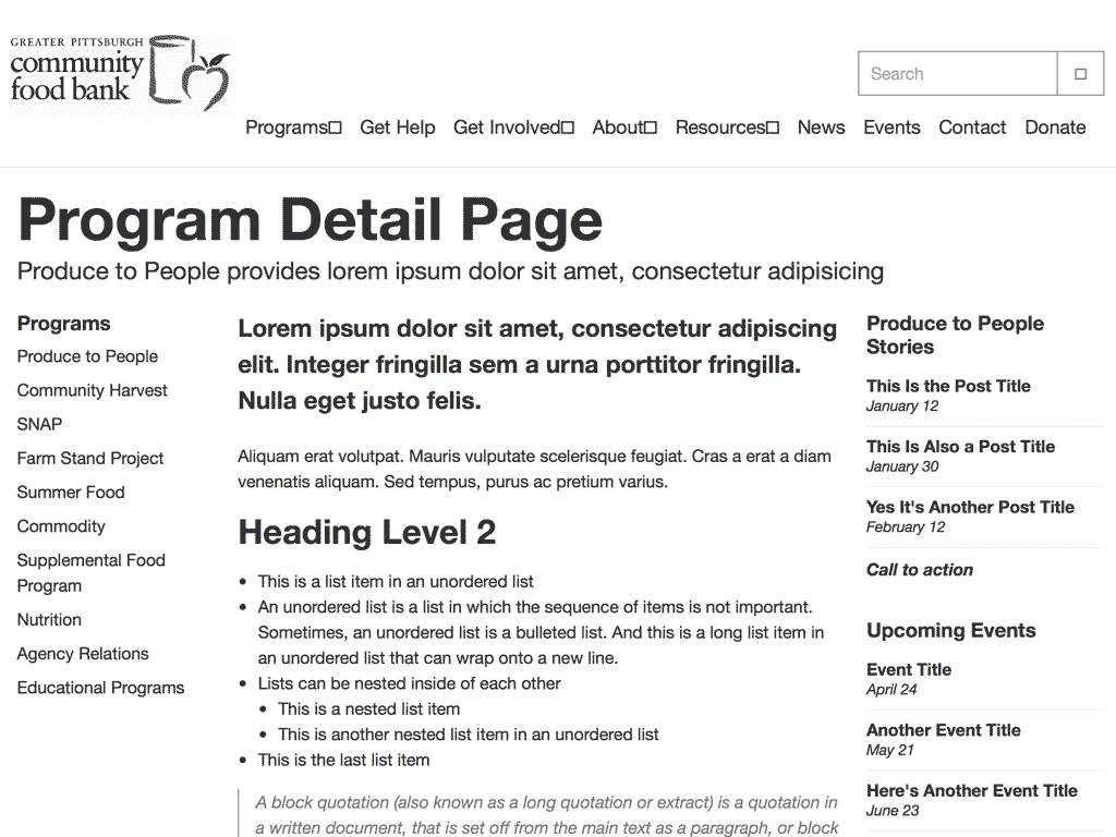
Eventually all the gray boxes are replaced with pattern includes. At this stage things are still extremely foundational so things still look like garbage. But we’ll get to that later.
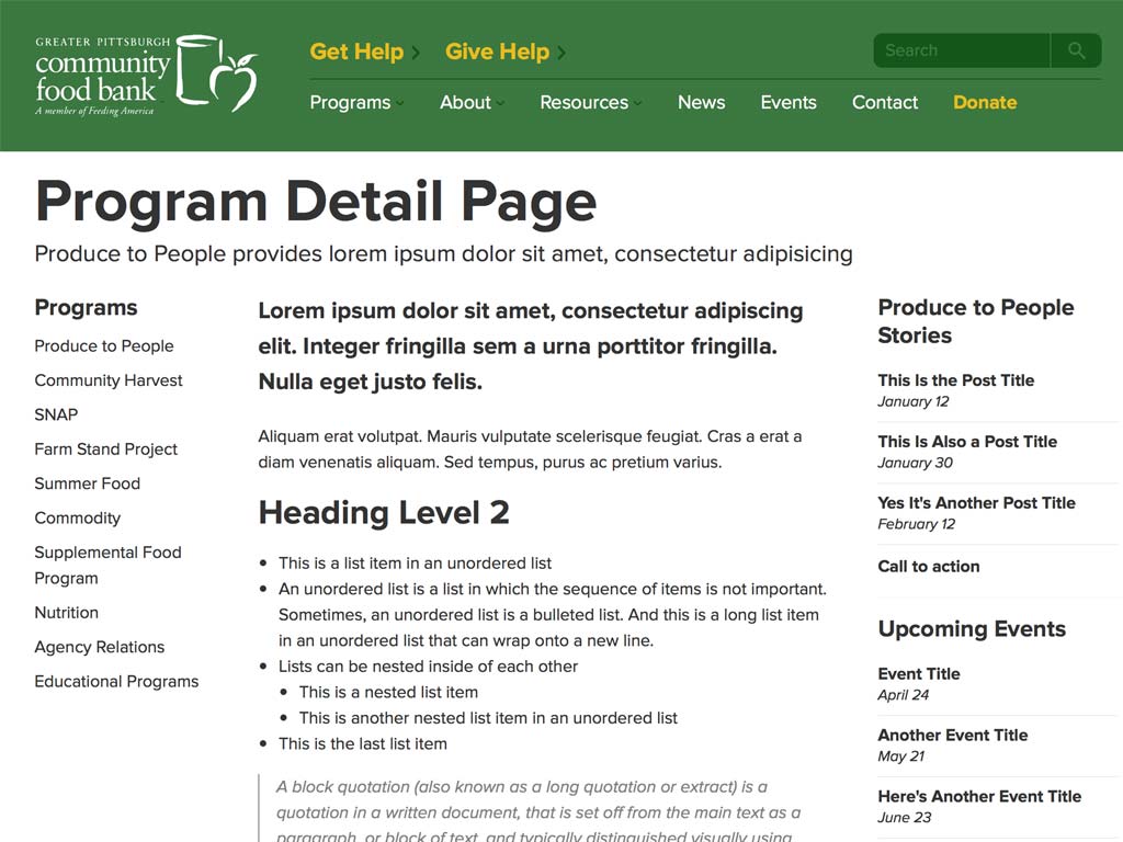
At this stage most of the design patterns are wired up and the structure is sound. This gives us the opportunity to go in and start styling some of the more global organisms like the global header and footer. The style of these elements will no doubt be tweaked throughout the process, but the initial styles give us a stylistic foundation.
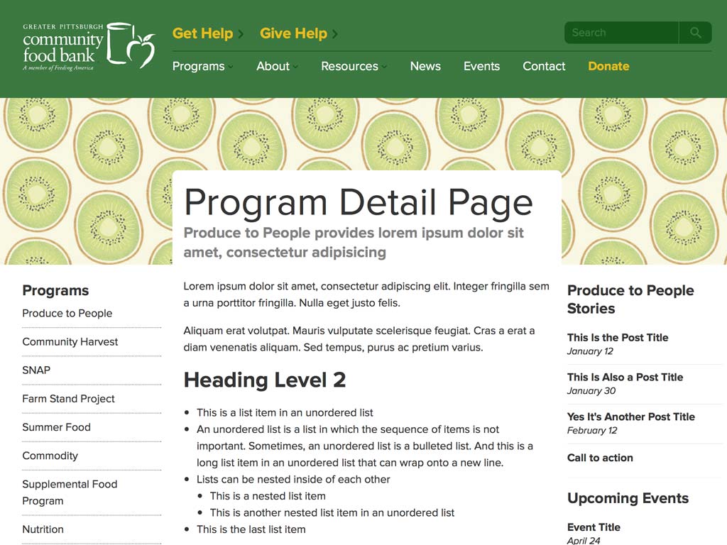
Once the global elements are styled, we start tackling the inner guts of the interface. We’ll obviously spend a lot of time doing this, and for the food bank project we’ve only just begun. But along with the rest of our timeline, it’s fun to see progress being made.
I’ve been working this way for the last year and a half, and it’s great to see other folks like Matt Griffin and the smart folks at Bearded follow a similar process. As I mentioned in my post about our TechCrunch redesign, I think of this process as being similar to subtractive sculpture.

You start out with a big slab of rock, and slowly chip away to get the rough shape of the form you’re creating. You take another pass at it to get a better sense of the object you’re trying to extract from the stone. You take another pass to start getting a bit more detailed. Eventually, you start honing in on a particular aspect of the form: a face, the arms, or the torso. Slowly but surely you detail each section of the sculpture until you’ve arrived at the final form.
Designing for a multitude of screen sizes, environments, and variables is hard work, so getting into the browser as quickly as possible gives us an opportunity to design and develop more realistic solutions.