Planting the Seed for a Responsive Future

Stephanie Rieger has a beautiful post called Responsive Is a Characteristic, which is a fantastic reminder that responsiveness should be an important component of any project, even if it’s not a full-blown, certified-organic responsive experience.
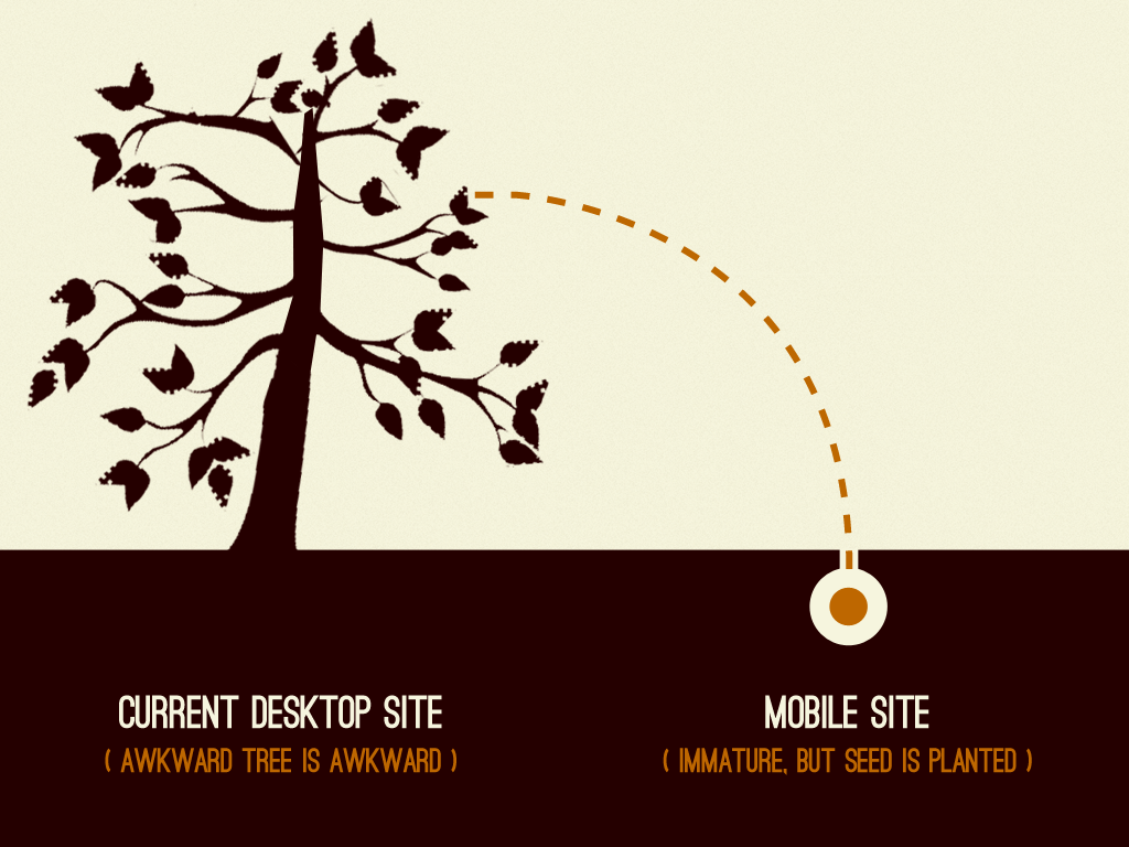
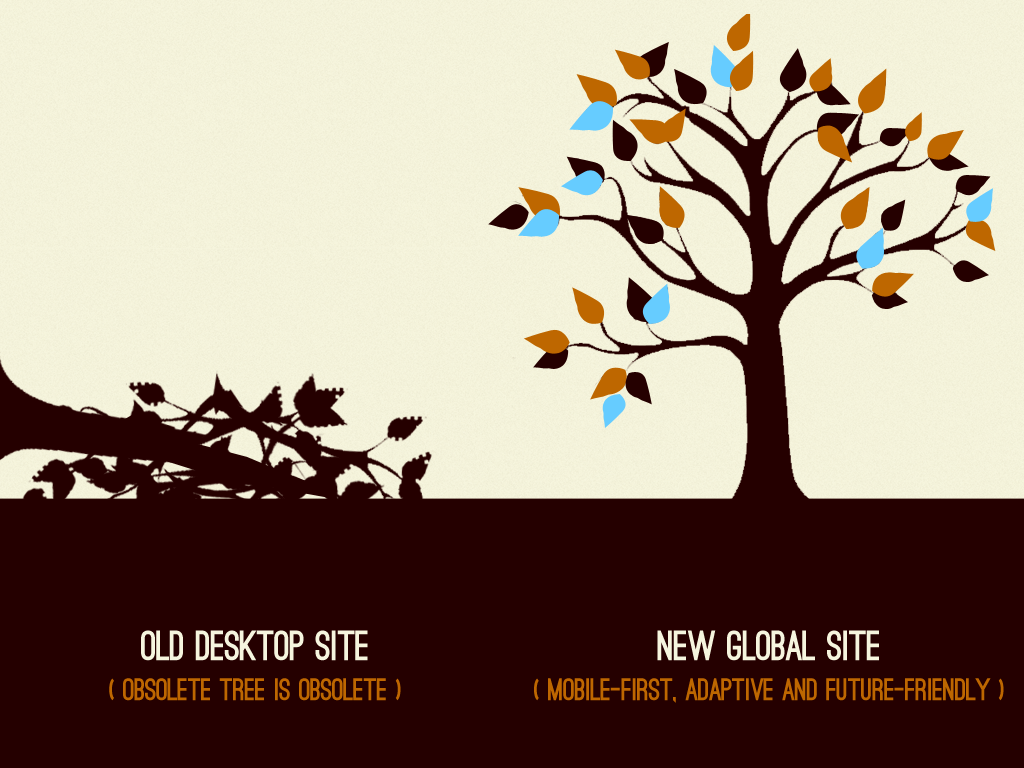
This is what I tend to call “planting the seed” for more adaptive experiences. Here’s the gist:

Current website situation

Mobile provides an opportunity to plant the seed to grow out of your legacy site/mentality

Eventual Future-friendly adaptive web experience

With time and effort, the legacy site can be removed and a mobile-first, adaptive, future friendly experience remains

The basic idea is that a creating a separate mobile experience can actually be a blessing in disguise. It gives you time to re-evaluate, prioritize, strip down and focus on what’s really important. And like Stephanie says, this process eventually changes the way you think about your content, infrastructure, user experience and approach. Slowly but surely investing in your mobile experience can provide an opportunity to eventually shed the dead weight of your existing experience and into a new mobile-first adaptive experience.

Kristopher Layon (@klayon) wrote a wonderful book called Mobilizing Web Sites: Strategies for Mobile Web Implementation that talks about what you can do to plant the seeds for more mobile-friendly experiences. What I love about the book is how he reminds us over and over again that we don’t have to wait for the “perfect opportunity” (they don’t exist) to optimize your project for mobile. There are plenty of things we can do now to chip away at it, all while planting the seeds to become permanently adaptive.

You don’t have to wait to start implementing more responsive solutions. It doesn’t have to be in the project brief or come as a demand from your boss. Just do what you can to create things as flexibility as possible and be as considerate of the plethora of today and tomorrow’s web-enabled devices.

Here’s the presentation where the ‘planting the seeds’ images came from:

7 Comments

  1. Are you suggesting that by creating a separate “mobile site” (different pages, new application, etc.) is a blessing? If so, I don’t see how that plays a role in killing off the old desktop site. Maybe it forces others who deliver content to start learning what it means to deliver mobile content, but that isn’t a step towards responsiveness. It’s a step towards maintaining two separate sites.

    • Great point. And with WTF Mobile Web We highlight a lot of the nightmares that result from creating multiple sites. But this is reality. Everyone is addressing mobile and for *many* people doing an entire, full-boar redesign of the desktop site is out of the question. So we’re forced/opt-in to creating dedicated mobile experiences to address the tremendous growth of mobile. And yes, like you said this isn’t ideal, but then again what is? Here’s also a good read about why creating separate designs for mobile and for larger screens can make sense.

      All we can do is do what we can to make sure whatever the project, whether “desktop-only”, “mobile-only”, responsive or other, is considerate to user context and does all that it can to address the growing number of web-enabled devices. Because it really is all about evolving our mentality.

  2. Great points, Brad. It is indeed difficult to maintaining a separate version of a mobile-web application and it would pay off to design/develop something that easily works for both, without sacrifice of quality.

    I wouldn’t go as far as saying that mobile websites should be designed first in all cases. I think that should depend on your application and how users are likely to interact with your application over the next couple of years.

    Looking forward to more of your writing!

  3. @brad
    I could not have said it any better. I think your comment from above really says what our responsibilities are without the BS.

    “All we can do is do what we can to make sure whatever the project, whether “desktop-only”, “mobile-only”, responsive or other, is considerate to user context and does all that it can to address the growing number of web-enabled devices.”

    Its hard to tell a client that a separate mobile site, web app, app, or fixed-width site is frowned upon, but what we can say is what contexts it might not be good for -or vice versa for the goals- and then go from there. Being absolute is being close minded and if we are to think differently we can’t think in absolute terms. Clean markup that is semantic is probably the most absolute thing necessary in my opinion to be future friendly along with progressive enhancement as the base.

    -Portable Semantic Markup is Gold-

  4. mars-o

    i see. so currently,we’re opt to do 2 separate websites (for mobile, and for desktop), but eventually, we should redesign our sites flexible enough – so that 1 website would be ok to be viewed either in desktop/mobile (whatever screensize the user prefers). so the trend is going minimalist then?

  5. My thoughts fall along these lines as well. As you say, sometimes a full-blown redesign is out of the question, but the mobile site vs. responsive site argument doesn’t need to be mutually exclusive. A mobile site can be a good introduction to responsive methods and can open the door to a wider discussion on the topic.

  6. Managing priorities.

    It should ring a bell on the URI layer abstraction. When the system has been designed with enough flexibility to separate the contents and the URIs, it becomes a lot easier to evolve your system step by step. It is not mandatory to destroy the old site altogether and create a brand new site.

    When we store the old magazines on the archive shelves, we don’t change the design of the archives when the design of the current released magazine is changing. I’ll stop here the metaphor, because the Web just helps to manage this kind of things. Basically, the mistake will be repeated if you think about the new site as something which must be to the “à la mode” of now. Because we do not know yet in the future what will be the new ways of delivering a good content to users.

    The first step IMO is to base your URI architecture on the fact that content at a precise URI will become legacy AND that this legacy might be interesting to keep for branding, history, etc.

    The question then becomes “How do we manage legacy?” (Photo shoebox if you prefer). To be more practical, for a big company, let’s take the organization page. Directors, departments will change. Often people have a URI for this page.

    http://bigco.example.com/org

    But they do not manage the change. You could have the same URI, and grab the content from another location.

    http://bigco.example.com/org/2009/10

    and then in March 2012, when it changes, you grab the content from

    http://bigco.example.com/org/2012/03

    etc. All the versions are here. You do not even have necessary to manage a design change, there are part of the legacy. Archived. It can even have values to keep the old design.

    Then when you start thinking like this, the management/creation of a future friendly responsive web site becomes a *lot* easier.

    URIs are not content, they are labels to identify past and future things.

Comments are closed for this post. If you've got something to add, feel free to reach out on Twitter.