Ella’s First Website
ULTRA PROUD DAD MOMENT: Ella made her first website!
Melissa and I woke up on Saturday morning to our goofy 6-year-old daughter entering our bedroom making this obnoxious sound. It was impressively annoying, especially considering she hasn’t seen Dumb and Dumber yet. She truly is her father’s daughter.
After we were done laughing, we recorded her and cracked ourselves up listening to the playback. We joked that it would make for a really effective alarm clock.
“We should make one!” I said.
Her face lit up.
“Yeah, we can make a little website that loops the sound. It’ll be funny.”
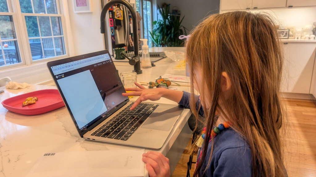
I brought my laptop to breakfast and I fired up my trusty, faithful, incredible friend Codepen. I insisted that Ella drive.

I decided to start her with one of the most magical, visceral aspects of front-end development: changing the body‘s background-color.
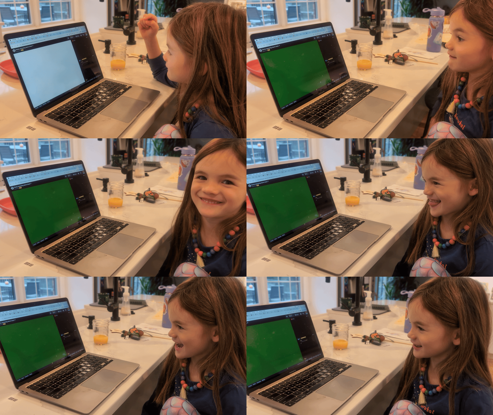
Just look at that reaction as soon as the web page’s canvas changed colors:

Surprise. Wonder. Happiness. Pride. Satisfaction. You can see the gears turning.
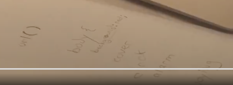
We continued on our journey. Like most kids her age, she is learning to spell and isn’t used to typing on a keyboard. On the back of an envelope, I wrote some of the words and syntax down for her to transcribe:

She diligently followed instructions, and though it required patience (she definitely started losing focus over time!) we kept at it. I said we needed picture of her that would be part of the alarm clock website. We took the photo and turned our attention to the next magic trick: replacing the background with her goofy face. She truly is her father’s daughter.
I had to intervene a bit here to open up Codepen’s super helpful assets feature to get the image online. But! I taught her how to use the trackpad, as well as copy and paste keyboard commands. It took a second and some fiddling around with the background-size value, but we got her goofy mug onto the website:
From there, we turned our attention to the HTML panel to add the audio tag. That was a little tougher, especially since her patience was wearing thin. But I was able to explain that writing loop would make the sound repeat forever, which she thought was funny. I also explained that autoplay would make it start playing immediately, but I learned autoplay (rightly) blocked by default to prevent, say, an annoying sound to loop for infinity.
After a little bit more finessing and me getting the audio asset in there, she had her finished website!
So here it is: Ella’s funny annoying alarm clock website!
She had a great initial reaction, and I think hearing her annoying sound come from a totally different machine didn’t really compute to her. And while her patience was understandably spent, she enjoyed the results.
There is a lot I could say here. That this is a beautiful reminder of the absolute magic that is web design and development. That a beginner’s mind can change your perspective. That the declarative and human-readable languages of CSS and HTML help make coding less intimidating. That we could continue to improve the website and add new features. That accessible tools that help people learn web development are incredible.
I could go on about all of these things, but I won’t. Instead I will say that I am so incredibly proud of Ella. I am lucky to be the dad of such a smart, creative, hilarious, curious, and yes obnoxious girl. I hope this is but one of many many many many many many creations that leave her head and make their way out into the world. I love you so much, Ella.
And yes, I woke her up for school today with her alarm clock.