Design Systems are for user interfaces
We often talk about design systems as singular entities. “The design system saves time and increases quality.” “Oh, the design system provides that.” “Update to the latest version of the design system.” The reality is that a design system is a multi-faceted layer cake, and also operates as part of other layered systems within an organization.
Design systems are systems of systems, but not all systems are part of the design system. Confused? You’re certainly not alone. This post tries to articulate how my own definition of a design system has recently changed to address some hard-earned lessons.
Design systems are systems of systems
Nathan Curtis said it well: design systems are systems of systems. A design system often contains many subsystems that make an interface tick:
- UI components and variants in design and code
- Design tokens
- Typography system
- Color system
- Layout/Grid system
- Icon system
These subsystems all come together to help build high-quality user interfaces out of a well-considered set of reusable components.
But not all systems are part of the design system
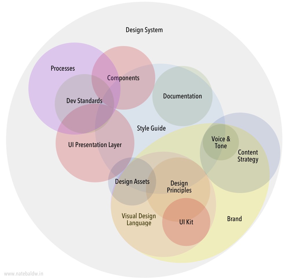
Especially once a design system has established a solid center of gravity, it can be tempting to shove every standard into the design system. Brand standards? Throw ’em in the design system. Content standards? Put ’em in the design system. Voice and tone? Represent ’em in the design system. Illustration standards for the marketing website? Chuck ’em in the design system. This widely-shared diagram from 2016 reflects this philosophy:

In 2016 I’d be nodding along with the rest of the audience when a speaker would show a slide like this. Hell, I have illustrations similar to it. But through my subsequent design system consulting and co-creation work, we’ve found this “everything lives under the design system umbrella” muddies the waters and makes the system unwieldy. It puts an undue burden on the design system to account for every aspect of creating a digital product and leads to a lot confusion across an organization.
“But these things are important!” Of course they are! They should be considered, captured, systematized, and documented. But not necessarily under the design system umbrella.
Design systems are for user interfaces
In our client work we’re finding it increasingly necessary to set explicit boundaries about what the design system does and doesn’t do. And where we’ve landed is that design systems handle everything related to common interface patterns that can be used across the organization.
What that user interface boundary does is sets up a relationship with other important facets of digital product design:
- Design systems care about content as it pertains to user interfaces.
- Design systems care about accessibility as it pertains to user interfaces.
- Design systems care about personalization as it pertains to user interfaces.
- Design systems care about voice and tone as they pertain to user interfaces.
- Design systems care about brand as it pertains to user interfaces.
- Design systems care about performance as it pertains to user interfaces.
- Design systems care about code standards as they pertain to user interfaces.
- Design systems care about internationalization as it pertains to user interfaces.
- Design systems care care about personas as they pertain to user interfaces.
- Design systems care about _________ as it pertains to user interfaces.
The design system embodies important standards from across an organization, but doesn’t necessarily define or own those standards. There can be a close relationship between systems, and some of those systems operate as siblings (like content and UI), while other systems operate more as a parent-child relationship (like brand and UI).
To provide some examples:
- The design system cares about photography guidelines coming from the brand department insofar as those guidelines impact how photography flows through heros, cards, and other UI components that house photography.
- The design system cares about content and voice & tone guidelines insofar as they influence character lengths and influence the shape of UI components.
- The design system cares about organization-wide technical standards insofar as those standards impact the design system’s front-end code.
- The design system cares about user personas insofar as they influence the properties and necessary variants of the design system’s components.
Again, it’s not to say that photography guidelines, content guidelines, voice & tone guidelines, technical standards, and user personas aren’t important. They very much are! But increasingly we’re finding that those standards ought to be defined and managed outside of the design system, and that close relationships should be established.
Product-specific UI solutions
Even within the world of UI, the design system shouldn’t solve every single problem a product team may face. Establishing a layer-cake approach provides a critical pressure release valve for the design system while giving individual product families or products the ability to solve their own problems.
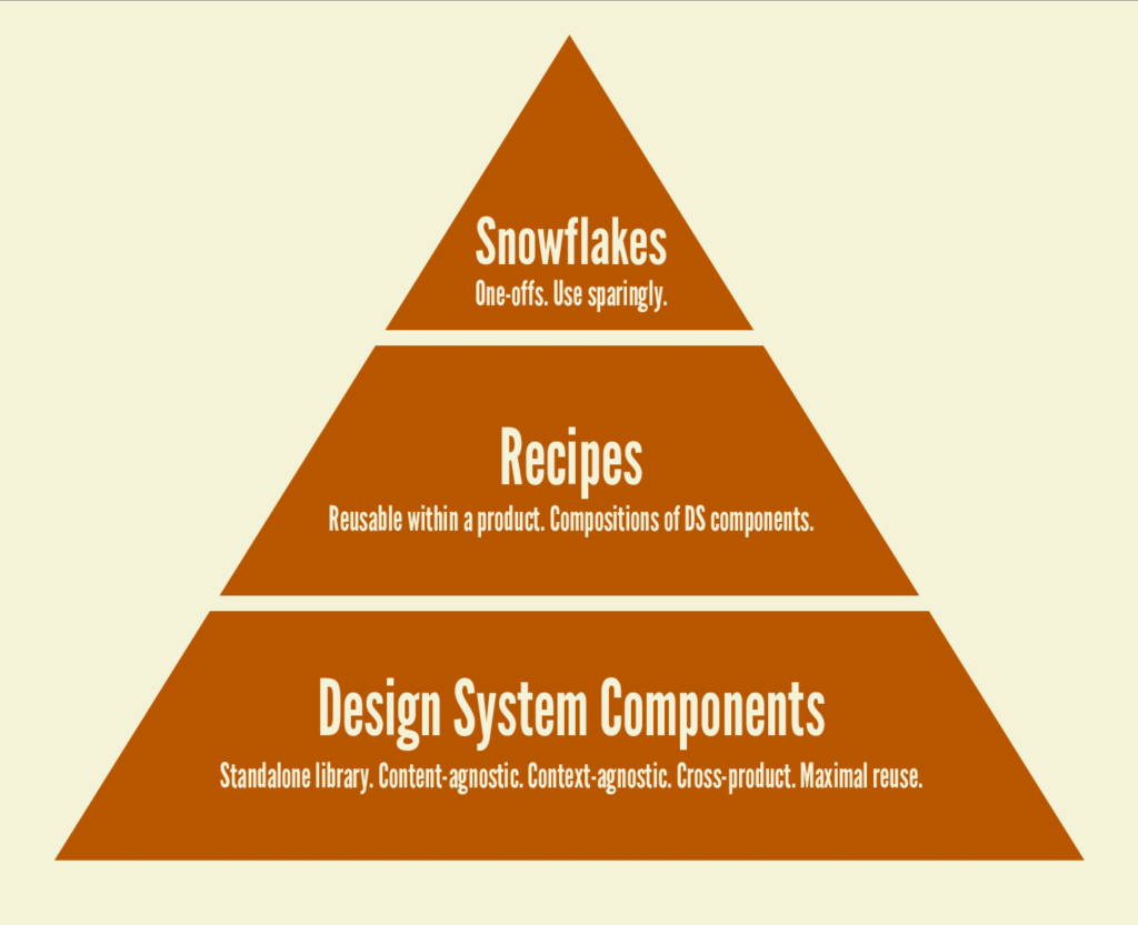
We’ve found it helpful to establish conventions around design system components, product-specific recipes, and one-off snowflakes and we work with teams to determine the right home for any given component or pattern.

With this approach, UI solutions can be placed at the appropriate level to promote consistency and maximize reuse without polluting the core design system with product-specific solutions.
Ikea is built on shared common components like screws, dowel rods, etc. Ikea furniture designers are intimately familiar with the shared components available to them, and those components influence and inform the furniture design process. In turn, those specific furniture designs inform and influence the nature and number of shared components. However, there are other product-specific components that don’t make sense to live at the shared component level (such as a maple dresser front or iron headboard for a bed). That is perfectly fine.
With this layer-cake approach, the design system (and design system team) can provide an architecture for building user interfaces at a product level, but doesn’t necessarily provide literally every solution for every single component or interface problem a product team may encounter. This prevents the design system from being a bottleneck while still ensuring product teams are working with the grain of the system.
An evolving language
My prior definition of design systems was this:
A design system is the official story of how an organization designs and builds digital products.
But my updated definition is as follows:
A design system is the official story of how an organization designs and builds digital interfaces.
Changing “products” to “interfaces” is a small-but-important change. As mentioned above, there are many different facets to creating digital products, and a design system by itself shouldn’t define and own every standard for creating successful digital products.
By creating a boundary around shared UI patterns, we’ve found clarity in our design system work. Like most things in this ever-changing field, we’re constantly refining and honing our mental models and language in order to do better work.