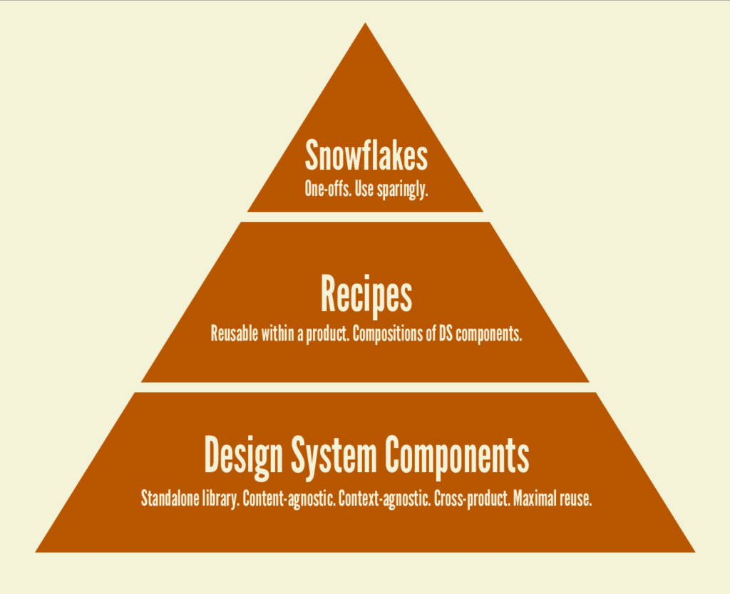
Design system components, recipes, and snowflakes
“When should we make something a component?” is a question I’ve been fielding for years. My strong answer: right from the start. Creating things with a component-based mindset right out the gate saves countless hours and wailing and gnashing of teeth. Everything is a component.
But there’s some nuance to this. Where each component lives matters. In my client design system work, we’ve arrived at some vocabulary that helps determine where any component should live.

- Design system component –
Accordion!Button!Card!Select!Table! Design system components are shared, content-agnostic, and context-agnostic built for maximal reuse. These are the components you see in all the publicly-available design systems in the wild. - Recipes – Recipe components are specific compositions of design system components (for the most part) that are to be consistently used across a product, but aren’t agnostic enough to live in the design system. Some examples:
ProductCard,ContactCard,NameField(e.g. a collection of first name, middle initial, last name, suffix),AddressField, and so on. These are valuable, reusable components but may only apply to one product. Recipes are often organisms in atomic design speak. - Snowflakes – “special snowflakes” are one-off components that are needed to build a product, but don’t really get reused outside of their first use case. When we worked with an airline, there was a
Seatcomponent that only really made sense for the “Select your seat” functionality on the website.
A place for building components, recipes, snowflakes, and more
Working in front-end workshop environments like Storybook or Pattern Lab, we’re able to use atomic design to simultaneously build a design system component libraries as well as entire pilot project screens (and all the recipes and snowflakes that comprise them). We build the entire UI in one place, and we have designated slots for each type of component.
In my view, this is really cool: we separate out where things live to provide some clarity for what belongs to the honest-to-goodness, publishable design system component library, and what belongs to the product. The architecture looks something like this:
.storybook
|--pages
|--recipes
|--snowflakes
src
|--components
Storybook adds a .storybook directory to a project, so we shove all of our recipes, pages, and snowflakes in there. It’s like saying “Hey, I want to showcase this stuff in Storybook, but this isn’t part of the official DS library.” Even sample data, images, and other assets live in the .storybook directory. But everything in src belongs to the publishable design system library.
You can follow the same structure in Figma, Sketch, and the like too.
Rather than “developer handoff” being “here’s a picture of a website; go build it”, our handoff entails delivering the fully constructed, production-ready front-of-the-frontend code. Back-of-the-frontend developers can take our page templates, recipes, and snowflakes wholesale and simply rip out the sample data and replace it with the real content, APIs, services, and business logic.
Considerations
- This structure embraces the notion of composition (React talks about this a lot). In our design systems, our
Cardcomponents are incredibly basic. They are basically boxes that have slots for aCardHeader,CardBody, andCardFooter. That’s it. Almost every implementation of aCardtakes the form of a recipe. For instance, aProductCardrecipe might look something like:
<Card>
  <CardHeader>
    <img src={ imgSrc } alt={ imgAlt } />
  <CardHeader>
  <CardBody>
    <Heading size={3}>{ title }</Heading>
    <TextPassage>{ description }</TextPassage>
    <StarRating rating={ rating } />
  </CardBody>
  <CardFooter>
    <Button text="Add to cart" />
  </CardFooter>
</Card>
All of those components are coming from the design system, but the specific arrangement of those components is in itself a component. Users of that recipe can then use the ProductCard like so:
<ProductCard
  imgSrc="cool-socks.jpg"
  imgSrc="Socks with a zebra-stripe pattern"
  title="Cool socks"
  description="These are some really cool socks."
  rating="4"
/>- My rule of thumb is that teams should default to thinking about things as a design system component. Creating component libraries embraces a “think globally, act locally” mentality. So even though you’re building a given component through the lens of a real product screen, you should be asking yourself “how can we design/structure/name/build this to be as reusable and agnostic as possible?” We often find ourselves building both DS components and recipes at the same time. “Ah, we need a
MediaBlockcomponent in the design system, but we need thisProductMediaBlockrecipe for the shopping cart template.” - Components can move up and down levels – Something that might begin as a product-specific recipe may become so widely used or needed that moving it down to the more foundational design system level is a good idea. A word of caution: things should move down into the DS level rather than cluttering the design system library with a bunch of too-specific components that have to be weeded out later. Polluting a design system library with a bunch of product-specific components gets noisy and messy.
- Consider a standalone “extras” library that contains recipes, snowflakes, and other utilities – We’ve had some success managing recipes and snowflakes in their own standalone library that gets consumed alongside the actual design system. Why do this? Well, keeps all or most UI work outside the application codebase, creating a separation of concerns. The application codebase can be freed up to focus on business logic and making things tick from a back-end point of view, where UI code is managed as a separate layer.
- This takes practice – Just what everyone needs: more vocabulary! More layers! More moving parts! When I work with teams, it’s clear that all of these parts, subsystems, conventions, vocabulary, processes, etc becomes a lot to digest all at once. I love having lots of working sessions up front with my clients to really make sure everyone’s had enough time to get their heads around things. It’s ideal to have many conversations early and often about when things should live and how things should be structured.
Have fun cooking with components!