
Content Parity
Brad Frost Content ParityWhenever I hear "One Web", I can't help but think of Rastafarian web designers. "Ya Mon! Let's turn on some Marley and write some Javascript. One Web!" (This is partially due to my bizarre imagination, and partially due to my staggering lack of cultural competence.)
Instead, whenever I think of the concept of "One Web" and providing universal access to information on the web, I tend to break it down into something much simpler: give people what they ask for.
It's a myth that mobile users don't want to do everything that desktop users do. One of the biggest challenges (perhaps even the biggest challenge) in mobile web design is achieving content parity, which applies the "One Web" philosophy. It's also known as Thematic Consistency of Resource Identified by a URI:
This is a realization of the One Web principle, whereby content should be accessible on a range of devices irrespective of differences in presentation capabilities and access mechanism. Web sites may paginate their content in various ways corresponding to differences in device characteristics; therefore the navigation structure of the site, and possibly its technical realization, may vary according to the device class that is being served.
For those of you fell asleep while reading that blockquote, it's basically saying it's alright to optimize the presentation of content as long as the content remains accessible in some way, shape or form.
Get what you ask for
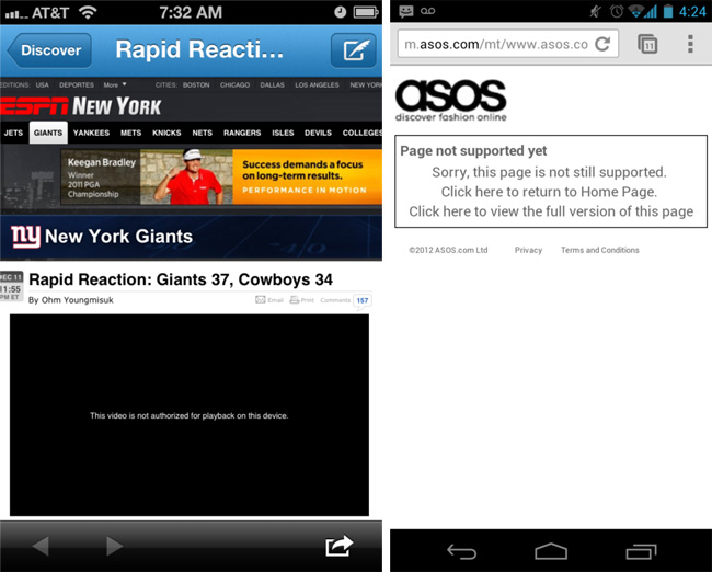
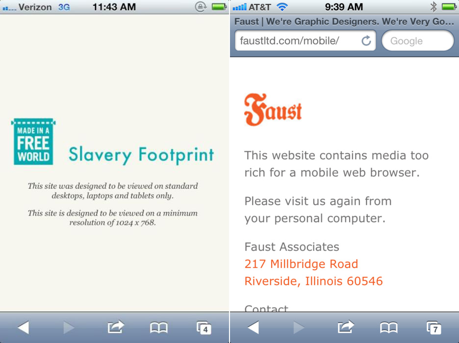
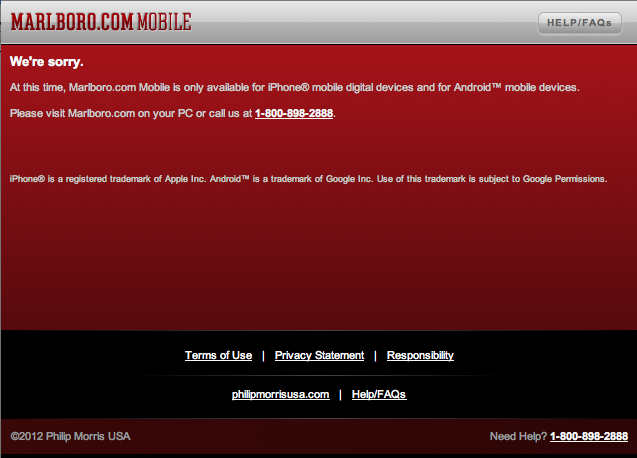
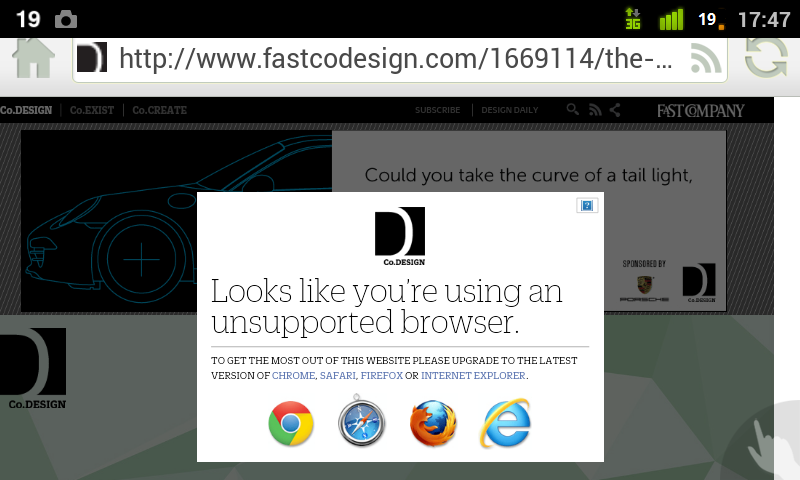
If you click a link or type a URL, you should get content you requested. Hopefully it's optimized for whatever device/browser you have, but at the minimum it's about basic access. If you click on a link to cute kitties, you should get cute kitties. Even on your phone. Or your iPad. Or your Nook. Or your Google TV. Or Internet Explorer. Or your Galaxy Note (*shudder*). Or your Blackberry. Or your Chumby.
And if you don't get what you ask for, whether its a mobile homepage, a broken page, partial content, or a video of Rick Astley dancing in a trench coat, you get pissed off. You were expecting something and didn't get it. You will go elsewhere to find your cute kitties, and many of you will make sure to never come back to the offending site.


Don’t penalize users for the device, browser or configuration they happen to be using
It's another myth that only certain devices access the web. That's entirely false, but the attractiveness of iOS and Android inadvertently (or sometimes intentionally) cause people to break the web. Remember, you can still create a great experience for the best of breed devices will still providing support to everyone else. This is a difference between "support" and "optimization".


Considerations
- Don't wall gardens - The beauty of the web is its openness. Don't arbitrarily lock people out because of browser, device or configuration. And of course, if you're making the next advanced killer app that requires a certain level of support in order to run, that's alright too. Just let people down easy if they aren't invited to the party.
- Don't introduce unnecessary dependencies - Technology isn't inherently bad. It's all about how you use it. I have nothing against advanced javascript techniques, powerful frameworks or new HTML5 features, but if the purpose of your site is just to put words on a page, don't over-engineer the shit out of things. Use the right tools for the job.
- Remember, there is no mobile web.
- UA Sniffing can become unruly - This might surprise you but I'm not opposed to user agent sniffing. It provides opportunities to enhance experiences in a lot of great ways. The problem, as Jeremy puts it, is that using it as a foundation is "committing yourself to an arms race." It's up to you to maintain a massive device database, and based on my experience this almost never happens. It just doesn't scale.
- Focus on performance - We want to deliver full experiences to mobile users, but we need to be mindful of page weight and performance. Optimize as much as humanly possible and your users, mobile or otherwise, will thank you for it. Use techniques like progressive disclosure and more to build up from a lightweight core.
- Be considerate - be mindful of the fact that everybody accesses the web in lots of different ways, and embrace that fact. It's what makes the web awesome. And keep in mind that today's landscape will not be tomorrow's landscape and rise above the short-sightedness of a project deadline to ensure your project's long-term integrity.
- Learn by Example- Go to WTF Mobile Web and take a look at the common pitfalls of mobile web design. And submit your own. While it's partially funny, it's also really important to document these challenges so hopefully the same mistakes don't happen over and over again.
Now get out there and give people what they want.