
Anatomy of a Reference Site Component Detail Page
Brad Frost Anatomy of a Reference Site Component Detail PageTechnically a pattern library is a simple collection of UI components, but in order for design system users do their best work, a pattern library should also present other important info. Let's take a look at what information can be displayed alongside each pattern
Title
The name of the pattern should be prominent and easy to understand by everyone who visits the pattern library. Naming things is hard, but teams should strive to agree upon names that make sense for everyone, rather than only developers. Conducting an interface inventory exercise is a great way to discuss and agree upon UI pattern names.
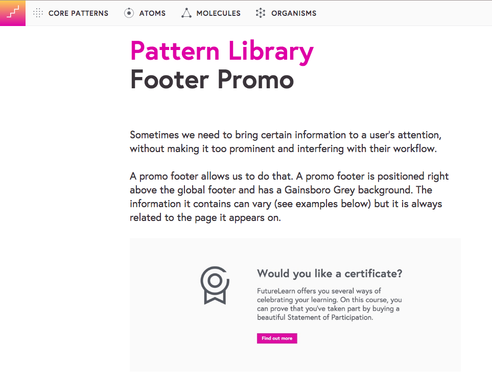
Each pattern in FutureLearn's pattern library prominently displays the pattern title
Description
A succinct definition should be provided to help people understand what the pattern is and what it does. Some patterns can be easy to discern ("data table") while others might need more of an assist ("jumbotron").
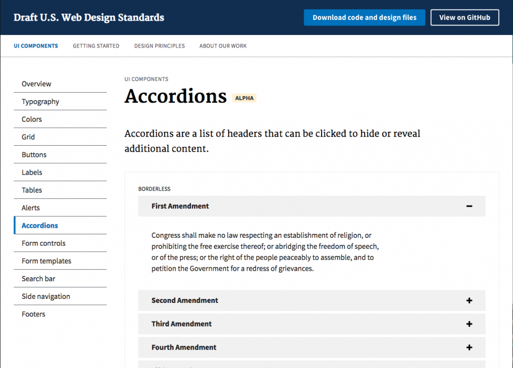
Each pattern in the Draft U.S. Web Design Standards pattern library has a succinct definition for each pattern
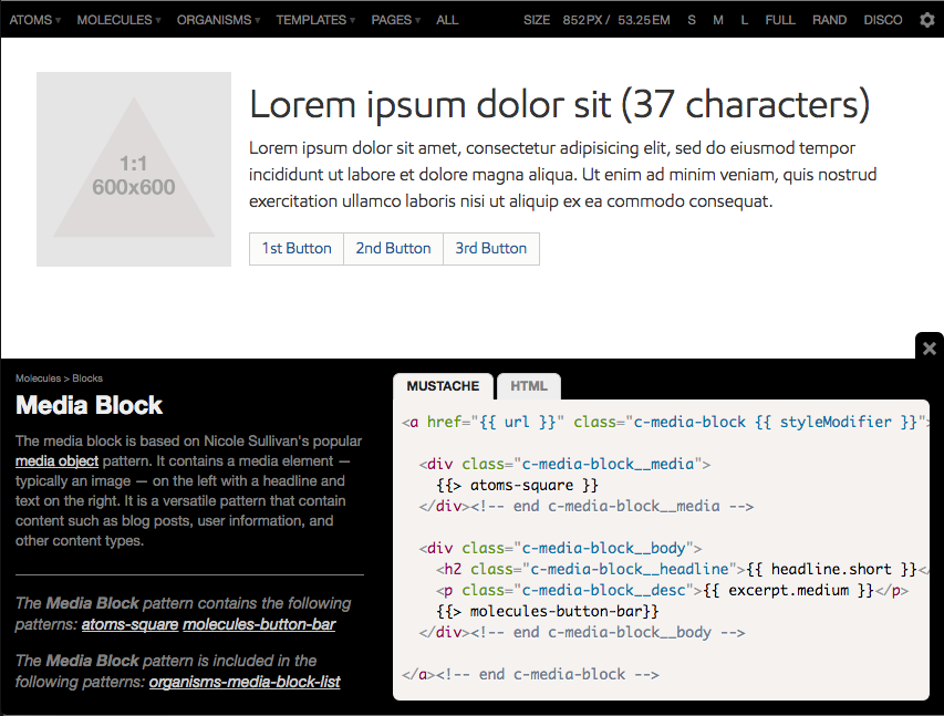
Live Example
A key characteristic of any pattern library is displaying a living, breathing instance of a pattern. Showcasing a live pattern allows teams to demonstrate responsiveness, interaction, motion, ergonomic considerations, true color & text rendering, and performance, which are all things a static picture can never show.
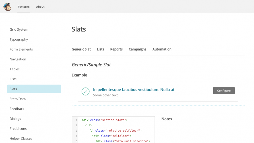
MailChiimp's pattern library displays a live example of each pattern in their library.
Context
While showing an abstracted live UI pattern is a necessary part of any pattern library, it's also important to show how and where that pattern gets used. Material Design does a fantastic job at putting a component in context of actual applications.
Material Design shows context for its UI components using plenty of images and videos
Screenshots and videos can be used to show a pattern in context. While these media are certainly effective, it can involve a lot of manual effort to produce them. One of my favorite features of Pattern Lab is pattern lineage, which shows exactly which patterns make up any given component, as well as shows where that pattern is used.
Pattern Lab's lineage feature displays what patterns make up any component, and also shows all the places that component is employed.
Usage
When should you reach for a toggle pattern instead of a group of radio buttons? Should you use tabs or an accordion? Showcasing dos, don'ts, rules, and considerations for each pattern can help design system users reach for the right tool for the right job and take a lot of the guesswork out of the implementation.
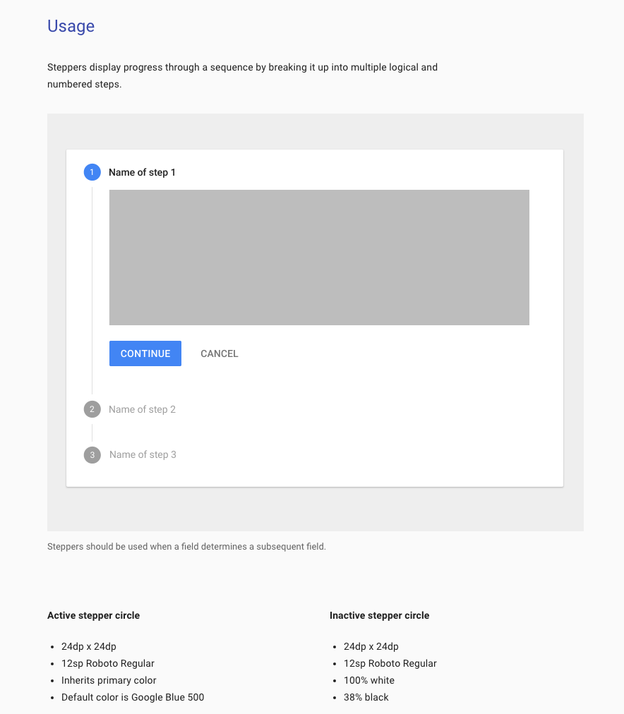
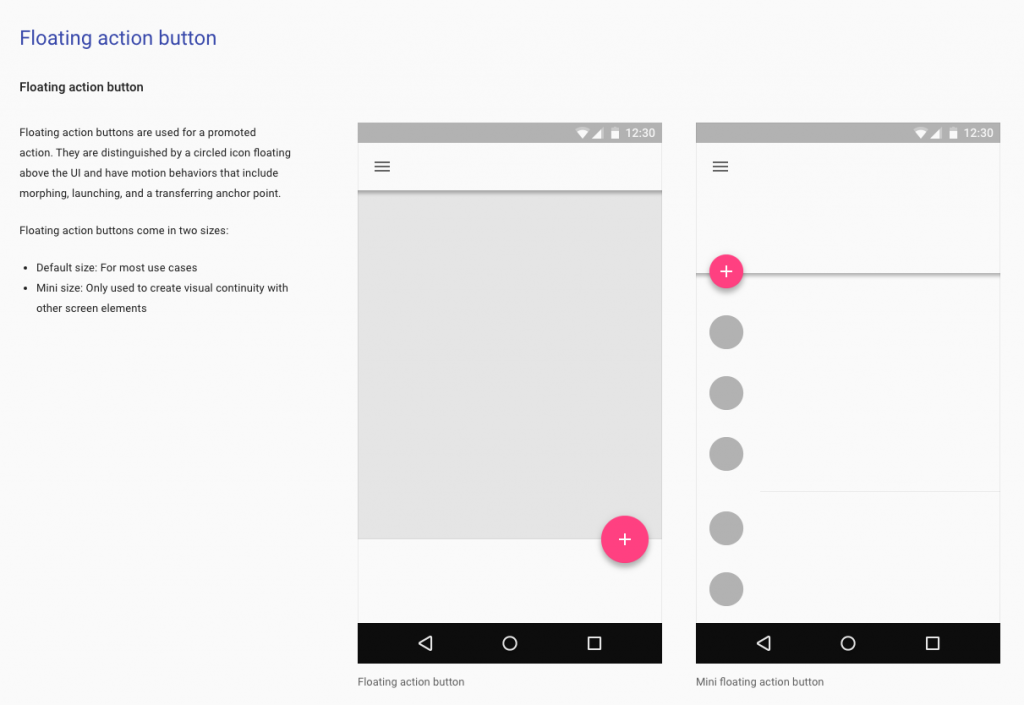
Material Design's usage contains information about when to reach for a particular pattern, as well as extremely specific sizing, spacing, and design instructions.
Code
Almost every pattern library out there displays the appropriate component code alongside the living instance of a pattern. But what code is relevant to show? It depends on the type of design system you're maintaining. For integrated design systems like Rizzo, the only code that gets exposed is the code necessary to pull a pattern into the application. For less integrated systems, frontend markup and/or CSS and/or JavaScript might be provided for users to copy and paste. Here's some of the code
- HTML showcasing the markup syntax and structure
- Templating code that shows the markup as well as the dynamic aspects of the pattern
- CSS code specific to a particular pattern
- JavaScript code to control a particular pattern
- Implementation code that shows how to pull a particular pattern into a backend system
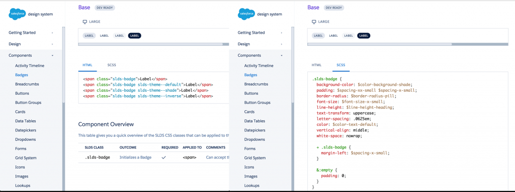
Salesforce's Lightning Design System showcases the frontend markup as well as the SCSS styling information for each pattern
Resources
The answer to "Why is this component like this?" shouldn't be "because I said so." A well-constructed design system should incorporates industry best practices. There are tons of fantastic articles that detail considerations for form, table, card, tabs, and so on. Bundling helpful resources from industry Smashing Magazine, A List Apart, CSS Tricks, and tons of other places can level up design system users and help them become better practitioners.
In addition to external resources, it's a great idea to maintain a set of over-arching design principles that govern your design system. Linking to these internal resources where appropriate helps tie abstract principles together with real-world implementations.
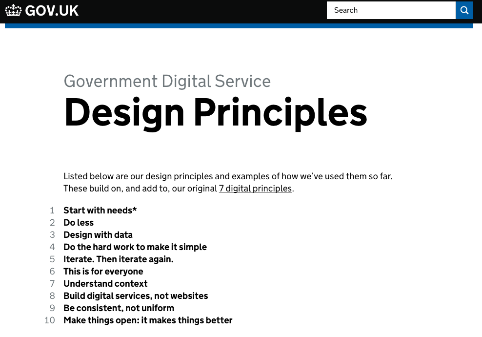
GOV.UK maintains a fantastic set of design principles that underpin their design system. Their UI patterns reflect these principles.
People
Who created this pattern? Who should you contact if you have questions or proposed changes to a pattern? Who else has a say in how this pattern should look or behave? Some pattern libraries expose relevant people's names and contact information to keep a healthy conversation going between design system makers and users.
Meta
And finally, patterns can contain helpful meta data that
- Pattern status - In progress, In review, Complete, Deprecated, and so on
- Version - i.e. Button v1.3
- Changelog - When was the pattern last updated with a link to its history
- Compatibility info - What are the dependencies required in order to use this pattern?
Crafting Effective Patterns
So a pattern can contain:
- Pattern title
- Pattern description
- Live example
- Contextual information
- Usage guidelines and requirements
- Code samples
- Internal and external resources
- People involved
- Helpful meta data
This information can help set your UI design system up for success.