A tel Tale Sign
In this responsive age, it’s worth pointing out that mobile phones can make things called “telephone calls.” Once upon a time, in an era before web forms and e-mail, the best way to make a dinner reservation, place an order, or get help from customer service was to pick up the phone, dial a number, listen for a few rings and (hopefully) talk to a human on the other end of the line.
As it turns out, phone calls are still an amazingly effective (and human!) way to communicate. Yelp mobile users call a local business every other second thanks to prominently-placed phone numbers in their plethora of mobile apps. So yes, these mobile phones we’re all carrying around are well-equipped to facilitate some phone call goodness. Here’s some other mobile web phone call use cases:
- E-commerce Product Inquiries – I’ve worked with a lot of e-commerce sites and people do indeed call customer service numbers to guide their purchases. Users often have questions about sizing, fit and quality. When the price is high, it’s natural to want reassurance from a human before taking the plunge on a purchase.
- E-commerce Purchases – Many people feel more comfortable going through the actual purchase process over the phone than through an e-commerce site. It’s not unusual for a purchase to start on the web and finish over the phone. It also can be more efficient to check out over the phone than stumbling through a mobile checkout form.
- New Business – If you’re a web designer, artist, photographer or business, it’s likely you have a website to generate new business. Talking over the phone is a more personal way to get to know a potential client before making a commitment, and making a call on a mobile phone can be much easier than clumsily pecking an online web form.
- Calling local businesses – I had a wonderful conversation with the owner of a locksmith company at the airport. Talk about the perfect mobile web use case! If you’ve locked your keys in your car, you’re not going to download an app, you’re going to search for a locksmith, call them up and get them there as soon as possible. Hotels, restaurants, bars and many other local businesses can all benefit from an easy to find and use phone number.
- Customer Service – Customer service numbers are intentionally buried by terrible companies (and unintentionally by those who don’t know better), but they can be crucial part of a user experience. When a FAQ page isn’t enough, or (heaven-forbid) the mobile site doesn’t provide the necessary information, users turn toward the customer service number to hopefully get the answers they need.
Making Phone Numbers Linkable
Max Firtman gives an in-depth look at how to make phone numbers clickable for mobile browsers. The most “standard” way is by using the tel: URI scheme, which looks like this:
Call Customer Service at <a href="tel:+18005550199">1-800-555-0199</a>This is a great way to bulletproof a phone number, even though most mobile browsers do a decent job auto-detecting phone numbers and converting them into links. iOS, Android, Opera Mini, Opera Mobile, Blackberry (even pre-6.0) all do a good job auto-detecting phone numbers in text and making them clickable. However, most mobile browsers don’t stylize these links by default (iOS and Blackberry add an underline to the generated phone links), so it’s a good idea to style tel links so they’re nice and actionable.

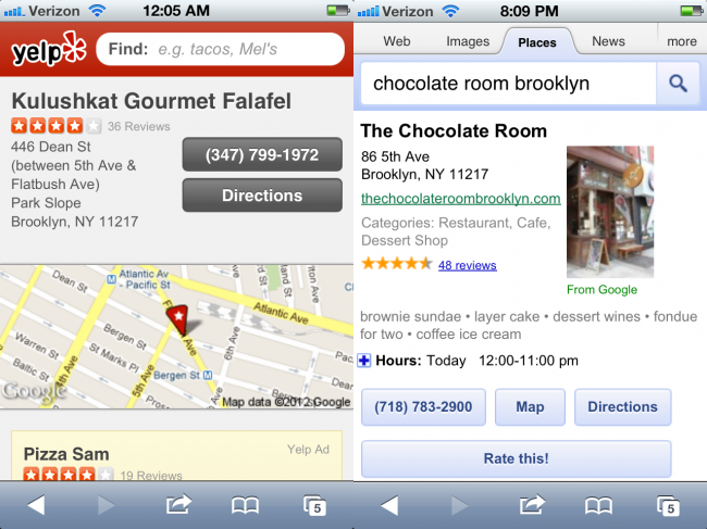
Chunky, actionable phone number links on Yelp and Google Local
Phone Numbers in Responsive Designs
Tel links work great in mobile browsers, but unfortunately seem to fall apart when you get to desktop browsers (iPads and other tablets cleverly ask if you want to add the number to your contact list).

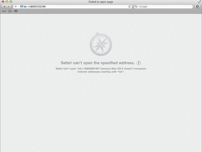
Safari and other desktop browsers unfortunately don't comprehend the tel URI schema
In their excellent book Head First Mobile Web, Lyza and Jason give a server-side detection example where the user experience is enhanced based on the device’s ability to make a phone call. I concur for the most part, although I really just want desktops to do a better job launching communication apps (Skype, iChat, etc) and/or contact manager apps (I’ve done some testing on this and it works in some environments, but not in others).
The tel URI-scheme is semantic in my eyes and think it should be encouraged. I don’t want to style a <span> and hope that all browsers will automatically detect a phone number. I suppose you could disable tel links and remove actionable styles for desktop browsers using Javascript, but again I like the idea of launching desktop VoIP software (used by millions and millions of people I might add). Yes, I know there are custom URI schemes for Skype and other apps, but the point is that any app should be able to leverage the app-agnostic tel URI scheme. And tel links make sense in other emerging contexts (TVs, car dashboards, tablets, etc).
Obama’s Missed Opportunities
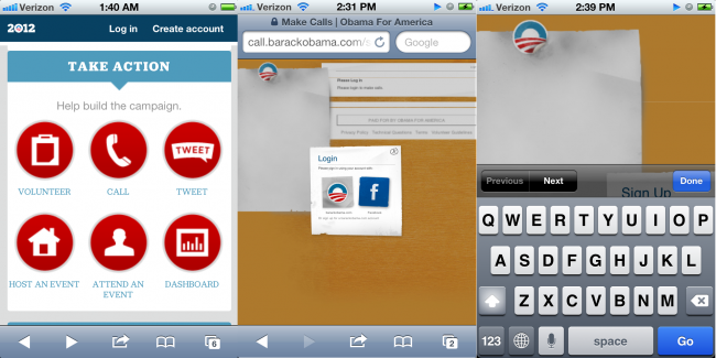
The reason I’m writing this post is because I had the opportunity to check out the newly-responsive Obama campaign site. I came across a giant red “Call” button while browsing the site on my phone, and naturally thought that I could make a call. Instead, it dumped me off to a non-responsive section of the site where the login screen got buried behind the virtual keyboard, rendering the section useless.
This can be written off as a technical flaw, but I was also surprised to not see any promotion of Obama’s historically very successful text messaging campaign. Again, mobile phones are capable of sending text messages and it would make a whole lot of sense to get people opting in to the program on the devices that can actually send and receive SMS.
I’m not trying to nitpick on a single site or discredit a very nice responsive design, I’m just trying to use this as a reminder that the mobile context is much more than screen size. Mobile is a unique medium with it’s own powerful communication channels built in. We should think about how we can take advantage of the capabilities of these devices to create better experiences.
Phone Link Best Practices
- Make contact information (regardless of context) easy to find – Make it easy for users/potential customers to find your phone number, email address and physical address.
- Global contact info is a good idea – Including contact info in the header or footer of every page makes it easy for users to get in touch no matter what part of the flow they happen to be in.
- Make phone numbers tap-friendly – Don’t leave it to the browser to auto-style your phone numbers. Style your phone buttons to be touch-friendly and make it obvious that the numbers are actionable.
- Expose phone numbers and email addresses – A big chunky “Call Us” button might seem like a strong call to action, but it’s as generic as “Click Here!” Spell out your phone number to make it dirt simple to read. While you’re at it, make sure an email address is exposed as well (I advocate against web-form-only approaches just because I’d rather write you an email in my native email client than a web form). Also, users may just want to copy the text to send to a friend in an email or SMS.
- Don’t make phone numbers images – This should go without saying, but…
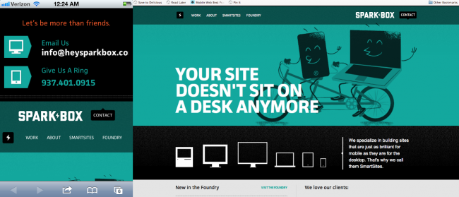
- Redundancy isn’t a bad thing – Putting contact information in multiple places makes it easier to find. The fine people at Sparkbox include their contact information 3 times on their homepage without being overbearing.
This post at surface level is quite simple: be mindful of telephone numbers on web pages. But it’s really meant to keep up thinking about the mobile context as much more than just a small screen. When we create mobile sites: whether they be dedicated, responsive or other, we should be extremely considerate of all the opportunities and constraints the mobile medium provides.


11 Comments
Simon
I avoid exposing raw email addresses where possible, because otherwise they get harvested by spambots eventually. A form isn’t ideal, but it prevents the email address from being grabbed by bots trawling the web. You can obfuscate the address using JavaScript, but then you still need a form as a fallback for the users without script enabled.
Mike
So would you suggest to use a JS solution for not linking on browsers that don’t support tel: or not linking it at all and hoping the mobile browser does the work for you?
Terence Eden
I’d add one other point – make sure your number is in international format. For example, use +1 at the start if you’re in North America, +44 if you’re in the UK.
If I’m on my British phone, roaming in NYC, and I’m looking for a restaurant to book, I need to be able to click and call – not click and get a wrong number message.
Andrew Williams
I’ve been using callto: to link my number, which I’ve just learned is from Skype, which also uses skype: links. I’ve also just learned that tel: is the specified standard.
On my iPhone, the callto: link prompts me to call the number with the phone. It doesn’t open the Skype app (or Google Voice, for that matter).
On Safari on my Mac, callto: opens Skype and tel: opens a Google Voice app I use.
So, I’m curious… What is the best option? I would imagine that anyone viewing my number on their mobile wants the phone function to be called, while anyone on a traditional PC would, in most cases, want Skype to open (since Skype is a very common way to handle calls on a desktop).
I guess the real question is what should happen with my phone number on a desktop PC? The phone should be triggered on a mobile browser, but what’s the best result when a phone number is clicked on a desktop browser?
…and then what is the best way to achieve that?
Also, thanks to Terence, I’ll be reformatting my number just in case. 🙂
Doug Smith
Any application can register itself as a handler for tel: urls, at least that’s how it works on a Mac. For example, I use an VOIP application called “Telephone” that registers itself that way and then phone number links work just fine in any of my desktop browsers. I’d hate to have sites start only offering tel: links to non-desktop browsers and thwart this functionality, even if not that many of us are using it yet.
john holt ripley
Using the tel: scheme is great – it’s exactly what I’d expect as a user when I click a phone number, but the lack of support in desktop browsers makes it an issue for responsive sites as you’ve said.
Is there a way to detect support for the URI scheme and then add the link with JS? It doesn’t feel right to do a UA check to see if it’s “mobile” or not and assume support that way.
Thanks for the article – it is important to remember that we do occassionally use phones to talk to each other.
Manuel Strehl
Two and a half years ago I asked a question on StackOverflow, that has exactly this topic:
http://stackoverflow.com/q/1164004/113195
The conclusion was basically the same as this post suggests: Use “tel:”, only use “callto:” to target Skype users directly.
Joshua Dance
The company I am working for is dealing with this issue now. Chrome just ignores the click of a tel link, while Safari goes to the “can’t find the link” page. We are still not decided on the direction we will go, but thanks for the helpful thoughts and ideas.
Torkil Johnsen
Obfuscating tel: and mailto: links are not the way to go if you ask me. At some point, you will have to share your e-mail address with someone if you want to receive any e-mail, and at that time you’re risking ending up on a spamlist.
Obfuscation schemes too often ends up in messing with the client’s default behavior for that type of link, which really reduces the usability of the site.
You need to put money into spamfilters instead, sadly.
Which reminds me: “I saw the greatest minds of my generation write spamfilters”
http://www.youtube.com/watch?v=TE0n_5qPmRM
Matt
Why can’t I click on a phone number in chrome’s mobile browser. I did notice that I was able to click on phone numbers that are being served up by Google’s paid search platform
maxw3st
Lot of good observations in your post. Maybe it’s an Apple thing, but on my PC (desktop) any phone number on a page shows up with a Skype icon in front of it and is styled in Skype blue. Just clicking them activates my Skype service. It crashes a lot in Chrome, but works great in Firefox.
Comments are closed for this post. If you've got something to add, feel free to reach out on Twitter.