Designing Pattern Flexibility
When discussing a pattern-based design workflow, one knee-jerk reaction I hear from visual designers is that a design system will stifle creativity, leaving everything looking homogeneous and bland. I think there is some validity to this concern, and this sentiment can’t simply be chalked up to failed-artist designers who always want to ignore constraints and paint outside the lines.
It’s essential to build flexibility into interface design systems in order to make dynamic sites that promote consistency while still looking great and meeting organizational needs.
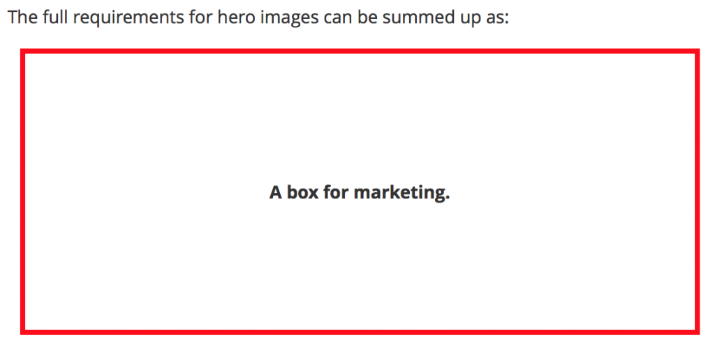
Jason Grigsby recently published a fantastic article about responsive hero images and how challenging it can be to design high-impact marketing images for responsive sites. Jason explains many scenarios where art direction of hero areas requires careful consideration in responsive environments. The whole post is well worth a read, but what really stood out to me was this image:
When designers express their concern about pattern libraries limiting creativity, I describe a box very similar to what Jason’s drawn. It’s not that designers can’t color outside the lines and produce really high-impact designs in a pattern-based workflow, it’s about figuring out where it’s appropriate to do so.
A Time and a Place
Design systems should deliberately establish patterns that provide more creative and organizational freedom, and hero areas are great examples of these looser patterns. These patterns establish parameters around when and where it makes sense to deviate from the rest of the design system and create something unique.
These more flexible patterns also alleviate Special Snowflake Syndrome, where certain departments in the organization think that they have unique problems and therefore the rules of the design system don’t apply to them. By establishing patterns that have a little more wiggle room, you can appease those Special Snowflakes in those areas while leaving the rest of the design system intact and untouched.
Doin’ Business
You can divide interface design patterns into two categories: blank slate patterns, and doin’ business patterns.
Doin’ business patterns should remain consistent and cohesive across the entire site. Buttons, form elements, and other key interface patterns should feel the same across the entire experience. The majority of an experience should consist of doin’ business patterns if you’re to create a maintainable, scalable system.
Blank slate patterns on the other can and should feel unique, one-offish, bespoke even (I hate that word). It’s in these areas where the organization can paint outside the lines and flex their editorial muscles.
BUT. Even though blank slate patterns can be unique, it’s still extremely helpful to try to create reusable patterns within those editorial areas. One client I’m working with has many editorial areas with a lot of high-impact imagery that changes on a near-daily basis. If they were to design and build unique designs every day, they’d burn out immediately. By establishing a handful of unique hero patterns, they can swap in new text and images and be sure it works across the entire resolution spectrum. And if they find their existing solutions don’t work for a particular scenario, they can establish yet another hero pattern, throw it on the pile, and make use of it later on down the road.
At the end of the day, design systems should help promote consistency while still providing design flexibility and accounting for organizations’ diverse needs.
