Side Projects & Collaborations
-
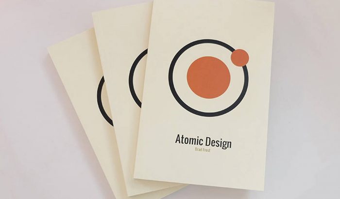
Atomic Design
I wrote and self-published a book called Atomic Design, which details all that goes into creating and maintaining robust design systems. This book introduces a methodology for thinking of our UIs as thoughtful hierarchies, showcases techniques to transform your team’s design and development workflow, and discusses how to successfully maintain a design system.
-
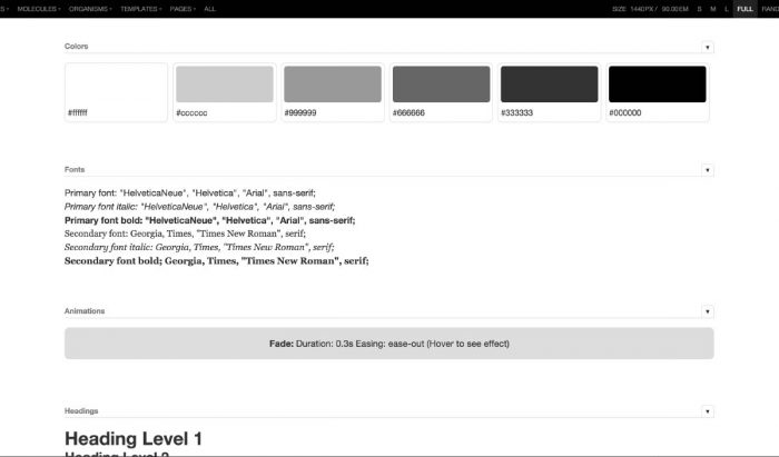
Pattern Lab
Pattern Lab is an open-source tool to help teams team build thoughtful, pattern-driven UI design systems using atomic design principles. It’s a static site generator (powered by either Node or PHP) that stitches together UI patterns, swaps out dynamic data,
Collaborators
-
Style Guides Podcast
As most of us know, getting a design system up and running at an organization is no small feat! That’s why the Style Guides Podcast exists. Together with my co-host Anna Debenham, we interview the industry’s best and brightest who have successfully implemented design systems at their companies and for their clients, so that the whole community can learn from their experience.
Collaborators
-
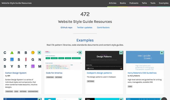
Styleguides.io
Together with Anna Debenham, we’ve created an open-source resource dedicated all things style guides and design systems. Thanks to a slew of community contributions, you can browse hundreds of examples of organizations’ style guides and peruse a myriad of design system tools, articles, podcasts, conference talks, and other resources.
Collaborators
-
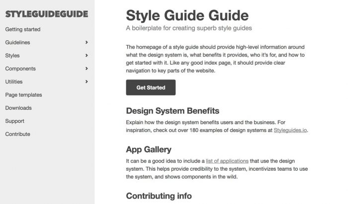
Style Guide Guide
Style Guide Guide is a vanilla boilerplate for creating an effective style guide for your organization. While it’s not going to fill in all the blanks (your team still needs to do all that hard work!), the tool gives you a smart style guide scaffolding with smart features to kickstart your design system & style guide initiative.
-
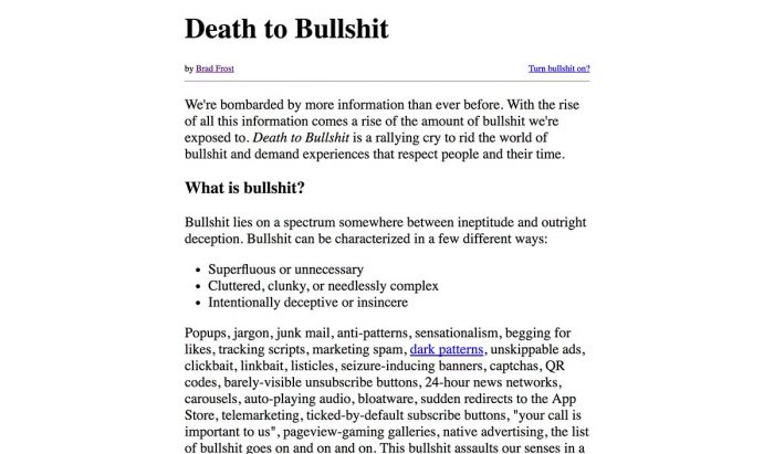
Death To Bullshit
We’re bombarded by more information than ever before. With the rise of all this information comes a rise of the amount of bullshit we’re exposed to. Death to Bullshit is a rallying cry to rid the world of bullshit and demand experiences that respect people and their time.
-

Frontend Guidelines Questionnaire
As it turns out, developers have opinions about things. Weight, right?! I created a one-page questionnaire that helps front-end teams establish effective, actionable guidelines so that they can write consistent & cohesive code together.
-
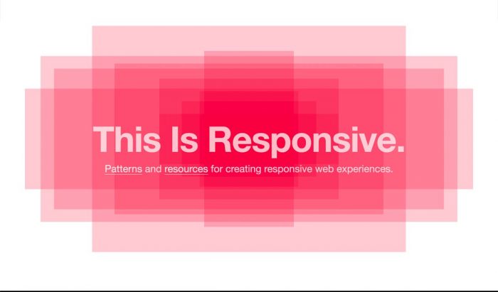
This Is Responsive
This Is Responsive is a site dedicated to all things responsive design. The site showcases a variety of responsive UI patterns, showing solutions for responsive navigation, data tables, images, layout, forms, and more. It also rounds up links to all the smart tools, articles, and talks the community has produced to help us all create better responsive experiences.
-
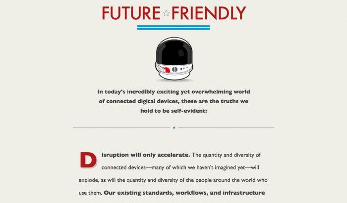
Future Friendly
After BD Conf in 2011, 10 web and mobile nerds retreated to a cabin to discuss the future of the web and mobile. The result was a manifesto that encourages designers to embrace the unpredictability of the future. That means laser focusing on providing users real value, creating portable data that means your content can go anywhere & everywhere, and thinking about how devices can work together to create exciting new experiences.
-
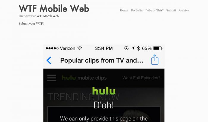
WTF Mobile Web
When creating for the web on mobile devices was still a relatively new thing, people did all sorts of crazy stuff. Jen Simmons and I created WTF Mobile Web to highlight all the anti-patterns we saw in an effort to help people avoid them. Given that the web is still unfortunately full of pop-ups, door-slams, and more, this site is still very relevant.
Collaborators
-
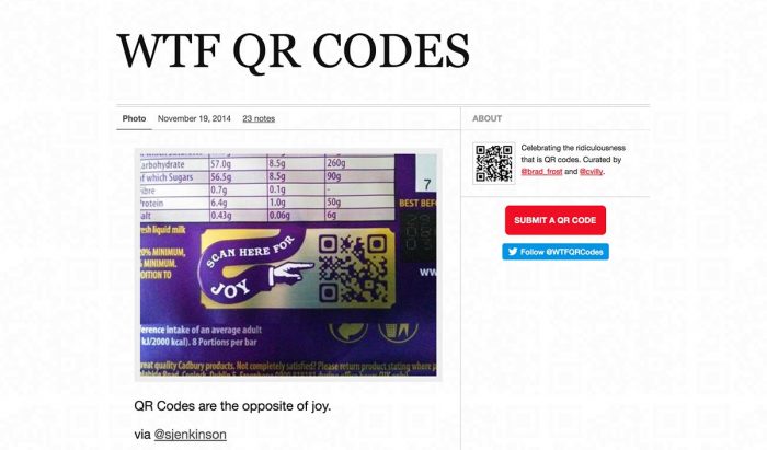
WTF QR Codes
QR codes are an amazing, quirky technology, and for a while there it seemed like they were a panacea for all of print marketing’s woes. Of course, that meant QR codes were used and abused by brands and marketers to clutter our environment with a bunch of robot barf. WTF QR Codes is a site I created with Craig Villamor to collect all the ludicrous and often hilarious applications of QR codes.
Collaborators
-
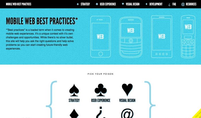
Mobile Web Best Practices
When the iPhone first came out, it didn’t receive a lot of immediate attention from the web community. Aside from a handful of mobile web developers around the world, the larger web community was oblivious of what it meant to create for these small, underpowered devices in everyone’s pockets. Mobile Web Best Practices was a site I created that provided tips and resources for designers tasked with creating web things for the mobile landscape. The industry has thankfully moved on from thinking about the “mobile web,” but the term served as a useful bridge to expose the web community to this new class of devices.