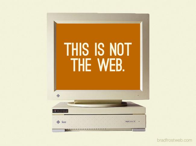
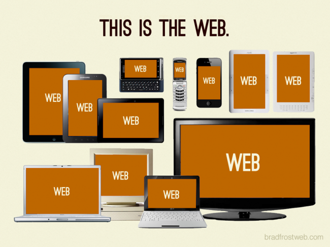
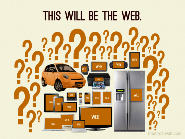
This is the web.
Since posting Responsive Web Design: Missing the Point and For A Future Friendly Web, I’ve gotten quite a few requests to use a few of my images for presentations and posts. I think these three images succinctly explain why we need to start thinking in a future-friendly way. So here they are in their original format, free for you to use.
These images are provided under Creative Commons Attribution License and definitely feel free to let me know how you end up using them. Thanks for the interest!


20 Comments
Michael Hessling
Thank you, Brad. We’ll be using these internally.
Craig Patik
Posting this on my cubicle wall as a reminder for native app-focused coworkers.
GIVISION | Jiri Mocicka
Already pass to my colleague at R/GA London.
Awesome work mate!
john holt ripley
Thanks for sharing these, they are the perfect introduction to a discussion on responsive design. Will be using these for an internal presentation to our account directors next week.
Timo
Thanks for sharing. I’d like to use this in my startup pitch as the introduction to the problem we are solving. We are creating an easy-to-use cloud service for cross-browser compatibility testing in different mobile and desktop browsers.
jono
great images… except for the internet fridge. it seems to be the quintessential futuristic household item that i just can’t find a rational need for.
anil pillai
hey Brad, nice take on the fast changing world… i’ll be using this somewhere, somehow. thanks, anil
lawrence serewicz
Cool slides except that the web and fridges, cars, and printers is already here.
http://www.gizmag.com/go/1132/ for fridge
http://www.cellular-news.com/story/41135.php for cars
http://www.hp.com/hpinfo/newsroom/press/2009/090622a.html for printers
What needs to be considered is how applications can be shifted across all of them for the “smart” house or “smart” living conditions.
Provocative slides and well worth using.
Thanks
john holt ripley
So, when will the first one be available on a t-shirt?
Garrett Coakley
I used these 3 slides in a talk I gave recently to the UX Oxford group about the work I’ve been doing at WDCS. There’s video of the talk at http://polytechnic.co.uk/blog/2012/05/rebuilding-from-the-ground-up To save you having to sit through the whole thing the slides make an appearance just after 13:30.
Thanks for letting us use them.
Michael "Spell" Spellacy
Thanks! I’ll be using internally as well. “This Will Be The Web.” is even posted on the door to my office. 🙂
Anthony
Thanks, I hope to use these for an upcoming presentation on mobile strategy- perfect opener!
Dean
Great slides, I will be using these internally for a 5 minute brief overview. Many thanks for sharing!
Gil Bouhnick
I love it.
We addressed similar discussions from the mobile side (saying mobile-web is everywhere), but the way to drew it makes perfect sense.
Sergio
Great!!! Thank you very much!!!
David Hickox
Used it in a presentation today to show our company why responsive design is important. And like magic, everyone got it. Thanks for creating these.
http://campl.us/kQLc
Marcelo Quinta
I used some of your slides (and your pictute) in some of my presentations, here in Brazil. Thank you!
Devon RW
I used them in a presentation I gave at zu. My co-worker shared the evidence https://twitter.com/FakeRobot/status/231502704894169088/photo/1
Thorsten
Hi Brad,
Thanks for sharing this. We use it in presentations with prospects to explain why responsive web design is a must have nowadays.
Bests
Thorsten
Gllm
Thank you for sharing those pics which I intend to use in a blog post dealing with the web history. I’ll give the link as soon I’ve uploaded it.
Yours,
Gllm
Comments are closed for this post. If you've got something to add, feel free to reach out on Twitter.