The Top 25 Responsive Design Tools
Note: this piece was originally published on Net Magazine, who recently nuked about 10,000 articles when they moved over to Creative Bloq. In an effort to preserve the writing I did for them, I’m republishing those articles here on my blog. This article is still alive over at Creative Bloq, so you can also read it there.
As responsive web design evolves, Brad Frost looks at some of the best tools, resources and thinking for crafting exceptional responsive experiences
This article first appeared in issue 241 of .net magazine – the world’s best-selling magazine for web designers and developers.
Over the past few years we’ve seen an explosion of web-enabled devices with varying resolutions, capabilities, form factors, pixel densities, interaction methods and more. This onslaught of connected devices is just the beginning, and we’re bound to see people accessing the web from a greater number of devices in the coming years.
It’s futile to create a dedicated web experience for every single device class out there, and the need to create a smart, flexible, adaptable web experiences is becoming more apparent every day. Responsive/adaptive/multi-device web design (whatever you want to call it) is here to stay. Just because responsive design is becoming necessary doesn’t mean it’s easy. We’re tasked with creating experiences that are simultaneously aware and agnostic of device context. We’re challenged to make interfaces that scale from itty bitty screens all the way up to massive cinema displays. Oh, and everything needs to be lightning fast, too.
These are formidable problems we’re up against, but thankfully the web design community is up to the challenge. We’re seeing clever, thoughtful and downright innovative tools and resources emerging on a regular basis.
There’s a lot to get excited about, but it can also be a huge task to keep track of the latest tips and tricks. This article takes a look at some of the most helpful responsive resources and tools that have emerged that will help you on your responsive journey.
1. Responsive Design Weekly
Web developer Justin Avery spends a lot of time curating a weekly newsletter dedicated to the latest resources, tools and techniques around responsive web design. If you’re like most people, you can’t spend your day glued to a Twitter feed waiting to pounce on the latest responsive news. This newsletter hands you all the latest responsive resources on a silver platter. Do yourself a favour and subscribe here.
2. Foundation by ZURB
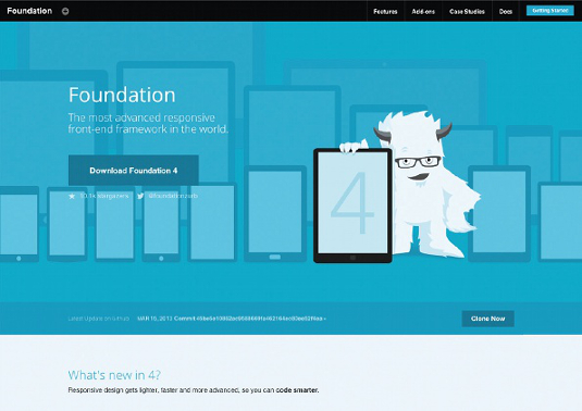
Foundation by ZURB is marketed as, “the most advanced responsive frontend framework in the world,” and there’s no denying that a lot of effort has gone into the open source project. ZURB spent a lot of time rebuilding its Foundation framework from the ground up.
Foundation 4 is now built mobile-first, which more closely follows a progressive enhancement strategy. Instead of taking large desktop designs and simply squishing them onto small screens, Foundation lets users layer in complexity as screen size and device capabilities increase. The framework also sports a comprehensive library of UI components that makes it easy to rapidly prototype any interface you can imagine.
If you want a framework that’s got a lot of the latest responsive development best practices, Foundation 4 looks like a pretty great candidate.
3. Jetstrap
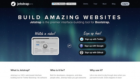
There’s been a massive shift around getting designs into the browser much earlier in the design process. Static wireframes and comps fail to accurately show how a design will look and function in the multitude of web environments. And prototyping tools have typically required a fair amount of coding knowledge to get started.
This is where Jetstrap comes in. It’s a visual interface-building tool for the Bootstrap framework. It provides a way for designers to quickly assemble rapid prototypes in the browser by dragging and dropping UI components onto a canvas. It doesn’t require hardcore frontend development skills to get started, but still outputs a living, breathing web page. It also provides the right level of abstraction to be accessible to non-developer types, but is still powerful enough to demonstrate how a design actually works in its final environment.
4. The Style Prototype
Mood boards can be too vague, whereas static mockups are too precise in this responsive age. That’s why designer Samantha Warren created Style Tiles to provide clients with a gist of colours, typography and atmosphere without getting too literal.
The responsively-minded folks at Sparkbox developed took Warren’s idea a step further with the Style Prototype.
The Style Prototype is Style Tiles in the browser, which allows you to show true colours, typography, animations and more in a website’s final environment.
5. Element Collages
Creating full mockups in Photoshop and declaring, “this is what the website will look like!” makes less and less sense. Designer and founder of agency SuperFriendly Dan Mall took the Style Tiles concept a step further with Element Collages. Element Collages are comprised of visual explorations for interface components. These collages facilitate conversation around the visual direction without having to create entire comps.
6. Pears
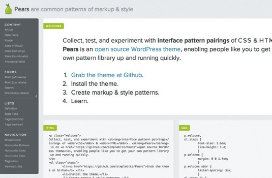
Anna Debenham explains the many benefits of frontend style guides as: allowing for easier testing, establishing a better workflow, creating a shared vocabulary and serving as a useful reference to keep coming back to. Pears is an open source WordPress theme created by designer Dan Cederholm for creating your own frontend style guide. Pears makes it easy for design teams to contribute to a shared pattern library to establish a consistent design system.
7. Icomoon
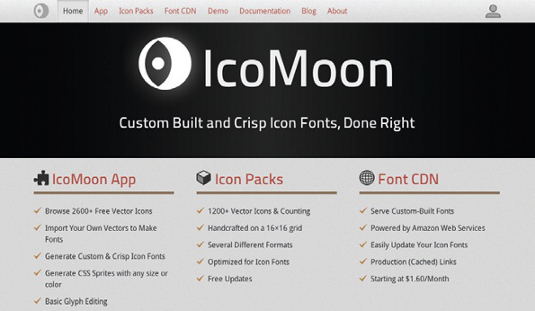
These days seemingly everyone is freaking out about Retina screens. Retina and other high resolution displays are quickly becoming the norm, and bitmap icons look fuzzed out and illegible on them. One of the most effective solutions to create resolution-independent icons is to create a custom icon font and embedding them with CSS @font-face.
Icomoon is a web tool that makes the process of creating and deploying icon fonts easy. It lets you choose from a library of icons and also lets you upload your own. You can then generate your custom icon font and download a package that includes the fonts and appropriate CSS. There’s even a font CDN that can serve up your custom icon fonts. Icomoon is a tremendously helpful tool as we strive to create resolution-independent experiences.
8. Foresight.js
Bitmap images can look fuzzy on high resolution displays, but loading hi-res images can considerably bulk up page weight. Foresight.js detects device display and network connectivity in order to determine whether to load in hi-res assets or not. Keep in mind that detecting available bandwidth isn’t a perfect art just yet, but this is certainly a smart way to think about conditionally serving hi-res assets only to users who can make use of them.
9. Detector
Feature detection and device profiling can be a tricky game. Device libraries are difficult to manage, but pure feature detection relies on client-side detection and solely relying on it can limit flexibility when delivering functionality to a broad-range of user-agents.
That’s what led developer Dave Olsen to create Detector, a PHP and JavaScript-based browser and feature detection library. Using a combination of Modernizr and user agent detection to determine device classes, Detector can adapt to new devices and browsers on its own without the need to pull from a central database of browser information.
10. Enquire.js
We all know how great media queries are for CSS. But what happens when you want to also alter an experience’s behaviour at certain breakpoints? Enquire.js is a script that uses matchMedia so you can conditionally load scripts, execute functions and much more when the right conditions are present.
11. SocialCount
ZURB reported that loading Facebook, Twitter and Google share widgets took 19 HTTP requests and added 246.7KB to a page’s weight. Frontend engineer Zach Leatherman addressed this issue by creating a progressively-enhanced, lightweight solution called SocialCount. The script lazy loads social widgets on demand so users aren’t penalised up front.
12. Fitvids
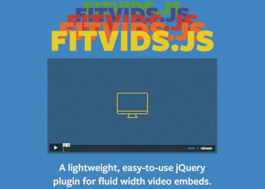
Videos and other media objects are different than images in that they don’t maintain aspect ratios when resized. Besides juggling a myriad of codecs, the scaling issue creates a big challenge for serving up video to a slew of web-enabled devices. Thankfully, there are ways to create intrinsic ratios for videos. Designer Chris Coyier and the responsive mavens at Paravel created FitVids.js, a plug-in that does the heavy-lifting for you in order to serve up videos that maintain the correct aspect ratio when resized.
13. IE-friendly mobile-first CSS
We all know how amazing CSS media queries are, but unfortunately older versions of Internet Explorer (less than 9) don’t support them. Must we abandon authoring mobile-first CSS just to support old IE? No! Developers Jake Archibald and Nicolas Gallagher demonstrate how Sass can help us author mobile-first styles while simultaneously providing appropriate desktop-centric styles to old IE.
14. Ish.
There’s no shortage of viewport testing tools, but most of them rely on popular device widths like 320, 768, 1024 and so on. Many have long been preaching to let content — not device widths — determine breakpoints in responsive designs. So, rather than determining several fixed breakpoints, ish. roughs out general ranges (small-ish, medium-ish, large-ish, etc) in order to ensure your design serves the entire resolution spectrum. You can also use ‘Disco mode’, which puts your responsive design through the ultimate stress test.
15. Proportional Media Queries
At the core of responsive design is abandoning fixed-width values and returning the web to its intrinsically fluid state. We’re already making widths, font units and measurements relative, so why are we still using rigid pixel values to set our breakpoints? Developer Lyza Gardner explains how using relative units for breakpoints creates more accessible experiences.
16. MQTest.io
It can be difficult to keep track of what media queries a browser supports. Viljami Salminen created a handy little tool called MQTest.io that identifies which media queries your browser responds to. The tool gets you thinking about how to exploit lesser-used media queries.
17. Sparkbox media query bookmarklet
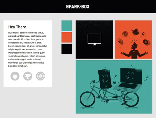
Sparkbox released a media query bookmarklet that determines the current media queries. You’ll find that having immediate access to screen dimensions in em units is quite the time saver for determining your proportional media queries.
18. BrowserStack
It’s increasingly challenging and expensive to test in a representative stack of devices, environments and browsers. While there’s no substitute for testing on real devices (so please keep testing on real devices!), BrowserStack provides remote access to a whole host of devices and environments allowing you to do some serious QA. It’s even touted by Microsoft as being an effective tool for testing those pesky old versions of Internet Explorer, too.
19. Mobitest
Great performance is an essential aspect of web experiences. Unfortunately, the average web page now weighs over 1MB and 86 per cent of responsive sites’ small screen view weighs the same as the large screen view. With Mobitest, you enter a web address and then the tool fires up the website on a real device and spits back a whole host of performance stats. You can quickly see how well your site performs by looking at its average load time, average page size and waterfall chart.
Performance is an essential aspect of web design, and tools like Mobitest make it easy to see how your designs really are performing.
20. Codepen.io Pro
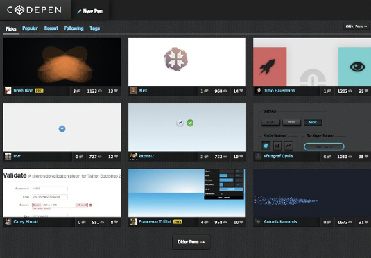
Codepen is an extremely easy tool to demonstrate a responsive pattern and other techniques quickly. It also comes with a lot of goodies (Sass, Less, popular JavaScript libraries) built in.
Recently Codepen released pro features, which includes a way to see the results of your code on multiple computers and devices instantly as you type. It’s an amazingly powerful feature that lets you immediately see the result of your actions on real devices.
21. Adobe Edge Inspect
Testing on real devices is essential. Until recently, the process has been manual and quite painful for all involved. Adobe created a tool called Adobe Edge Inspect that allows you to auto-refresh all connected devices. It also makes it super easy to get under the hood and remotely inspect code on a remote device.
22. Remote Preview
Adobe Edge Inspect is a paid service that currently relies on apps that only work on iOS and Android devices. There’s a whole host of other mobile platforms out there, including Windows Phone, Symbian, BlackBerry and more. This led Viljami Salminen to create Remote Preview, which is a simple tool that live refreshes your website on a host of devices.
23. This Is Responsive
A common question asked about responsive web design is ‘where do I go to keep up with all this stuff?’ It’s a legit question, especially considering how quickly the landscape and best practices change.
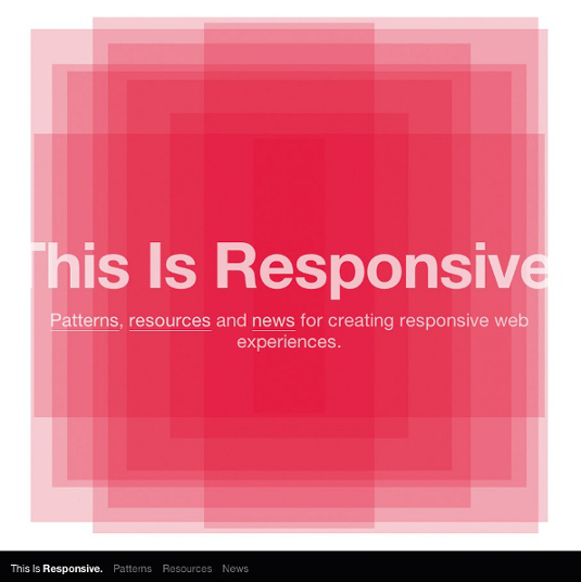
This Is Responsive is a resource site created for three purposes. The first is to provide the latest news, inspiration, thinking and techniques around responsive web design. The second is to organise and categorise a set of responsive resources. The third (and most exciting) is to collect the community’s brilliant emerging responsive design patterns all under one roof.
The news section is a running list of all the content about multi-device web design. Great stuff happens in the world of responsive web design every day and, unless you’re constantly refreshing your Twitter feed, you’re going to miss things. The news section allows you to stay up to date on the latest thinking at your convenience.
The resources section of This Is Responsive is a categorised list of helpful resources. Smart people have written about a whole host of responsive design topics: approach, design process, grid systems, handling tricky interface conventions and much more. In case you haven’t noticed, responsive web design is quite the buzzword these days, so it can be hard to separate sound resources from the noise. This Is Responsive’s resource section is curated to elevate the best thinking around whatever responsive topics interest you.
The responsive patterns section is where things get exciting. When working across several responsive projects simultaneously, I noticed that each design team was trying to solve the exact same problems, but independently. With this in mind, I set out to create a implementation-neutral library of all the emerging responsive patterns that have been created by the community.
‘How do I handle responsive navigation?’, ‘How do tables translate to small screens?’, ‘How do carousels work in a responsive environment?’: we’re all asking these questions on a regular basis. Let’s pool our unique solutions together for the benefit of the whole community.
This Is Responsive is entirely open source, which means anyone can contribute a resource or pattern. Thanks to tools like Codepen and jsFiddle, it’s easier than ever to create a quick abstraction of a responsive pattern.
24. Compressive Images
Compressive images have larger dimensions but lower file sizes. Scaled down, they display crisply on hi-res displays.
Images make up the vast majority of a web page’s weight (see: http://httparchive.org). One of the biggest challenges of responsive design is preventing sending massive images (especially those created for hi-res displays) down to users on small screens and/or poor connections.
There have been many clever approaches to responsive images, including Picturefill, @srcset and others, but they all require juggling multiple image assets and using JavaScript to swap out assets based on certain conditions. There will still be plenty of use cases where separate assets are required, but it feels like we have to jump through quite a few hoops just to serve up optimised images.
In his post Retina Revolution, Daan Jobsis found that a JPG’s compression rate matters more than its dimensions when it comes to determining the asset’s file size. That means we can save out JPGs with larger dimensions with higher compression rates, then simply scale the images down to the appropriate dimensions in the browser. This results in crisp-looking images (even on Retina displays), but does so without increasing file sizes.
In fact, these compressed JPGs can often weigh even less than the base image. The Filament Group did some further exploration and found that a compressive image can actually weigh up to half the size of its base.
No responsive image technique is perfect, and compressive images are no exception. It turns out any sort of image scaling can slow down page rendering. But this is true of any fluid image. Therefore, we should be mindful of this implication when crafting responsive experiences.
25. Sass 3.2+
.jpg)
Sass 3.2’s ability to nest media queries makes it a powerful tool for authoring responsive CSS. There’s been a shift in how we write CSS. Preprocessors like Less and Sass allow us to author powerful styles as well as helping us streamline our CSS workflow.
Many of Sass’s default features are fantastic for responsive web design. For example, it’s great to be able to store our breakpoint, font-size and spacing values as variables. But where Sass 3.2+ really shines is its ability to nest media queries.
Managing media query blocks has been a hassle. Do we keep our ‘medium’ styles in a block at the end of our stylesheet? Or do we go a step further and create separate CSS files containing our medium styles?
Either way, it ends up being redundant and we have to update rules in multiple places, which can be a nightmare for maintenance. However, Sass 3.2 introduced the ability to nest media queries within rules.
Here it is in action:
.module {
  padding: 1em;

  @media all and (min-width: $breakpointmedium) {
    float: left;
    width: 50%;
  }
}
This keeps all styles related to a particular rule in one place, so you don’t have to sift through all your CSS to find every instance of .module.
Getting better
We’re just getting starting with all this multi-device web stuff and we’re up against some significant challenges. But, as more people get on board with responsive design, we’ll see even more solutions, resources and tools released to the community. There’s never been a more exciting time to be creating for the web.