Responsive Design to the Rescue: How HOMAGE Grew Mobile Revenue by 258%
Note: the following is a guest post by Jonathan Poma, the director of Digital at HOMAGE. HOMAGE is one of my favorite t-shirt stores, and I constantly get compliments on my Boomshakalaka t-shirt. As it happens, they recently launched a responsive redesign of their e-commerce site, and Jonathan is here to share their story. Enjoy!
Overcoming False Positives
When you work on the web long enough, you learn that positive statistics can be misleading. Unique visits. Average pages per visit. Time on site. Conversion rates. All can be up. And all can suck.
We at HOMAGE learned this lesson last year as we stared down the 2012 holiday season. We’re in the t-shirt business—our vintage-inspired tees focus on eclectic moments and personalities from sports, music, politics, and pop culture. Business was booming, which the web stats seemed to support—homage.com revenue was up 45.81% for the year.
But all was not well in the land of e-commerce.
Looking deeper, we discovered that our smart phone traffic clocked in with a 104.5% increase. And tablet traffic had exploded to the tune of 810.4%. How were we serving this surge of mobile-friendly fans hungry to get their hands on an HOMAGE tee? With a non-responsive website, that made checkout a chore. Were we upsetting customers and losing sales? You betcha.
Upping Our Game with Responsive Design
Our brand is built upon the stories of champions—their individualism, triumphs, and legacy. Our web performance didn’t live up to that standard. Our fans deserved better. And we could do better. So we did. On February 12, 2013, our new responsive website launched.
And happiness returned to the land of e-commerce.
By the end of August, total web traffic was up 66.12%. And total revenue was up 69.26%, thanks in no small way to a 17% conversion rate increase. But the real magic was in the mobile statistics.

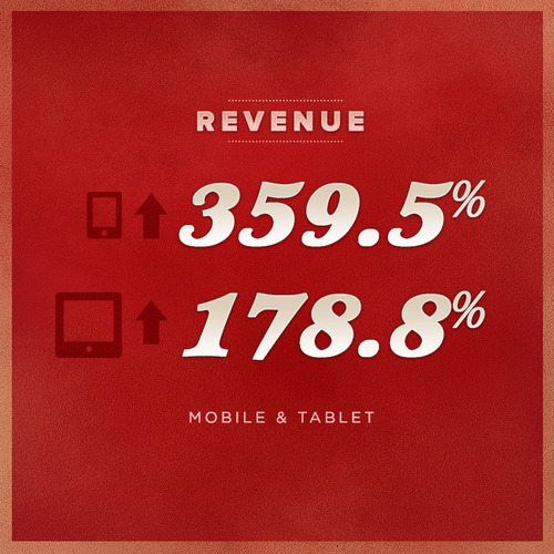
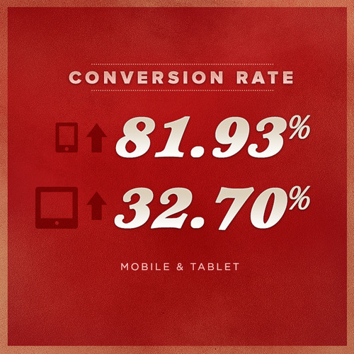
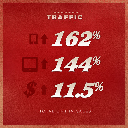
Smart phone traffic rocketed up 162.4%, accompanied by an 82% conversion rate improvement. The mind-blowing result: a 359.5% revenue increase from smart phone users.
Tablet performance was quite impressive too. Tablet traffic jumped up 144.4%, paired with a 32.7% conversion rate lift. Consequently, revenue from tablet users soared northward by 178.8%.
For perspective, let’s compare those results with our standard web (non-mobile device) performance. During the same time period (from launch until the end of August), standard web traffic was up 46.65%. And our conversion rate elevated by 17.8%, helping generate a 40.6% revenue increase. Great results, but very mortal compared to the superhuman performances from the mobile web platforms.

A responsive web upgrade wasn’t a guaranteed victory, and some in the company were skeptical. But we challenged our thinking and the false-positives of our previous web statistics, knowing we could do better. We did, learning a few key lessons along the way:
- A mobile user experience is as important to customer satisfaction and sales growth as any in-store experience.
- For brands and businesses new to the world of responsive web, expect mobile revenue growth to outpace mobile traffic growth.
- Combined, all forms of mobile traffic and revenue growth trounce standard web traffic and revenue growth.
We acted quickly to launch our responsive upgrade in Q1 of this year. That sense of urgency meant we de-scoped some additional web improvements for later. Later is now.
Facing Forward, Looking Up
We’re now focusing on improving the site’s performance, making it lighter than its current 3MB (our homepage). Implementing better media queries can, in part, help us achieve that efficiency. A number of usability enhancements are also in the works. All of it will be coming to homage.com in early 2014.

Our culture has learned to embrace the vital importance of a strong and responsive web presence. That means our work is not done, nor should it be for you. The quality of your brand experience is defined wherever your customers interact with it. Increasingly (by galactic orders of magnitude), that first experience is your website on a mobile device. So ask yourself, is your brand delivering a worthy first impression on the web? Or do false-positives have you fooled?
Special thanks to Matt Gartland for editing this post, and to Phil Franks for the graphic assets.
If you have any questions for Jonathan, feel free to get in touch with him at @pomajp on Twitter. Also, check out This Is Responsive for more responsive design case studies.