Layout & Grid in Design Systems
Simply saying the word “grid” conjures up strong and confusing feelings. Kinda like puberty! With so much history and so many different (and sometimes competing) paradigms, it’s no wonder conversations around layout and grid are so fraught, confusing, and contentious. I’m long overdue to share how we tend to think about and execute layout/grid in design systems, so let’s dig into it.
Boxes to put stuff
The bulk of a design system’s component library can be thought of as stuff. Buttons! Accordions! Form controls! Stuff! Layout and grid serve as boxes to put all that other stuff, and as such they require some different thought and consideration than other stuff-shaped components.
Layout and grid are concerned with how all the UI components hang together and behave responsively to create a whole, honest-to-goodness user interface. I’ll share some of the layout/grid concepts and tactics we’ve found to be successful over the many years implementing design systems. But first a disclaimer: I fully recognize you can skin this layout/grid cat many different ways, so try not to freak out if you see things that might differ from how you’ve approached things. It’s ok, I promise.
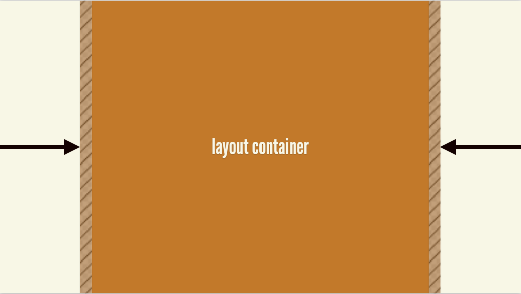
Layout Container
The layout container component is an important, invisible component that caps the width of the experience so the content doesn’t go full-bleed to the width of the viewport. It also controls the gutter padding so content doesn’t butt up against the viewport edge.
See the Pen Untitled by Brad Frost (@bradfrost) on CodePen.
<ds-layout-container>
  <!--content goes here-->
</ds-layout-container>
This component can be used to contain the contents of an entire page, but can also be used inside components like Heros and Bands that span the full viewport width and provide a splashy background color, gradient, or image. The Hero or Band background should span the full viewport width, but the layout container component caps the inner content to a reasonable maximum width and provides alignment with other contained page elements.
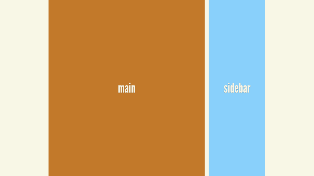
Page Layouts
Page layouts, as the name implies, are containers that provide page-level layout configuration. Think things like “Two-column layout with right sidebar” or the holy grail layout.
See the Pen Layout 2-column with sidebar example by Brad Frost (@bradfrost) on CodePen.
<ds-layout variant="right-sidebar">
  <ds-layout-section name="main">
    <!--main content goes here-->
  </ds-layout-section>
  <ds-layout-section name="sidebar">
    <!--sidebar content goes here-->
  </ds-layout-section>
</ds-layout>
Including common page layouts is very much an “it depends” type thing, meaning that teams can include them in the core design system…or not. The main reason to include page layouts in a design system is to ensure other UI components included in the library work properly with these common layouts. In absence of container queries (more on this soon), including layouts is the only real way to really guarantee any design system component — say, a complex weekly schedule component — looks and functions properly when plunked into a layout container, a main column, a sidebar, etc. Developers would write conditional code like.l-sidebar .c-table { display: block } in order to adjust styles to ensure components render properly in different layout contexts.
Grid
Now here is the real reason you’re here reading this article. You don’t care about layout containers or page layouts. “Tell me about the GRID SYSTEM. TELL ME HOW TO DO THE GRID SYSTEM, BRAD” I hear you screaming at your glowing screen. Well, alright then.
Oh grid, you confusing sonofabitch. I have many thoughts and feelings about grid systems and their history, baggage, and misconceptions as they pertain to web design/development. Thankfully, Donnie D’Amato deftly articulated these concepts and feelings on a website called gridless.design:
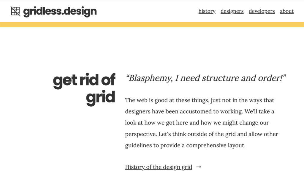
I encourage you to give the entire site a read (it’s only a couple web pages long), but the gist is that the “grid” the designers wield (those ever-present light pink lines superimposed over a whitespace-rich design comp) is a different beast than the “grid” that developers wield (which includes CSS Grid, Flexbox, and a slew of other modern CSS techniques).
This interdisciplinary disconnect around grid’s mental model affects how teams execute grid. In a broken, unidirectional, “developer handoff” process, design comps are treated as sacrosanct, and developers see that 12-column semi-transparent pink guideline as a hard requirement that must implemented exactly as articulated by the static design tool. This is how a “how to do a 12-column grid in HTML/CSS?” Google search ultimately led to massive success for tools like Bootstrap. Despite the introduction of many new CSS technologies and layout techniques over many years, this antiquated 12-column mental model still dominates a lot of conversations around layout and grid. Not that I’m jaded or bitter or anything.
How we handle grid in design systems
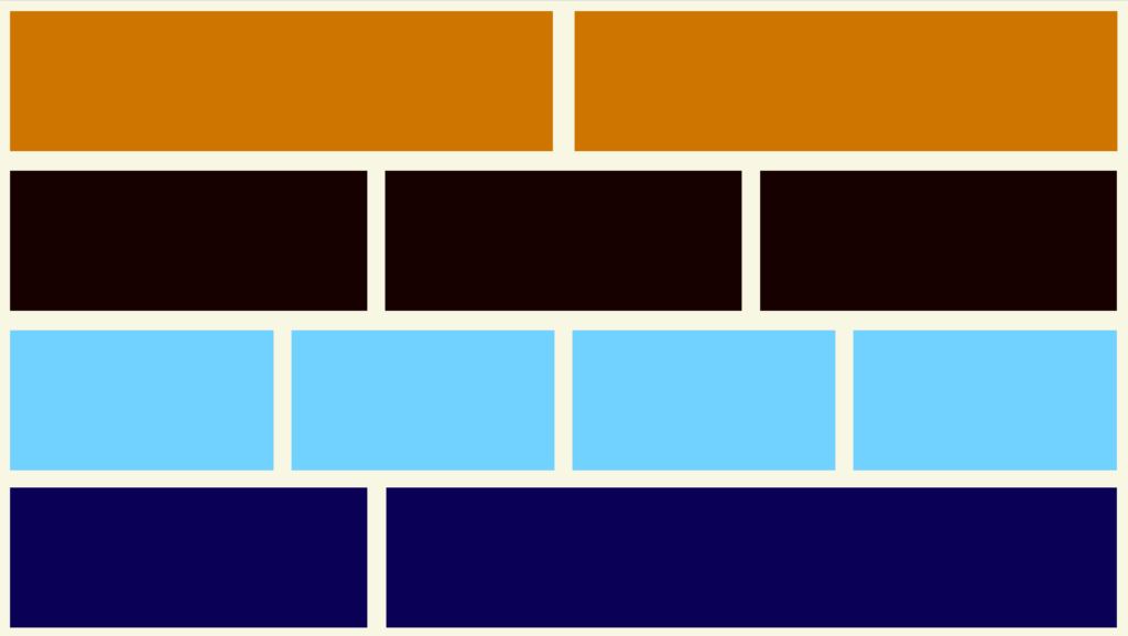
If creating a strange 12-column grid isn’t the way to go, then how do we implement grid? The basic gist: we add a grid component with accompanying grid-item subcomponent to the design system library. The grid component provides common repeatable layout behaviors, such as side-by-side, 2up (two items that are stacked on small screens and then move to a side-by-side configuration when space allows), 3up (same as 2up but going from stacked to 2 across to 3 across), 4up, and so on. A variant property controls the specific behavior to be applied to the grid items.
<ds-grid variant="2up">
  <ds-grid-item></ds-grid-item>
  <ds-grid-item></ds-grid-item>
</ds-grid>
See the Pen Grid example by Brad Frost (@bradfrost) on CodePen.
That’s the extent of what these components do. They don’t handle things like margin or padding (which could be added with utility classes if needed) or have any other responsibilities; they are simply boxes to put and arrange stuff. The end!
Here are a few common variants our grid components we develop for our clients’ design systems:
- Side by side – displays two items beside each other regardless of the viewport size
- 2up – stacks items, but displays items beside each other when the viewport becomes large enough
- 3up – Stack items until there’s enough room to display them side by side, then display as three across when enough space is available
- 1-to-3up – Stack items until there’s enough room to display as three across. This is good for situations of _only_ three items (such as “promo touts” on a homepage) where an orphan on medium viewports is undesirable.
- 4up – stacked to 2up to 3up to 4up when space becomes available
- 2/3 – One item occupies 2/3 of the available space and another occupies 1/3 of the available space
Of course, the specific number of variants depends on the project, but it’s often some flavor of this.
It’s increasingly apparent that writing solid CSS grid code is critical for design system and product work. Here are CSS grid resources I’ve found to be valuable over the years:
- Layout Land channel by Jen Simmons
- Grid By Example by Rachel Andrew
- Complete Guide To Grid on CSS Tricks
Design system boundaries and our near-future
Design system creators and the front-end development community at large have long wanted the ability to create fully-fluid components, drop them into any layout, and have things Just Work. Until recently, that wasn’t possible.
Thankfully, container queries are finally a thing! While at the time of this writing support is incomplete, our blissful, container query-powered future is nearly upon us. There are many great articles about container queries out there, so you can dig into the technical weeds elsewhere. But the basic gist is that rather than writing @media queries (e.g. @media (min-width: 60rem)) like we have been for over a decade, we’d largely switch over to writing @container queries (e.g. @container (min-width: 60rem)). Rather than listening to the whole viewport, we want to listen to the size of the parent box we’re putting our component into. Here’s what that means for design system creators:
- Design system developers create fully-fluid components and use container query syntax to manage each component’s breakpoints.
- Design system developers provide layout and grid components (outlined above) for common layout solutions.
- Design system consumers do one of the following:
- Use design system-provided layout and grid components in their products
- Create product-specific custom layouts and grid solutions
- Consumers drop design system components into ds-provided or custom layouts, and those components Just Work, irrespective of the layout they are placed into.
I’ve long pontificated to Ian that in time, the bulk of a UI will be provided by the design system, which will drastically cut down on the amount of custom UI code a product team needs to create. And the bulk of that code will be writing custom CSS grid code to handle things like laying out complex custom forms or other page-specific situations. With fully fluid, container query-powered components in place, product teams can drop design system components into complex, bespoke grids. Pretty cool!
Layout and grid: it’s (not) complicated
I hear layout and grid talked about in extremes: it’s either this totally easy, trivial thing or a totally unknowable, unsolvable riddle. Like most things, the truth seems to be somewhere in the middle. There indeed an art to crafting an elegant, intuitive layout and grid solution for a design system. On the other hand, all we’re really doing is putting a couple boxes beside one another. It’s hard. It’s easy. It’s weird.
I hope you’ve found this helpful. As I mentioned, there are many different ways to approach layout and grid for design systems. If you’d like to share other techniques with me — or challenge me to a duel — please get in touch!