Revisiting the Priority+ Pattern
In his article Obvious Always Wins, Luke Wroblewski warns of the dangers of sweeping links and actions under the rug. It’s challenging to find the room to expose important actions on constrained mobile screen sizes, but it’s necessary for designers to do so.
A while back, I took a look at a few responsive navigation and multi-level responsive navigation patterns. I discussed the pros and cons of the Priority+ navigation pattern, which exposes the most important links and tucks the remaining items behind some form of “more” link. I wasn’t very enthusiastic about the pattern in my original assessment (“Nobody clicks ‘more’ links” I said), but I’ve come around to the pattern for the visibility it provides.
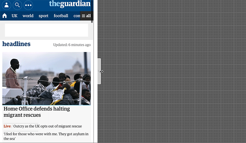
The Guardian makes use of the Priority+ pattern for its section navigation. The navigation is organized in order of importance: UK > World > Sport > Football > Comment and so on. As screen real estate becomes available, additional sections are exposed with the full section list available by selecting the “all sections” button.
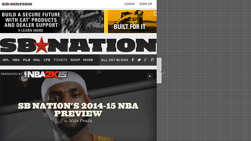
SBNation also employs the Priority+ pattern for its section navigation. They expose the most popular sports in order they feel makes the most sense for their readers: NFL > NBA > MLB > NHL and so on. Additional sports are accessible by an admittedly too-subtle “more” link.
This pattern surfaces the most frequently accessed links or actions, while still providing access to the breadth of other available content or features.
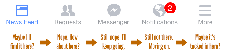
Moreover, this pattern does a much better job educating the user about what this interface element is (“Local, world, sports, more…this must be where I can see the site’s various sections”) than a relatively opaque pattern like the hamburger menu. It also creates a scent for the user to follow. For example, a mobile Facebook user looking to create an event might follow a path that looks something like this::
This ability to scan these labels left-to-right and feed right into the overflow “more” link feels like a more natural discovery flow compared to everything hiding beneath an ambiguous icon. The Priority+ pattern simply gives a much better scent for the user to follow.
The Priority+ pattern (and the overflow pattern, which I’ve written about before) makes use of available screen real estate. As screen space increases, the number of exposed links increases as well, which can results in better visibility and more engagement. The fact that it scales quite nicely across different screen sizes without having to transform the pattern is a nice bonus as well.
Considerations
- Navigation is branding – I’ve been asked what I think of sites that employ the hamburger menu on large screens as well as small. Squarespace is (or at least used to be) an example of this. While sweeping the navigation under an icon frees up space, it also removes a crucial opportunity for branding. Navigation doesn’t just provide wayfinding for users, but also communicates to users what features and services the experience provides. For a company like Squarespace whose brand name doesn’t exactly convey what they do, exposed primary navigation can help potential customers better understand the services they provide.
- Navigation is political – organizations employing the Priority+ pattern need to make a decision about the hierarchy of links inside a navigation. Navigation can be one of the most political areas of a site (“If you remove that newsletter link I’ll tear your face off!”). One workshop attendee shared a story with me where one department got demoted further down the list and consequently saw traffic to the section drop substantially.
- Makes Assumptions – the Priority+ pattern requires designers to make an assumption about the relative importance of each navigation item. Hopefully research, analytics, and data are guiding these decisions, but be aware that the items your organization prioritizes may not be the same items your users are looking for.
With navigation it’s essential to find the balance between accessibility and unobtrusiveness. I feel that the Priority+ pattern provides a sense of clarity our hamburger-riddled landscape could learn from.