Launching a Campaign Website…Quickly
I had the opportunity to make a website for Brian Forde, who is running for Congress in Orange County, California.
Brian got in touch after reading my Designing an Effective Donation Form blog post, and wanted to bring that thinking to his campaign website. So on July 7th we hopped on a call, where I learned that Brian worked as a Senior Tech Advisor in the Obama White House and is running for office so he can improve peoples’ lives, use technology to make government more capable & efficient, and combat the toxic, xenophobic views & policies coming from the other side. All this very much aligned with my own values, so while I typically shy away from political stuff, I decided to take on the project.
Then came the big question: when does the site need to be live? “July 17th,” he said. Of course, that meant the site would need done in a little more than a week.
I signed on to build a website in a week the way that some people drunk-buy stuff off of QVC.
— Brad Frost ? (@brad_frost) July 7, 2017
Normally building a site in such a short window of time isn’t a great idea, but I took it on for a few reasons:
- I (bizarrely) had availability during that window.
- I wanted to see if I still had it in me to launch a site in such short order.
- But I also wanted to see if I could execute a good design process even with an abbreviated timeline.
- Ian hasn’t experienced the rush of tight-turnaround projects. Most of our work has (thankfully) involved slower, deliberate burns, so I felt the project would give him a good taste of how a lot of people work. Plus, it builds character.
- Like most people depressed with the state of the country, I’ve been asking myself “what can I do to help?” Designing and building websites is what I do, so designing and building a website for a progressive Congressional candidate seemed like a very tangible way to put my skills to use to advance the values I feel are best for the country.
So challenge accepted. This post will talk about how we built Brian’s campaign website in a little over a week.
The Process
Step 1: Gathering and Setting Up
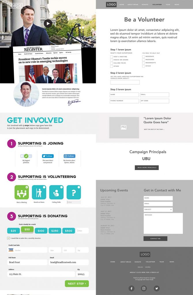
Once the contract was signed on July 8th, we dove right in. Unlike an established brand or company, the campaign was in the early stages of putting their identity and operation together. I asked them to pass along any materials they had, and they sent through a work-in-progress logo, a link to a logo design they ended up not using, some copy for campaign principles, some inspiration sites, and some wireframes and a comp a friend had done:
Brian explained which aspects of the inspiration sites he gravitated towards, and talked about what he liked and disliked about the comp and wireframes. This was enough fodder to get to work.
Getting Pattern Lab up and running
Knowing this would be a tight turnaround, we knew we’d be designing this project entirely in the browser, reducing the amount of wasted energy going towards artifacts that weren’t an actual website. Using Pattern Lab Node, we were able to spin up an empty project and we quickly imported our vanilla CSS architecture, common Gulp tasks from other projects, and default starter patterns. (I’m hoping to share this whole setup soon, as it’s basically how I start almost every new project).
With Pattern Lab set up, we were ready to get to work.
Step 2: Establishing design direction
Decoupling design conversations
It’s amazing how certain design artifacts muddy the waters and inhibit good conversation from happening. When static comps are presented, conversations about look and feel get distracted by content, information architecture, and layout. I felt that Brian and the team were already having a hard time reacting to everything locked up in the initial comp and wireframes.
One thing I’ve learned (and written about in my book) is to decouple conversations about IA and visual design early in a project so as to have productive conversations about each topic without getting tripped up or distracted.
Isolated IA
For conversations around IA, we’ve found a simple spreadsheet cuts through a lot of the noise that formal wireframes tend to create. From chapter 4 of Atomic Design:
With a few simple spreadsheet columns, we can articulate which display patterns should be included in a given template, and what content patterns they’ll contain. More importantly, we’re able to articulate each pattern’s relative hierarchy and the role it plays on the screen. If you read the leftmost column vertically, you’re effectively looking at the mobile-first view of what the UI could be.
So we created a spreadsheet that stubbed out the IA for each page, defining components, the jobs they need to do, and their order on the page. This allowed the campaign to work through what they wanted the site to accomplish without worrying about layout, color, functionality, etc.
Parallel to this process, Ian was working in Pattern Lab to stub out all the pages and linking them together. And just like that, in a few minutes we had a basic bones of a website that would evolve into the final product.
Quick & dirty visual direction
For visual design direction, I was initially toying with the idea of putting together some style tiles (or rather, their in-browser style prototypes) to talk about color, typography, and texture. But even that felt wasteful.
So instead I opted to conduct a 20-second gut test exercise. I rounded up a handful of inspiration sites (including the ones provided by Brian) and used the web inspector to swap in the campaign’s work-in-progress logo, some images I found of Brian from a Google image search, some nav, and hypothetical headlines. I then presented each site to the campaign for 20 seconds, and had everyone vote on how happy they’d be if this was the site that we ended up with.
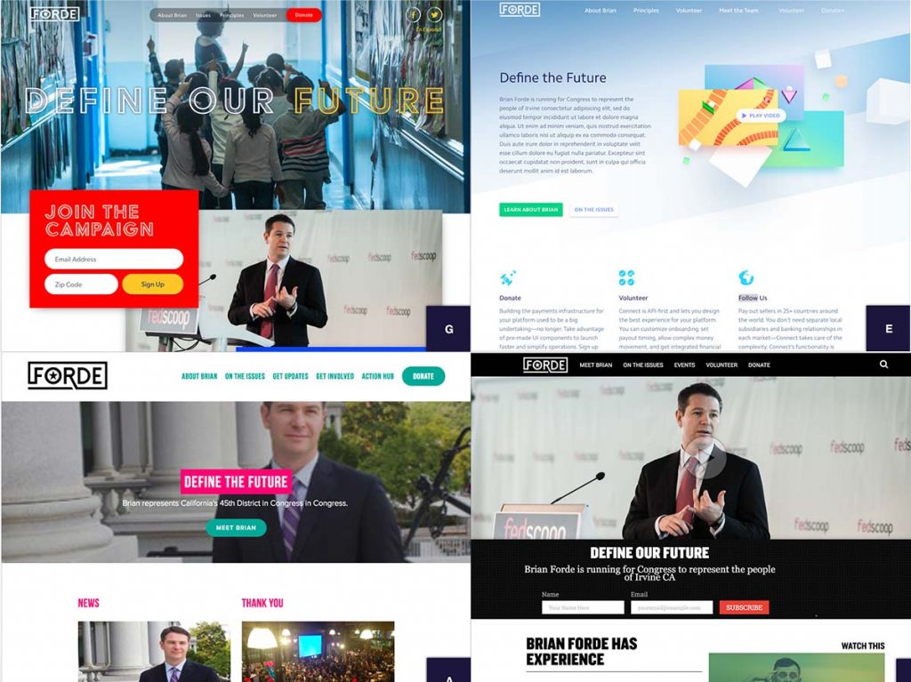
This was the first time I’ve ever conducted this exercise remotely, and unfortunately Google Forms was acting up so I couldn’t see the vote tallies to formally rank each site. But we were able to walk through the designs and discuss what each person liked and didn’t like about each one. With a little time in the web inspector, I was able to “design” and present over a dozen directions for the site. Keep in mind that this exercise was not an attempt to copy any of these site designs, but rather an attempt to extract general themes that could help guide the visual direction of our custom design.
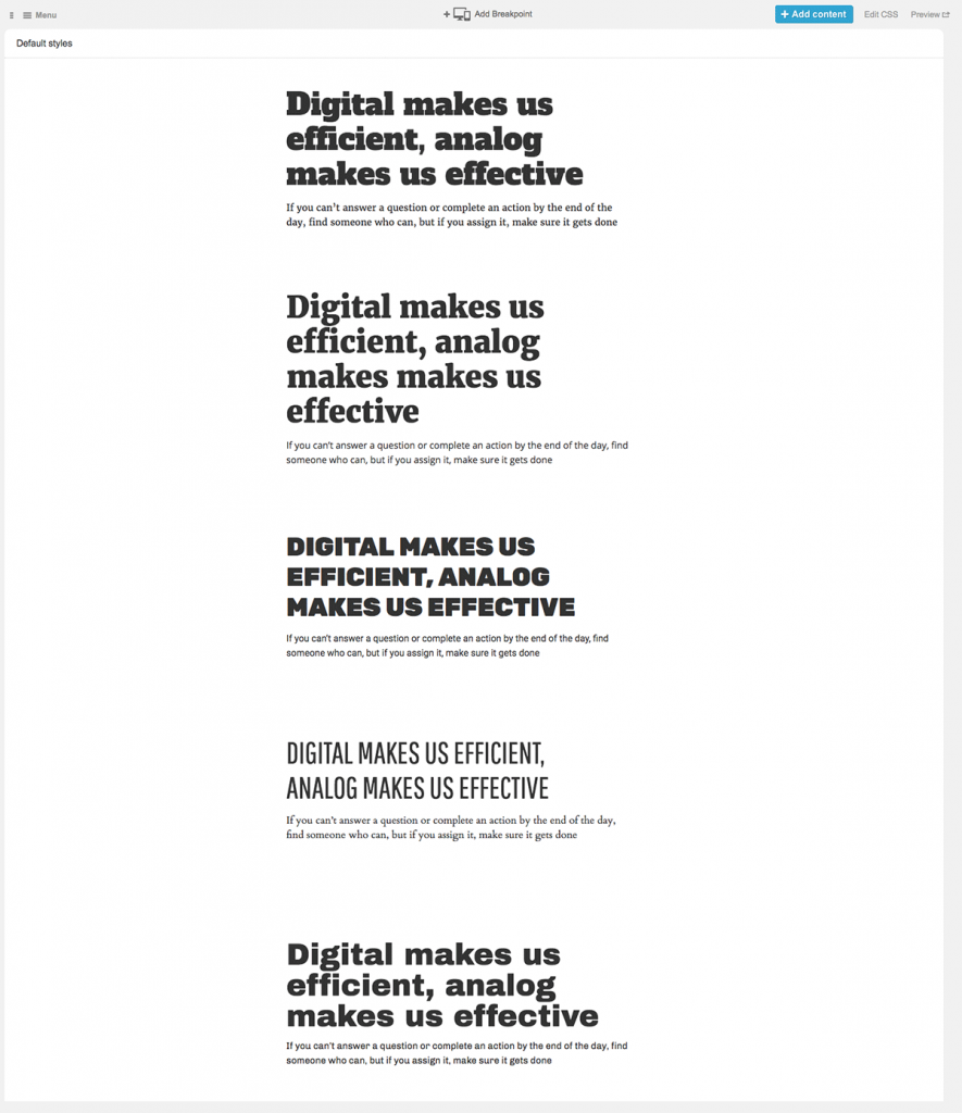
Typography
One of those themes was around typography. A few of the sites that scored well in the 20-second gut test all had bold, pronounced typography.
I put together a Typecast project that stitched together different Google Font pairings (I used this site for help).
I showed this to the campaign, but we didn’t have to go through it in any depth. I ended up solving this in a different way, which I’ll describe later.
Frontend Prep Chef Work
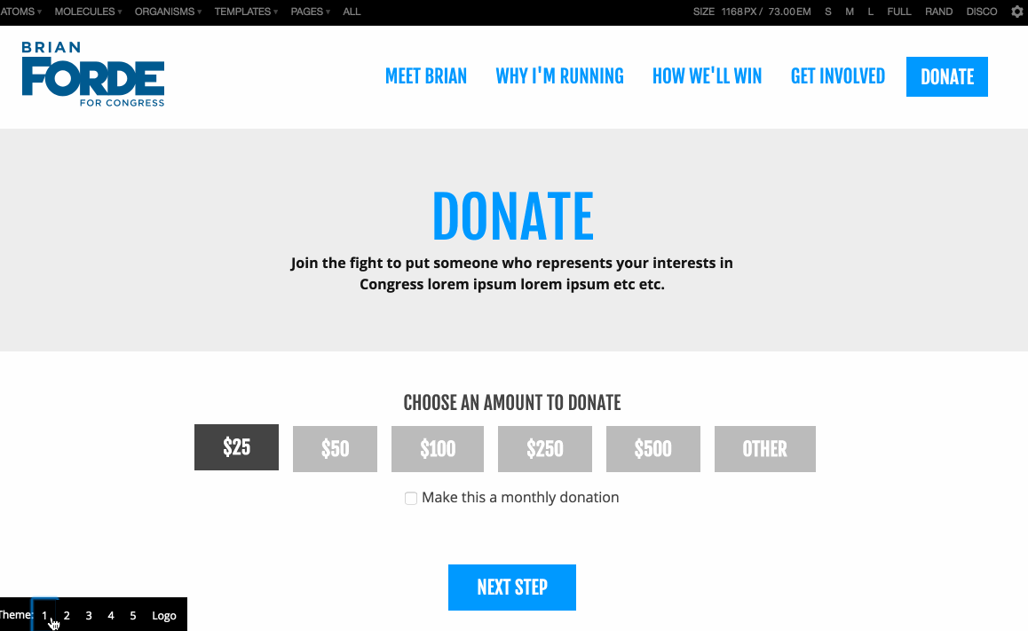
While we were talking about design direction, Ian was working behind the scenes to create a lot of the patterns we knew we’d be implementing. Things like headers, footers, hero blocks, form fields, text passages, and so on were all safe patterns to start building out. Other things, like the donate form, needed wired up with third-party tools, so we prioritized building those components out.
This frontend prep chef work allowed us to put the structural foundation of the design in place, which wasn’t likely to radically change even as the visual design was established.
Theme Switcher
Ian and I were thinking about how to start weaving color, typography, and texture into the codebase without committing to one direction.
What we decided on was to build a theme switcher. We threw a bunch of Google Fonts from the Typecast exploration into the <head>. We created a two-tiered Sass variable structure that allowed us to quickly swap out colors (like button colors, block backgrounds, etc) and other properties from one file. We then had Gulp bounce out a few theme files like theme-1.css, theme-2.css, theme-3.css, theme-4.css, and theme-5.css. I then hacked together a little widget that allowed us to toggle between the theme CSS files.
This ended up working really well. On a call with the campaign, we walked them through each one of the themes, and they quickly decided on the one that they really liked. We didn’t burn too much energy building the extra themes, and once we made a decision, we burned down the theme stuff, lopped up the unused fonts, and defined the colors and type inside of Pattern Lab.
Step 3: Iterating over designs
At this point, we had a basic design direction in place, quite a few meat-and-potatoes patterns in place, a solid IA, and so on.
From here, we were able to put our heads down and evolve the designs in the browser. We established components that weren’t already in place, built up the fidelity of the ones that already were, and generally started making the site feel like a cohesive site.
The ability to build patterns in isolation but simultaneously see the patterns in context of actual pages is big. It’s still in my opinion the biggest benefit the atomic design methodology provides. It’s the same reason why Pattern Lab is my tool of choice for doing frontend work.
Step 4: Content, integration, testing, and cleanup
We were making progress on the site’s design and functionality, but there was a problem. We didn’t have any content. And we needed a place to actually serve the site.
Jekylling all the way
When the project began, we talked about what CMS would actually serve up the website. I talked with the campaign’s CTO, Derek Frempon, about which direction to take. Because it’s ultimately a pretty static site with a few forms, we decided to go with Jekyll. I know Jekyll well, and I’m pretty sure a project due in a week isn’t the right time to learn an entirely new CMS.
Even though we technically weren’t on the hook for the integration, we spun up Jekyll, populated the templates, includes, and brought over the rendered CSS, JS, icons, and images from Pattern Lab. We were able build an export-to-website Gulp command that moved over all the assets from Pattern Lab into Jekyll. Unfortunately, the component markup required manual translation to get it to work, but it wasn’t too bad.
Content last, and that’s ok
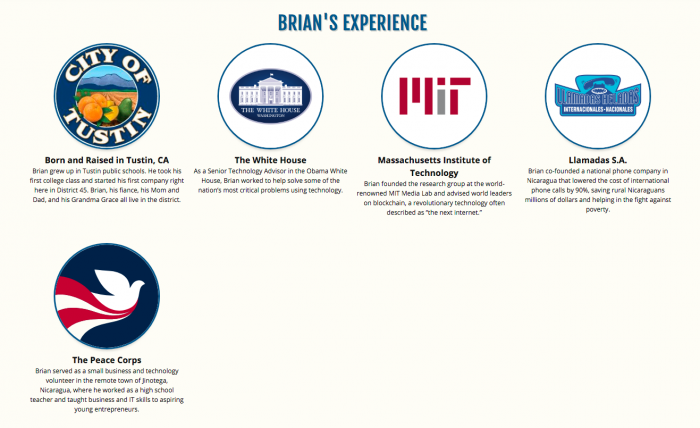
As an industry we love to hate on the “just pour in the content after the fact” mentality. There are many good reasons for that. But sometimes it’s just a project reality where everyone’s scrambling to create content on a deadline, which was the case with this project. The campaign worked really hard on messaging, tone, and content, and much of it happened in parallel with the web design process. They really came through in the end. I woke up one Tuesday morning to see all the lorem ipsum text wiped out and replaced with thoughtful messaging about helping people and how technology should be wielded by the government. Great stuff. They had to get their head around Markdown syntax, but with a little guidance, they were able to populate the site.
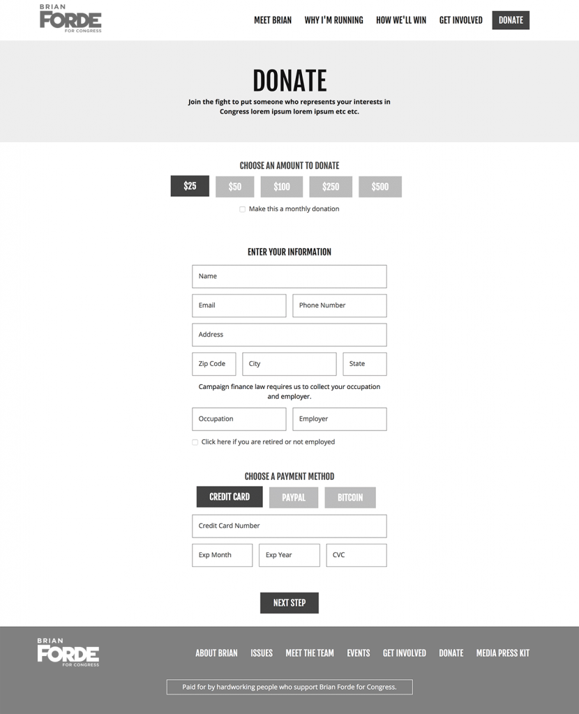
Of course, when you pour content into an existing design, it’s likely not going fit perfectly. We had to do some massaging to align the content with the design to avoid launching with stuff like this:
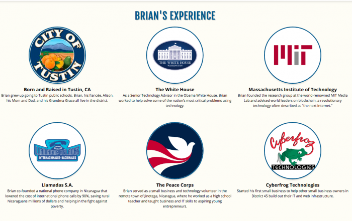
But instead something like this:
After some more QA, cross-browser testing, we launched the site on Wednesday the 19th.
The Result
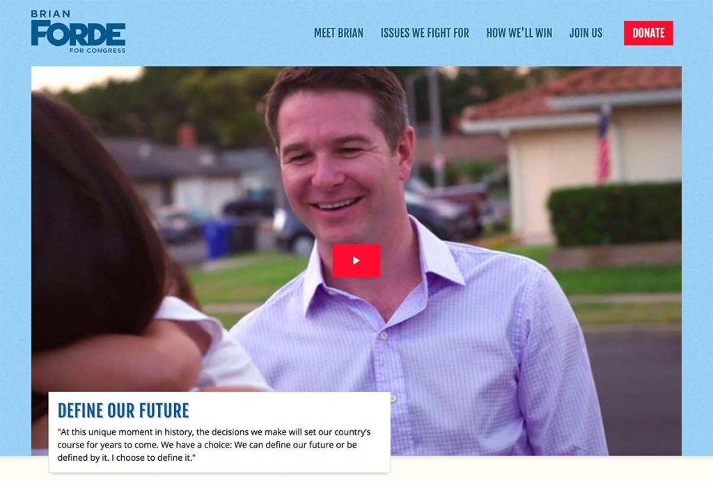
I’m pleased with the result. You can check it out at forde.com to see what we ended up with, as well as (of course) check out what Brian has to say.
Takeaways
- Pro bono work can lead to paying gigs, provided you take the time to share your process and things you learned. Our food bank project was a fulfilling project in a lot of ways, and I’m happy we were able to share so much.
- Lean on existing patterns and infrastructure. Ian and I already had solid frontend guidelines in place based on past work for bigger clients, so we were able to get straight to work rather than having to discuss how we’d approach things like CSS architecture, commenting, JavaScript, etc.
- Designing in the browser allows you to get closer to a final product much faster than juggling a bunch of static artifacts. With the exception of a single spreadsheet and a pen and paper sketch, the entire process was done in the browser.
- I’ll take quick sketches and conversation over highly-polished design artifacts any day of the week. Static artifacts are often used as a replacement for conversation. It’s incredible what you can accomplish when you talk through potential directions and make some decisions.
- Pattern-based design and development isn’t just for huge organizations. I get a lot of people asking me, “when does a pattern-based design and dev process not make sense?” People often say that for small sites, patterns, atomic design, design systems, style guides blah blah blah all seems like overkill. Far from it! Even a 6-page campaign website greatly benefitted from a pattern-based process. We were able to build for reuse, establish a handful of patterns that could be combined and displayed in unique ways, and we were able to save a lot of testing effort. Moreover, with a system in place, they’ll be able to iterate much more as the site evolves.
- This is an evolution. The campaign is now launched, so really this is just the beginning. They have a solid website foundation in place, so now the fun of iterating, optimizing, and tweaking begins. The campaign will no doubt grow bigger and more complex, which of course will translate to the size and complexity of the website. Putting a solid foundation in place makes scaling and evolving that much easier.
I’m happy with how the project turned out, and I’m looking forward to seeing Brian help flip the House!