I Have No Idea What The Hell I Am Doing
I recently had the opportunity to be the opening keynote at Generate Conf in New York City. I got a chance to talk about dealing with uncertainty of the future. Here is the video of the talk:
And here’s the transcript:
Thank you. How’s it going New York? It’s good to be back. Like Oliver said, my name is Brad Frost, and I have absolutely no idea what the hell I am doing. Thank you Dave Rupert for coming up with this beautiful title slide for me inadvertently.
I think that we’re a lot like this kid. We’re just getting blasted in the face with more things than ever before. We have to make things that work on more devices, more device classes, viewports, browsers, environments, user settings. There’s more technologies to use, more software, more tools, libraries, frameworks, for us to choose from. And just to keep up to date with everything, we have to follow more blogs, more Medium posts, more Pastry Box posts, Net Magazine posts, more tutorials, more podcasts, more conferences, more videos, more newsletters, more tweets, more opinions to pay attention to.
The funniest part about this scene is–well the whole thing’s funny–is that he’s just sitting there taking it. He doesn’t have to be, but he’s like “Who are you? Why are you doing this to me?” But he has the option, right? And again, we are this kid. We have the option to decide whether or not we want to sit there and get blasted in the face by all of this stuff and continue to be overwhelmed and inundated with technology and decisions. Or we can figure out a way to step away from the hose.
Responsive Design
So this is our reality now. This is, as web designers, this is what we’re struggling with. We have all these different tools, all these different viewport sizes, all these different device classes. And this is the promise of responsive web design. Now all of a sudden we can create these layouts, these squishy websites, that just magically adapt their layout depending on whatever the viewport size is. And that’s fantastic, because boy do we have a lot of viewport sizes we have to support now.
But for whatever reason even still to this day, five years later–responsive design just turned five years old–I still see a lot of this. Read some tutorial on responsive design and I see values like 320px, which is an iPhone 4 in portrait mode. 480px, iPhone 4 in landscape mode. 768px, an iPad in portrait mode. 1024px an iPad in landscape mode. The fold. Oh god the fold. All the time. All the time with that.
But this idea that there are such things anymore is just totally out the window. Samsung shits out a different-sized black rectangle every 30 seconds. And Apple’s in the game now too. The iPhone 6 and 6 Plus, I love this GIF:

It just sums it up so perfectly. So now we have values like 375px for the iPhone6, and 414px. And now we have more powerful tools like Sass, and we bake this language: “Well we need to make our sites work on phones, and tablets, and desktops.” And we bake those into the language and our workflow. But Jason Grigsby, as he so eloquently puts so many things, says:
Any attempt to draw a line around a particular device class has as much permanence as a literal line in the sand. Jason Grigsby
It’s selling the Web short–and what we do short–by trying to put things in buckets and only caring about phones, tablets, and desktop machines. It’s our job as responsive web designers to not just cater to the current crop of devices out there, but also recognize that we just don’t know. I don’t know, the people that write at The Verge don’t know what the devices next year are going to be and what their viewport sizes are. So it’s up to us to craft layouts that work on any viewport.
So I made a little tool called ish. It’s called “ish” because when you hit the “small” button it gives you a small-ish viewport, you hit the “medium” button it gives you a medium-ish viewport, and you hit the “large” button and it gives you a large-ish viewport . And you hit it again and it gives you a different value. The idea–this isn’t terribly practical from a development or design standpoint–this has everything to do with educating our clients, our stakeholders, our colleagues, that yeah it’s on us. We’re not just making something that’s going to look good on an iPhone; it’s our job to make an experience that’s meant to be beautiful and functional across any device, any viewport size that happens to access our site.
Of course there’s the client-favorite Disco Mode–I threw this in here–it just bounces your screen around. And the clients they look at it and they’re like “Hahaha look at it go! Look at it go!” And it’s great though, because again it’s helping them–it’s a bit cheeky–but it gets the point across that what we’re trying to do is make an experience that’s just totally bulletproof, no matter what viewport size happens to come around the corner. We’re ready for it.
Progressive Enhancement
Viewport’s one thing, but as we all know, this isn’t the Web anymore, even though we still create on these desktop machines. But now we have all these smartphones, dumb phones, e-readers, tablets, netbooks, notebooks, desktops, TVs, game consoles, all these other things that can access the Web. And these things all have varying capabilities. And that’s just what we’re having to deal with right now: the watches, the smart fridges that you can go buy today if you wanted to. What’s more important than these things that exist today are these question marks. Nobody knows–again not those people at The Verge, or Engadget, or whatever–nobody knows where the device and Web landscape is going to be even a year from now.
And yes, our browsers are getting more powerful, our browsers are getting more powerful, yes our machines are getting more powerful, Moore’s Law is still very much in effect. But at the same time, there’s two parts to Moore’s Law. There’s the technology itself increasing: faster processors, faster chips, all of that good stuff. But there’s also this idea of cheap devices. And we’re starting to see this flood of cheap, good-enough devices that Scott Jenson calls the Zombie Apocalypse of these low-powered, underpowered, good-enough Web-enabled devices.
The web is not a platform. It’s a continuum. Jeremy Keith
As Jeremy Keith so eloquently stated, the Web whenever we talk about it in terms of a platform, we’re putting it on the same level as iOS, or Android, or even something like Flash. This binary you-either-have-it-or-you-don’t. But Jeremy says it’s so important to understand that the Web is a continuum. That across all of these different Web-enabled devices, across all of these technologies, browsers, user settings, or whatever, there is a spectrum that we need to support. And the Web is actually very well-equipped to deal with that. And this is why progressive enhancement matters so much, in this day in age.
So instead of starting with all these assumptions that we’ve always had: oh of course the user has the latest version of Chrome. Of course they have JavaScript support. Of course they’re on a wired connection. Of course we have their full attention. Of course they’re on a large screen size. Of course they’re on a capable, efficient input method like a mouse and a keyboard. And making all those assumptions and designing and developing around those things, and then figuring out after the fact how to cram all that shit down into a small screen.
Instead we need to do what Luke Wroblewski has been talking about for years now. This idea of flipping everything on its head and embracing the fact that the mobile medium provides these constraints that are extremely helpful for us. In that, instead of making all these assumptions, maybe we should start off by saying: yeah of course the user is on a small screen. On a shitty edge network. Of course they’re on a really crude D-pad or touchscreen something that’s more of a course input type. Of course they’re hurried and distracted.
And we solve all our business goals, we solve our user goals, we solve our content goals at that most constrained environment, and then as screen space becomes available, as browser support more available, as features become available, we’re able to take advantage of those and layer on enhancement. That is why progressive enhancement matters so much.
And there’s been this big flood of MVC, really heavy-handed JavaScript libraries. And the thing is always “Oh well nobody switches off JavaScript anymore” and that’s true not many people are doing that. But at the same time that doesn’t give us a free pass to just all of a sudden skip to the most fragile layer of the stack.
Progressive enhancement is more about dealing with technology failing than technology not being supported. Andy Hume
Because you have to answer the question: what happens when things go wrong? And they will go wrong. And you have to answer those questions. Do you give your users a middle finger in the form of a spinner? (That would actually be a pretty cool spinner). Or do we provide them content and functionality to the best of our ability. Start at that base HTML level, layer on CSS enhancements, and layer on JavaScript functionality.
[Note: the video cut out a video of me navigating my insurance company’s sluggish, spinner-heavy Web experience. It’s a shame because I thought it was pretty funny.]
At the end of the day this idea of progressive enhancement, this idea of Web standards, of starting with HTML and layering on CSS and layering on behavior on top of that is foundational work. HTML is ugly. I get it. It’s Craigslist. But it’s like concrete. Concrete is pretty ugly. It’s drab. It’s gray. But at the same time its what allows us to build all sorts of great stuff on top of it.
Future Friendly
There’s no such thing as designing a future-proof experience. But that doesn’t mean that there aren’t things that we can do to better prepare us for whatever’s going to happen down the road. And if you think about it–and this is a weird concept–the projects you are working on today are going to be interacted with on devices that didn’t exist at the time you made them. And this is something that’s happening increasingly–again every day–look at the new watches. This is really cool:
This guy’s demonstrating checking his Twitter feed on his watch, and happens to go to a website I made a couple years ago. That’s pretty cool, right? So this dude can access we made a while ago, before these watches were ever a thing. I wasn’t coding up the website going “Oh I bet these watches are going to be browsing this one day.” But this is what we’re talking about: being future friendly means embracing the unpredictability of the future.
Atomic Design
We’re not designing pages, we’re designing systems of components.Stephen Hay
Whenever we’re designing for an unknown future, we need to take better stock of what it is that we’re actually producing. Thinking about things in terms of screens or pages anymore just really doesn’t cut it. We have to break things down to their component pieces.
Anybody using Bootstrap or Foundation by Zurb? These things are great. Responsive design is hard. Multi-device Web design is hard. And here are these solutions, these UI toolkits, that we’re able to stitch together in any way we want. And it’s fantastic, and from a conceptual level I’m totally on board with it. Yeah, let’s make this system of components, as Stephen Hay said.
But this is my problem with these things. These things are tools. Singular. Bootstrap is a tool. Whenever I watch sci-fi movies as a kid, I could never shake the thought out of my head. Huh, I guess if given enough time, we just solve fashion. Some guy’s like “hey I think we should just wear jumpsuits from now on” and everybody’s like “Sure. Sold” And look at these happy people, they love it.
Obviously humans are a diverse bunch. We have different needs, we have different wants, we have different goals, and desires and all that. So whenever we think about these tools that give us the answers: here’s what your dropdowns look like, here’s what your buttons look like, and we implement those, you’re going to look substantially similar to the other sites that are happen to be utilizing the same tool.
Tiny Bootstraps, for every clientDave Rupert
So Dave Rupert wonderfully summed up what we need to be doing, and that’s creating tiny Bootstraps for every client. He goes on to explain further that these responsive deliverables–what we’re delivering to our organizations, to our clients, to everybody–should look a lot like fully-functioning Twitter Bootstrap-style systems that are custom tailed for your clients’ needs.That custom-tailored bit is the operative part of that sentence. It’s up to us to craft our own design systems.
Adn that’s what’s given rise to a lot of these front-end style guides and pattern libraries that have been released. Code for America‘s is amazing. Salesforce. Mailchimp. Yelp. Starbucks. And whenever you crack these things open, there’s patterns like “blocks 3-up“. So here’s a basic pattern they’re using throughout their interface, and you can resize the window to see how it works in a responsive environment. At the same time they’re establishing this shared vocabulary they can use for all future things. Here’s a featured list with a thumbnail and a headline and an excerpt. Here’s your data tables: a little simple one with 3 columns that’ll squish quite nicely onto small screens, and then here’s one that’s more complex and how does that work on small screens?
So I’ve been spending a lot of time thinking about these interface design systems, and how important it is to deliberately build up an interface design system. I’m calling it atomic design, and it’s meant to be a very deliberately way to craft your own design system.
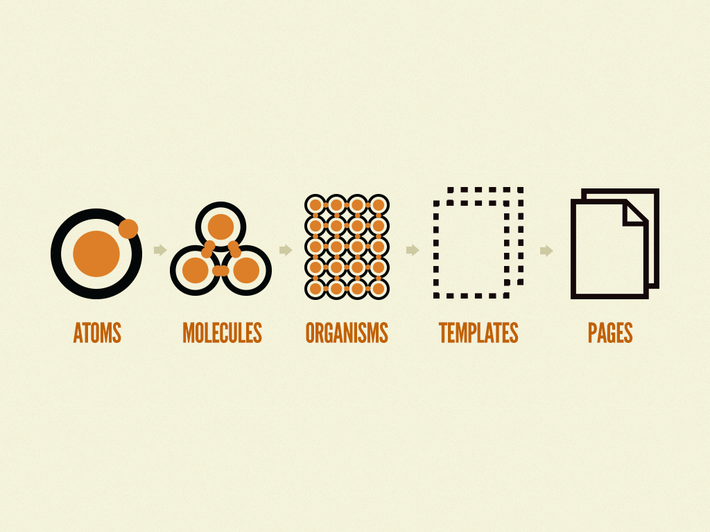
The progression of atomic design: from atoms to molecules to organisms to templates to pages
It’s sort of a talk in and of itself so if you want to read more about it you can buy my book.
So just last week Google released updates to their Material Design language, and I absolutely love seeing this because this is exactly what we need to be doing. Again, we don’t know if the stuff we’re designing and building today is hitting the mark 100%. That’s sort of a cocky thing once you think about. You do it once and go “oh it’s done, it’s solid.” These systems allow us to take them, implement them, learn from them, test with them, and roll all of that thinking, all of those learnings from implementing those systems, and roll it back into the language itself. And that’s what Google’s doing, and that’s what loads of people are doing with these design systems. Again, I don’t know where the system’s going to go; I don’t know how people are going to use it. So these pattern libraries and design systems are becoming increasingly essential.
Tools
Great minds discuss ideas. Average minds discuss events. Small minds discuss people. Henry Thomas Buckle
I love this quote. So I will take this quote and commandeer it.
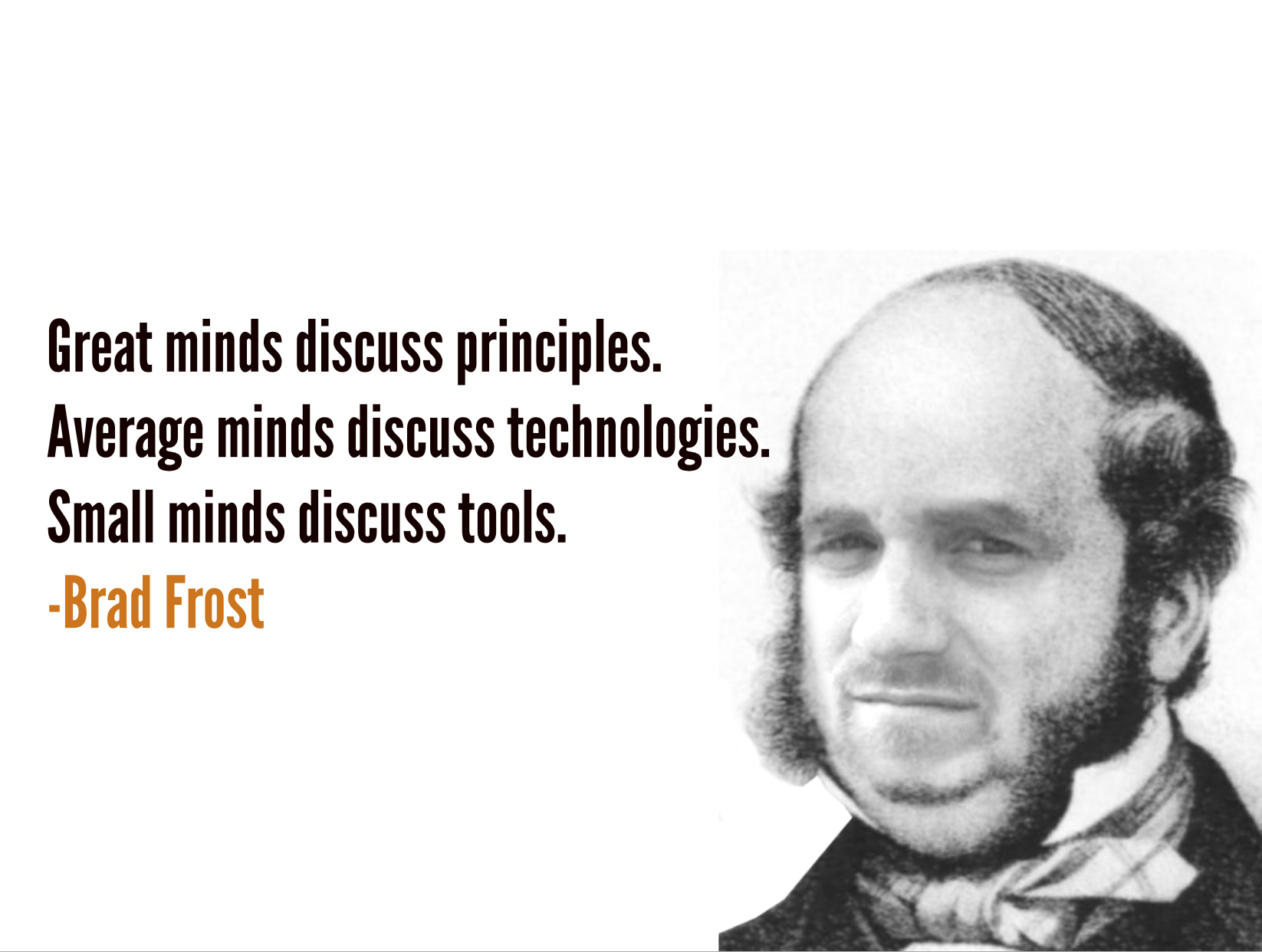
Great minds discuss principles. Average minds discuss technologies. Small minds discuss tools.
It’s kind of exciting to see exactly what you’re going to look like in 15 years. That’s the power of Photoshop right there. But yeah, the idea is that great minds think about principles, average minds discuss technologies, and small minds discuss tools.
Do me a solid: who’s a visual designer who uses Sketch? Where are my Photoshop people at? What about front-end devs? Who’s using Sublime Text? Who’s using, say, something else? So, we’re gonna play a little game called Gangs of New York. Reach under your seat, there are cleavers and butchers’ knives and we are going to murder each other over our tools. We get into these habits of over-emphasizing the importance of tools. What grid system do I use? What editor do I use? What tool is the right thing for the job? Front end framework? Jquery of no Jquery? Angular or Ember? And we get in these battles. Native vs Web?
And really what we need to do is really take a step back. But I get emails all the time from design students and developers who are like “Please help me. What languages should I learn? What frameworks should I use? What tools should I use?” It’s sort of understandable though because have you looked at a job posting site recently? Ever look at a job listing? It’s crazy.
So I will use this stage to–well, things have been going pretty well for Brad Frost Web LLC–so I’m thinking about maybe ramping up my staff. So I have a job opening for you. So you all are smart coming to a conference like this, so maybe I’ll hit some gold.
You must demonstrate proficiency in the following:
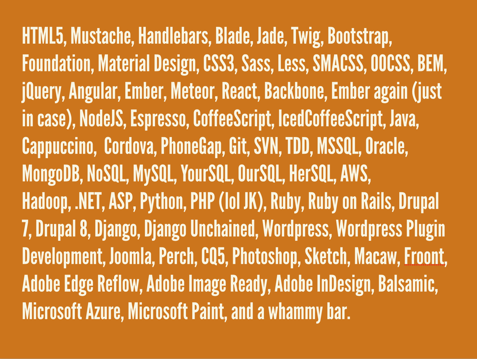
If you fit those requirements, Brad Frost Web LLC is eager to see what you have to offer our cutting-edge global workforce. Starting salary is a competitive $15,000 a year, and perks include casual dress and a ping pong table. No recruiters.
No shit these are emails I got last week. “Do you know any React.js Experts?” I went on React.js’s Wikipedia page and it’s first stable release was literally four months ago. Again, this infatuation with specific tools and specific technologies.
And again, I just got asked to answer this question: “As a front end engineer should I be aware of all of the problem solving algorithms to pass large companies interviews?” Sort of bubble sorting and all that crazy shit. And it’s tough. It’s really really tough. Jen Simmons recently on her absolutely wonderful The Web Ahead podcast was talking about this:
When I am trying to learn a new technology, it’s easy to Google and look at a tutorial and read some code. What’s hard is to really wrap my head around why I want to use which thing. That’s frequently the thing that’s not well-explained or well-documented. Jen Simmons
Understanding the underpinning reasons why certain technologies are helpful and useful is so insanely important, but that’s not what we focus on. Instead we focus on this torrent of frameworks and Github repos that multiple like horny rabbits.
So it’s about principles.
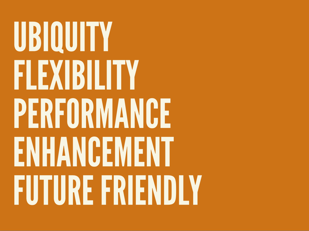
I call these my principles of adaptive design. What I want to focus on is: are the things I’m making taking advantage of the ubiquity of the Web? Are they flexible? Are they performant? Are they taking advantage of the unique capabilities of the browsers and devices that they’re being experienced on? Are these things built to last? Am I thinking about the future?
Skills
So what do we do? What do we focus our efforts on? We all have a certain skillset and we always can be learning more.
Are you familiar with the whole idea of being T-shaped? A T-shaped skillset? So you have a breadth of stuff that you’re aware of, sort of like your periphery. But you have an area where you’re particularly skilled. I think this is a nice, sane way to embrace this idea that we don’t know everything.
As a front-end developer, the stem of my T is HTML and CSS, but for somebody else that’s part of top of the T. I was thinking about this though. If the T were a table, it would fall over. Really, what we need to do, is this:
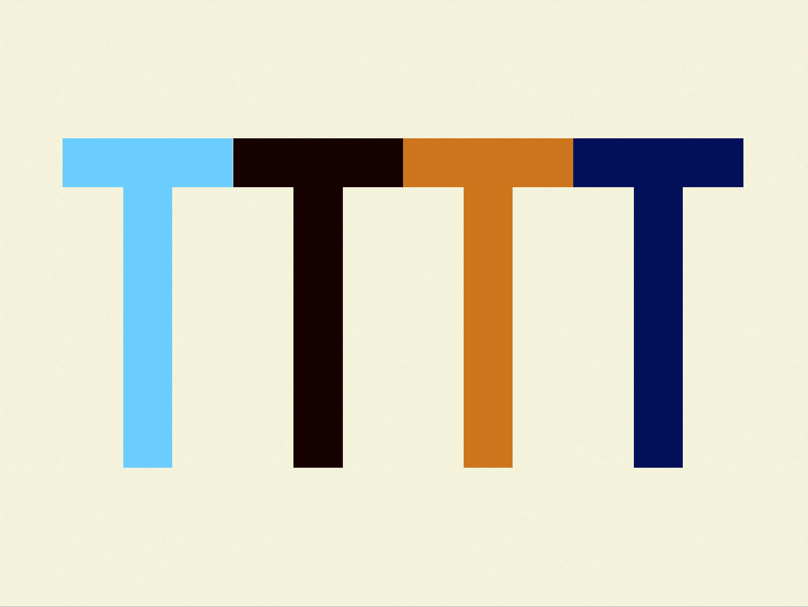
This is getting some T-shaped individuals together to work on a project team together. Having complimentary skill sets that all allow you to as a whole be stronger and more stable.
Process
And in order to accomplish this, we have to kill this idea of the waterfall process. But you know what I’m talking about right? UX designers in here? So you’re making wireframes, generating a 300 page PDF and we present that to the client and they’re like “Sure, this looks good I guess. Yeah.” And that gets signed off, and you hand it off to the visual designer, and they apply color and typography and texture and all of that and we put it in front of the client. And they’re like “Hooo, I don’t know. Can we make some changes here?” We say sure and go back and do a v2. And we come back and they’re like “I like this, but…” And we’re like ok we’ll do a v3. And they’re like “OK, I like a little bit of that but can we roll in this from V1”. And so eventually once homepage_final_v2_forreview_finalfinal_fordevreview_finalthistime_FINAL.psd gets approved, then the visual designers quietly tiptoe over to the code cave, slip the designs under the door, and as they run away they yell “Get that done in two weeks. We’re already behind budget and schedule!” And the developers come out of their cave and they’re like “Ah this is all wrong! Ah!”
As a frontend developer I suffer from a serious identity crisis. At all the places I’ve worked, they say “Oh what do you do?” “Well I write HTML and CSS.” “Oh you’re a coder! Go over and sit by those Ruby folks, and whip us up some gems.” And I’m like “Uhhhh.” “How long is it going to take to write that middleware for us?” And I’m like “Uhhhh…my mom is an art teacher. I’ve never had a computer science class in my life. I don’t know what you’re talking about.”
I think it’s so essentially important to design for this future, to design for this multi-device Web landscape, to treat front-end development as a critical and key component of the design process.
Raise your hand if at your organization designers and developers sit right next to each other. That’s good. Happy to see that. Raise your hand if designers and developers sit on the same floor? Raise your hand if designers and developers are on separate floors? Raise your hand if they’re in separate cities? In separate countries? This is a huge freaking deal. We can’t get passed this with those types of organizational barriers in place. What this process assumes is that each one of these pieces has all the answers. And we don’t. We just don’t know everything. We don’t know what the hell we’re doing. It requires all of us working together, and–gasp–actually communicating and collaborating with each other. Sitting next to each other. Smelling them for hours at a time. Stuff like that. It’s uncomfortable, and sort of unnatural, but at the same time it’s absolutely necessary for good work to be produced. This takes everybody. (This is at my uncle’s chiropractic office and I’m like “Oh my god. That is going in my slides.”)
But it’s not just just our own disciplinary teams, this requires all of us. I absolutely love working on the Web, and hope that you all do too. Because we, the people that make the Web, are the ones that understand its power. That understand that true collaborative nature of sharing knowledge and being open. So I highly encourage you to blog, write on your Medium site, find ways to share bits of your own design process, share case studies, share data, share tips and tricks, share photos of your works in process, ask questions on Stack Overflow, answer questions on Stack Overflow, put together little proofs of concepts, prototypes, contribute to documentation, submit browser bugs, share your stuff on Github.
The beauty of the Web is that it’s this big, messy thing. And when you visualize it in this way:

You quickly learn that no one has all the answers. There are no experts. There are no rockstars. There are no ninjas. There are just people that have pieces of the puzzle. And it’s up to us to continue to share and reach out and continue to help each other actually accomplish this stuff.
I absolutely love this graph:
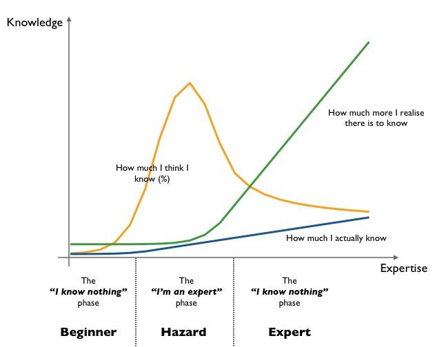
Simon Wardley recently produced this. You sort of go through this process of “I don’t know anything” and it’s true because you’re just starting. And then you get ramped up and you have this false sense of security. And then as time goes on, you realize there’s a hell of a lot more you don’t know. So I don’t know anything. I have no idea what the hell I am doing. And neither do you. And that’s ok.

The Web is one giant puzzle that we just happened to lose the box to. And it’s never going to be fully complete. We spend hours organizing all the blue sky pieces, then your toddler comes by and eats a couple. And then some jagoff comes and throws about a thousand new pieces onto the puzzle and they’re like “Here you go! Now this is part of the puzzle.” But does that mean that we don’t put the puzzle together? No. We should put the puzzle together. Because even though it’s never going to be done, we can start to see that progress happen. You can start to see that beautiful picture start coming together.
And puzzles are a hell of a lot of fun. Thanks.
This video is also available on Treehouse.